Rupert Murdoch is the chair of News Corporation, the company that houses many newspapers, TV networks, and other vehicles for information, including Fox News and Dow Jones (the company that runs The Wall Street Journal). A while back, he was a TIME Magazine cover story, around the time he was trying to acquire Dow Jones, which he has since done. I decided to do a portrait of the man.
Aged faces with lines and forms provide some nice opportunities for visual interest. I tend to lay down paint with a soft brush and sculpt it around with a stiffer brush, pushing it to create the landscapes of the face, leaving brush strokes showing here and there, combining hard and diffused edges, and playing with various degrees of translucency.
On this image, I also overlaid a couple of textures, digitally. It can be seen best in his collar and in the background. I wanted to introduce a bit more to the visual textural feast. It can help draw the viewer in as they try to peel back all the layers within the illustration.
Sunday, April 27, 2008
Behind the Portrait Curtain
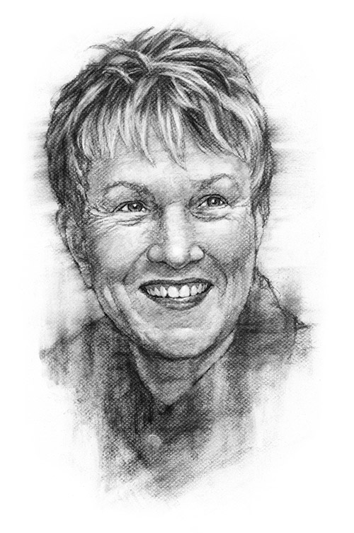
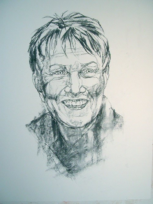
Here is a bonus entry this week. There is a magazine titled Step Inside Design. Before it was called this, it was titled Step-By-Step Graphics. I found it a source of inspiration when they had my illustration heroes demonstrate how one of their paintings went from blank canvas to final art. Here is my own documentation. This is one of the several charcoal portraits I've been working on as of late. I thought this particular one was interesting to see her appearance change from beginning to end.
After projecting it to paper, I'll lay down some vine charcoal. This step is where the fun happens. What takes place here will form the foundation for everything -- from dark/light patterns to linework to every unexpected "happy accident," so it's the place to get loose and let the interest happen. Everything after this is basically refinement. Angles are important in portraiture. I am paying attention to those within the face -- the lids of the eye, the nostril, the mouth, the eyebrows, the contour of the cheek -- these make or break a portrait. I'm also focusing on a more posterized version of the final -- leaving the middle values of gray to come as part of the blending. It is interesting for me to look at this first image from a distance and see how I could find the map for the final art located here.
Next, I'll take a blending stump, chamois, and kneaded eraser to soften the marks and pull out the lightest lights in the eyes, teeth, hair, and highlights of the face. Windsor Newton seems to have made their soft vine charcoal even softer. Which means it doesn't take much to lose all of the interest created in the stage prior. I blend lightly to hang-on to lines and texture. As Emeril says, it's easier to add more of an ingredient -- much harder to take away. Meaning, it's easier to continue to blend and soften an edge, but impossible to truly bring back that unexpected mark once it's gone. That's the crux of my artistic challenge -- how much cool stuff to keep versus how much refinement to give. That's a variable that can be manipulated and, in the long run, helps keep things interesting for me.
Hair can be a source of fits for some, but I actually enjoy rendering it, especially when it's filled with energy, like in the subject here. I think the potential for creating movement with charcoal complements its nature.
After giving the drawing a shot of spray fixative, I go back in with a compressed charcoal pencil and more vine charcoal to add darks (usually starting with the eyes, nostrils, and mouth) and continue refinement of the facial tones and shapes, and hair. Next, it's scanned into the computer and made ready to send.
Here she is again.
Saturday, April 12, 2008
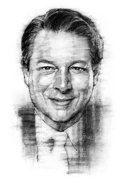
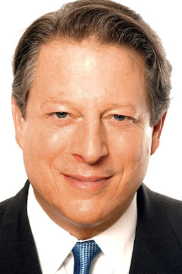
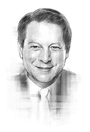
Al Gore
One of the cool things about portraiture is the opportunity to illustrate notable figures. One of those folks, for me, was Al Gore. This is the second time I've portrayed him in charcoal. The first time was in the 90s, when he was still Vice President. That particular illustration was for Science Magazine and was to accompany an article he wrote. But, as sometimes happens, the story was killed, and the illustration didn't see the printed page.
This particular illustration was done a few months ago for McKinsey and Company to accompany an article he wrote with one of his business partners, David Blood, former head of Goldman Sachs Asset Management, whom I also illustrated. The two men formed an investment-management firm dedicated to investing for sustainability. In this article, they discuss socially responsible investing and society's expectations of corporate responsibility. When the assignment came, I was asked to illustrate Blood and Gore. I said, "You got it."
Of course, Al Gore has now become a bit of a rock star, what with his Academy Award, Nobel Peace Prize, and the host of other bits of recognition he has garnered over the past few years -- primarily dealing with his efforts toward calling attention to global warming.
Whenever I do a black and white portrait, I will compose one preliminary sketch, unless there is a need to create more. Then, upon approval, go to the final art, done on Canson paper at a size of 14 inches X 18 inches, scan it, and do some minor processing in Photoshop to prepare it for the digital realm (set my black and white points and do some minor clean-up).
The key for me, in doing these portraits, lies in creating an interesting composition with the black and white pattern distribution, and bringing out the interest created by the handling of the medium -- while maintaining the likeness of the subject.
reference photo
preliminary sketch
Sunday, April 6, 2008
Sacajawea
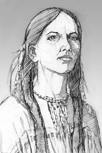
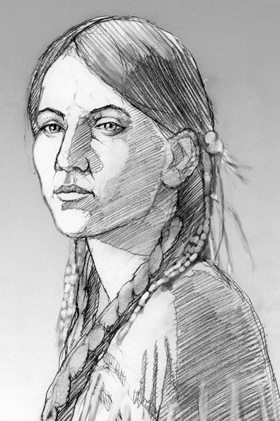
This is a book cover illustration of Sacajawea I recently completed for Harcourt Publishers -- a very fun job and a very cool job.
The project called for a fairly straightforward portrait of her at about age 17. Several challenges arose. My first became finding a model about that age and shooting photos in clothing and hair style that as closely as possible replicated my intended depiction.
The problem was, I didn't yet know what I wanted to depict or how I wanted to portray the figure. That usually comes after the photos are shot. I'll see some great lighting or unpredictable nuance that will drive the illustration.
I lucked out with the model -- a friend's daughter just happened to be the perfect age. I had a few ideas to get us started. Then, as we tried different angles, I started to zero in on the lighting and compositions that seemed to be working best. Things started to come together in my mind's eye. I took several hundred photos, and I cannot more greatly express how pleased I was with the shoot and resulting photos. That always bodes well for a job. The next task was weeding down the shots to a manageable number of the best, from which to create my sketches.
Hair and costume were the next challenges. Since there are no photos of Sacajawea, her face is fairly open to interpretation. We know she was a member of the Shoshone tribe and died in 1812. Of course, she was integral to the Lewis and Clark expedition. I scoured the net for others' depictions, as well as general research about her and her tribe, so as to not portray anything unacceptably inaccurate. I believe what I've depicted doesn't violate this goal. I integrated the clothing, necklace, hair style, hair decor, and braids after the photos were shot.
The end-goal for me was not just a straightforward portrait, but one that also says dignity and strength. I think that is accomplished with the expression, posture, lighting, and color.
I wished to keep the colors on the warm side, complimenting the reds and yellows within the figure. The subtle blues in the beads balances things out.
My preliminary sketches.
My client chose the camera-right-facing pose, you see, above.
You can order the book, written by Joseph Bruchac, HERE.
My thanks to Harcourt Publishers, for the project, and to our model, Caitlin Brady, for helping re-create Sacajawea, for the world to see.
Allan Burch is an award-winning illustrator and portrait artist, providing solutions for editorial, book, advertising, and institutional projects.
•View more of his work»
•Sign-up for his newsletter»
•Purchase prints»
The project called for a fairly straightforward portrait of her at about age 17. Several challenges arose. My first became finding a model about that age and shooting photos in clothing and hair style that as closely as possible replicated my intended depiction.
The problem was, I didn't yet know what I wanted to depict or how I wanted to portray the figure. That usually comes after the photos are shot. I'll see some great lighting or unpredictable nuance that will drive the illustration.
I lucked out with the model -- a friend's daughter just happened to be the perfect age. I had a few ideas to get us started. Then, as we tried different angles, I started to zero in on the lighting and compositions that seemed to be working best. Things started to come together in my mind's eye. I took several hundred photos, and I cannot more greatly express how pleased I was with the shoot and resulting photos. That always bodes well for a job. The next task was weeding down the shots to a manageable number of the best, from which to create my sketches.
Hair and costume were the next challenges. Since there are no photos of Sacajawea, her face is fairly open to interpretation. We know she was a member of the Shoshone tribe and died in 1812. Of course, she was integral to the Lewis and Clark expedition. I scoured the net for others' depictions, as well as general research about her and her tribe, so as to not portray anything unacceptably inaccurate. I believe what I've depicted doesn't violate this goal. I integrated the clothing, necklace, hair style, hair decor, and braids after the photos were shot.
The end-goal for me was not just a straightforward portrait, but one that also says dignity and strength. I think that is accomplished with the expression, posture, lighting, and color.
I wished to keep the colors on the warm side, complimenting the reds and yellows within the figure. The subtle blues in the beads balances things out.
My preliminary sketches.
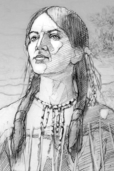
My client chose the camera-right-facing pose, you see, above.
You can order the book, written by Joseph Bruchac, HERE.
My thanks to Harcourt Publishers, for the project, and to our model, Caitlin Brady, for helping re-create Sacajawea, for the world to see.
Allan Burch is an award-winning illustrator and portrait artist, providing solutions for editorial, book, advertising, and institutional projects.
•View more of his work»
•Sign-up for his newsletter»
•Purchase prints»
Labels:
America,
book cover,
expedition,
history,
Joseph Bruchac,
Lewis and Clark,
Native American,
Sacajawea,
Shoshone,
woman
Subscribe to:
Posts (Atom)