Saturday, December 20, 2008

Dancing With Myself

Above is the image gracing my 2008 year-end holiday card.

In 2007, I created a card featuring 2 dancers and the word "joyous" on the front. "Noel" was awaiting the recipient upon opening the card.

I liked the subject and the concept from 2007 so much, I decided to repeat the idea for this year's card, with a different image, of course.

I wanted to keep the colors warm and reddish, to reflect those we see this time of year. I wanted the image to say, "joyous," and play well with the energetic brushwork I planned on using.

Thanks so much to everyone who has taken the time to view this blog, whether you are a first-time viewer or a faithful follower. I'm looking forward to a positive 2009, and wish the same for you. You may always follow the year, as it unfolds, through this blog, as I update work every week or two, my website, and my monthly newsletter (please see the link to the right to sign-up).

I wish you all the best for a wonderful holiday season and a peaceful and prosperous 2009.

Sunday, December 14, 2008

Bleed the Freak

Anger plus fear is a lethal combination, I've heard. Both, I'm sure, course through the veins of soldiers like the one on this page, every day and all over the world.

Bleed the Freak is a sample image, ultimately destined for my portfolio, at this point. However, I had some parameters for its completion.

The image needed to reflect a dramatic point of view. It also needed to be cold and unwelcoming. I have since added the flash of red, for warmth and added drama. Lastly, it needed to project emotion and tell a bit of a story.

Who is he? What's he reaching for? Where is he? Why is he in anguish?

These are questions a viewer can pose. They are also ones that the viewer can answer, or at least draw some plausible conclusions, based on the context.

I shot some photos and used the one I thought captured a good mix of emotion, shape, light, and composition.

I zoomed-in a bit more on the figure, than what I had shot, to make him further inescapable to the viewer. After the painting phase, I took the art to the computer, where I adjusted the local and global values, as well as the local color, bringing barely saturated teals to the clothing and helmet and the slightest bit of warmth to his skin tones.

To bring some rawness to the image, there needed to be more texture -- another layer or two of obscurity between your eyes and his. I wanted to make it less-clean.

Some radiating wood texture brought a carved look while aiding in an explosive feel, apropos to the subject. On top of it all, a spatter texture, I thought, brought a sense of debris and, obviously, blood -- also appropriate.

Illustrations like this harken to the amazingly well-crafted and complex, yet seemingly spontaneous work one can see in comics and graphic novels -- something that captivated many a young artist. It is a reminder of the pure magic of illustration.

Tuesday, December 9, 2008

Tickled Pink

Do you feel the red blaze lighting up your right eye socket? You surely know the feeling of your lips stretching around your dentist-clean teeth, and the strain in your throat as you release whatever sound makes you comfy in times of trial?

This image was created as a sample, for a particular purpose about which I will comment in a future post.

However, I am posting this image because it is not something often seen in my portfolio. And, for those that know me, this is not an emotion often associated with my name.

It was one of those juicy illustrations that has all the makings of an enjoyable experience at the drawing table (and computer).

"Create an illustration that is rich with emotion and drama. Make it something cold and cathartic, while you are at it."

Perfect.

I added the red, later on, to bring just a hint more emotion.

I'll admit, as I was creating it, I was in the midst of a marathon of illustrating, so I didn't fully appreciate the catharsis involved.

However, little did I know, circumstances would present themselves, later, that would allow much-needed catharsis through writing about it.

I'll just keep that to myself.

There is something powerful about channeling aggression through music, exercise, art, or whatever means does the trick for you.

At one time, I enjoyed all of the above activities as means to channel bottled-up hostility.

As an aside, I also enjoy driving...somewhat expediently...and aggressively (but responsibly, and timidly...oh who am I kidding). In an escalating fashion, throughout my driving life, I have purchased vehicles that cater to such nonsense. In another life, I might have been in a profession that allowed me to sit behind the wheel of an excruciatingly powerful machine designed for ridiculously dangerous speed.

But, today, the only ridiculous speed I engage in, is that which I offer my clients. (nice segue!)

You see, today, I can (with evidence, even) call myself an award-winning, professional illustrator who offers an above-and-beyond, dependable, and multi-faceted, client-centric service, built over years of diligence and conscientiousness, and targeted toward providing an (hopefully) outstanding product and wholehearted investment to your project, while representing you, your brand, and the reputation of your company, always, with the utmost care, commitment, and respect.

Please browse the rest of this blog and/or click over to my website (see link to your right), and drop me a line. I'd love to discuss your project -- large or small.

Sunday, December 7, 2008

Peak Oil

In 1956, M. King Hubbert proposed a peak oil production curve. It was and is a bell-shaped curve that shows the rising and peaking of oil production at the point where half of the earth's reserves are depleted, then sloping downward as further production is likely to begin a terminal decline -- marking the end of "cheap oil."

For the November/December 2008 issue of the Bulletin of the Atomic Scientists, I was asked to illustrate this concept.

I began by ideating -- immersing myself in images, sparking ideas, which I then jotted down in my sketchbook, sometimes accompanied by scratchy thumbnails. After amassing several pages worth of ideas, I whittled them down to my 10 or so favorites, and moved to a sketch phase.

Coming up with ideas is one thing, translating them to a visual form is another -- part of the craft of illustration.

I've been interested in symbolism and clichés, lately. Clichés are immediately recognizable, and sometimes it just takes a minor adjustment or looking at it from a slightly different perspective to turn a cliché into something unique and interesting.

Symbolism is something also universally recognized. How many stress dreams have you had? How many involve missing a final test? Maybe, you've also been naked.

Maybe, that's just me.

That's symbolism, nonetheless. It's a tool I like to explore whenever I can. Symbols are interesting in and of themselves, plus, they allow the viewer to bring their own interpretation to the illustration.

Sometimes, I will find reference, other times I will shoot my own. Sometimes I will construct models or purchase props in order to create the very best possible product I can -- after all, it's also about going above and beyond, right? Otherwise, why bother? Your clients are entrusting you to be just as invested in their product as they are.

So, after acquiring my reference, and compositing it all, digitally, into preliminary sketches, I will weed it down to about 4-6 sketches.


In this case, the client liked the oil wells (2nd sketch), but felt the image would better communicate the idea of peak oil by adding the graph, to emphasize the Hubbert curve created by the wells.

I think it adds to the composition.

This illustration happens to be one of my favorite pieces I've done for the Bulletin. I think it communicates the point, the color palette and value pattern work well together, the textures are nice, and the structure of the composition is interesting.

But, it's always the client who needs to think so.

Saturday, November 22, 2008

Pleading Insanity

Here is an illustration created a few years ago for Phoenix Magazine. Unfortunately, as some jobs are, this one was killed for one reason or another. However, one of its results was this dark piece from my archives.

The story it accompanied had to do with prisoners and the potential abuse of the insanity plea. The client knew what they wanted, so it was just a matter of my translating their concept to the page.

As you see above, the intent was to depict a gruff-looking prisoner -- maybe qualified to plead insanity, maybe not -- with shadowy, dreamy figures flitting about, at least raising the possibility of the instability of his mind.

The textural quality of the charcoal on paper drawing lends itself to the cold mood and sense of uneasiness the client was looking to achieve. The harsh light, bisecting the guy's face, both creates drama and alludes to the decision between right and wrong (good and bad, light and dark) when it comes to the issue.

So, who is posing as the prisoner, you are probably asking. Since I tend to pose for my own illustrations, whenever possible, I can say, from the neck down, I am loosely represented.

But, as I'm such a non-threatening sort, my head just would not cut it.

Luckily, a friend, who taught a college-level life-drawing course at the time, happened to have a model who looked like he could have slipped through the barbed wire at the state facility.

It turns out he was a prince of a fellow, but had the mug of a prisoner...at least a prisoner in my illustration.

The end result worked out just perfectly.

Everyone was thrilled, which thrilled me, doubly.

Saturday, November 8, 2008

Carl Crawford of the Tampa Bay Rays

Carl Crawford, of the Tampa Bay Rays, World Series runners-up, was the last of a number of baseball players I painted for the 2008 MLB Masterpieces baseball card series for The Upper Deck Company.

I had posted an earlier illustration of Jim Thome, where I document my challenge of dealing with out-of-focus crowds. At this point in the series, I felt like I had hit my stride, and figured out the formula for such crowds. In this particular image, I cooled the crowd back with blues and violets to allow the warmth of the foreground to further pop forward.

This was a terrific assignment in which to participate. The original 8" x 10" paintings are sold to collectors, and reproduced for the baseball cards on a high-quality, linen-style card stock. I recently received the cards, and was very impressed with how they turned out. If you are an illustration enthusiast, and a baseball fan, you should do yourself a favor and check them out -- not just because I participated in the project, but because they are really cool collectible art pieces.

The excellent communication throughout the assignment was a measure to its success, in my eyes.

I am often contacted by students and beginning illustrators, seeking advice for starting their careers on the right path. Building strong communication skills is one such way.

When evaluating my working relationships, communication is at the very top of my criteria. How much value does an illustrator place in communication? How much value does an art director place in communication? Communication makes the world go around, and it certainly drives our profession. An assignment can be made or broken by the level of communication displayed on both sides.

As an illustrator, one of the most valuable commodities you can possess is the power of timely and thoughtful communication. In an era of email and non-personal contact, it can be endlessly frustrating for an art director to contact an artist. Making yourself available and going the extra mile to make it easy for an art director to contact you, is a first impression that will pay dividends on your reputation and separate your services from other equally talented artists.

My policy is to respond to all emails, if only to acknowledge their receipt. I feel it bridges the lines of communication, facilitates a smooth workflow, and is just a matter of professional courtesy. All positive and considerate actions will spill over to the quality of the resulting art, I believe.

Transparent and conscientious communication builds trust. Trust is the cornerstone of a creative professional's reputation. As illustrators, we have nothing if not our reputations, right?

As evidenced in the United States' recent presidential campaign, communication is a vitally powerful tool, and always reflects beyond the speaker or author. I absolutely believe this can be said for everyone who considers themself a professional -- political, creative, or otherwise. In my opinion, an aspiring creative professional will be miles ahead, in both fostering their own career, and in bolstering the reputation of their peers (and their industry), by choosing to do everything within his or her power to make conscientious communication not just an unending priority, but one of their most stellar attributes.

Sunday, November 2, 2008

The Sarah Palin Experience

Is Sarah Palin going rogue? Has she ever not been rogue? Isn't that the nature of mavericks?

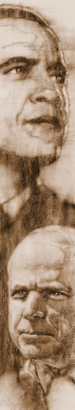
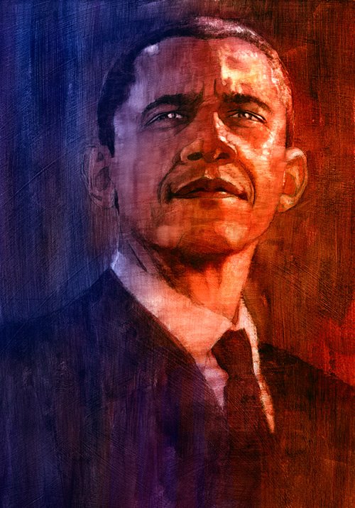
This illustration was inspired by her latest rogue-like headlines combined with her tendency to, at least in weeks prior, perhaps be following a script, in both words and deeds -- like a puppet. I have also added a "wink" to the power of the story of her expensive wardrobe, with the glimmer in her earring.

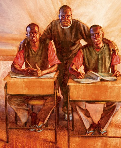
While the face is composited from additional sources, her body comes from my own personal photographic reference. You see, I had the opportunity to attend a Sarah Palin rally. One week later, I had the opportunity to attend a Barack Obama rally.

What follows below is the recounting of my experiences at both.

Thursday October 23, 2008.

Clutching my Sarah Palin reference, I walk toward my studio to begin what I know will be one heckuva portrait of 1984's Miss Wasilla crown-holder and 2008's Republican candidate for Vice President of the United States. However, the phone, and its robo-call on the other end, interrupts my train of thought.

"Yello!?"

"Come and see Sarah Palin at Bass Pro Shops in Springfield, Missouri, tomorrow. Gates open at 9am."

How fortuitous and coincidental that I just happen to be in a Sarah frame-of-mind. Even though I'm a Barack Obama supporter, what good reason would I have to miss an opportunity to experience the spectacle that is a Sarah Palin rally? As a person who has found himself mainlining the political news for the past 2 years with an increasingly ravenous appetite, I would be doing a disservice to myself to miss out on such a tasty treat. My mind was made up.

At 6am, Friday morning, I wake to the radio station DJ telling me people have been camping in line to see Ms. Palin since 3:30am.

I'm out the door at 7am. The Ozark Mountains are especially picturesque this morning. Fog fills the valleys, the air is crisp, and the early-autumn sky is crystal clear and blue.

Shortly before 8am, my car is in park, and perfectly positioned between two yellow lines at the Bass Pro Shops parking lot, flanked on all sides by cars, vans, and trucks, many with bumper stickers screaming "McCain/Palin '08", with an occasional "Drill, Baby, Drill!" I could sense the heavy affection for Ms. Palin in the air.

The sunny, crisp day quickly turns to overcast. The brisk wind becomes a bone-chiller, as I come to the realization my light jacket over a t-shirt is not going to keep me comfortable.

I come upon 2 lines. One for ticket holders, and one for non-ticket holders. The rally was originally an invitation-only event. Supposedly, 4,000 tickets were sold out in short order, so the decision was made to move the rally to this larger public venue.

My line, for non-ticket holders, was already about 150 yards long, one hour before the gates were scheduled to open. The line eventually strung out several blocks.

The volunteers, wearing white t-shirts (over layers of clothing), screen-printed in red with "McCain/Palin," directed the steady stream of arriving people toward their proper line. Occasionally, a volunteer would walk by, informing us about the no signs policy -- some would be provided for us. Cameras were okay -- shoot as many photos as you'd like. And, they made sure we were all fired up to see Sarah!...Sarah!...Sarah! There was also a volunteer to see if line-standers would like to volunteer for the campaign -- work the phone banks, knock on doors, and so forth.

Then, there were the buttons. The first guy was selling for $5 per button.

"No, thanks," I said.

Luckily, I refused that guy, who was obviously trolling for suckers, since the next guy was selling for $3 each, and a discount for multiple buttons. Union-made, to-boot. What a deal!

"No, thanks," I said.

The buttons were printed with all sorts of slogans. Some were straight McCain/Palin, blue and white typeset badges, while others were more brash and all about Sarah -- usually with pink hearts, girl-power anthems, barracudas, pit bulls, lipstick, high heels, and even the stylishly-framed, glasses-wearing Vice Presidential hopeful.

Good Lord, it was cold. The wind would blow and erase all doubt, if someone had any. The lack of sun was the problem. 43 chilly, windy degrees fahrenheit, for what turned out to be five hours on my feet, with insufficient bundling, is bound to border on at least feeling cool-ish to even the heartiest of fellows. I asked myself, more than once, was it really worth it to see someone for whom I had no intention of voting? That's when my weight training experience kicked in and my somewhat-trained mind remembered how to endure beyond this minor discomfort. I would kick myself later, in warmer environs, for not sticking it out.

Aside from the air being thick with affection for Ms. Palin, it was also thick with neoconservativism, or at least some form of it. Subscribing to a "progressive" political agenda, I was apparently outnumbered. The people in front, behind, and just about everywhere I cared to look, reminded me, with enthusiastic conversations riddled with variations of the words, "socialism," or polite and not-so-polite ridicule of the smattering of sign-weilding protesters, this was McCain/Palin Country, or, at least, the McCain/Palin parking lot. I didn't want to get into a debate with anyone, and luckily I didn't. However, a reporter for the Springfield News-Leader, Missouri's third largest newspaper, just happened to approach the 65-year old, rain coat-clad woman in front of me, asking, "What brings you here?"

Looking out from under her hood, she launched into the popular talking points of the day. The family of multi-generational women behind me also had some thoughts on why they were here. Theirs were much more reasoned -- not against anyone, but rather for particular policies and how each thought the policies would best benefit their lives. Also, as women, Sarah provided many levels of inspiration to them, and their children.

While it would have made an interesting sidebar, I didn't offer my reasons for being there. I'm kind of kicking myself for not doing so.

Glacially, sometime between 9am and 10am, my line started moving. With my plastic American flag attached to a dowel rod that had been handed to me at some point, I inch forward, toward the gates, with the rest of my fellow non-ticket holders. Out come the contents of my pockets, as I step through the metal detector.

I'm clean.

Big and Rich is pumping through the huge concert speakers perched by the stage. The VIP section had bleacher seats directly next to the stage, which was set up "in-the-round."

"I'm Joe, too!" and "Sarah Barracuda" and "I (heart) Sarah," were three of the signs I spotted from the VIPs. Each was quaintly painted in red, blue, and pink on white cardboard -- certainly homemade by those holding them. However, my sources tell me even those signs were provided by the rally organizers. There were plenty of blue McCain/Palin signs. The crowd became a sea of blue during the applause moments as those signs rose and shook. Perhaps the most curious sign I saw was a white, handmade pig drawing, attached to a popsicle stick. The pig was wearing red lipstick and the wording read, "Can you hear me, now?"

I'm not the smartest guy, so I'm probably overlooking the obvious, but I still can't quite add that one up. Surely it's a reference to an unfortunate statement made by Mr. Obama during the early weeks of Ms. Palin's tenure as V.P. candidate. But, is that the best symbol of her candidacy? Is it a defiant symbol? Is it an ironic statement? I'll probably take those questions to my grave.

At this point, my focus turns to my job, which is shooting photographic reference. I park myself among the crowd -- about 35 yards from the podium with a face-on view of the speaker when she takes the stage. To my right is the press stand with photographers and news media personnel. To my left is a tent with organizers. Behind me is a growing crowd. By my estimate, it was maybe around 5,000 people. News reports estimated up to 20,000, but I would question that figure.

Pierce Arrow, a local band, sings a few songs to fire-up the crowd. Missouri's Republican candidate for Governor, Kenny Hulshof, acts as emcee, bringing down-ticket Republican candidates on-stage. Each gives a 5-minute spiel. Back comes the band to do a couple more songs. Then a couple more. It seems as if Sarah is hung up at the airport, so how about a couple more? "No," squeal a few of the impatient red-staters around me.

"Mama Judd is mad," Naomi Judd, one-half of the Judds, and introducer of Sarah, begins. Ms. Judd goes on to defend Sarah from the demonization she has perceived as taking place via the media. One thing was for sure. Mama Judd meant Sarah was only minutes from replacing her on the mic. The people around me were ready to get to the main attraction.

"There she is," remarked a father, on my immediate left, to the 4-year old sitting on his shoulders. After witnessing the angry mob-scenes on TV, I was expecting an eviscerating attack on the Democratic nominee. However, in my opinion, it was a fairly tame speech. There was no mention of "palling around with terrorists."

"Experimenting with socialism," and "spreading the wealth" were the buzz words of the day. It seemed like a well-orchestrated ceremonial event -- not meant to be substantive, but a forum to say some things, give the crowd a chance to cheer and boo at precise moments, and let people feel as if they might be leaving with more than they brought. She spoke well, was very charismatic, and came across as quite likable. She brought a rock star quality that people wanted to experience. I'll leave fact-checking to the non-illustration blogs.

Afterward, she descended the platform to the sounds of Shania Twain's, "She's Not Just a Pretty Face." Shaking hands and signing autographs with the crowd nearest her, she snaked her way around the stage, eventually exiting from where she came. The atmosphere was that of a celebrity walking the red carpet, with cameras hoisted above the crowd, following her every move. Also following her every move were the sharpshooters poised atop the nearby building. Faces all focused in her direction, craning their necks just hoping for a glimpse of her. I moved closer to the stage, investigating the area in hopes of maybe getting some more photos. James Brown belted out "Living in America," as I passed the speaker, which became the new home for my plastic American flag. I looked for a crowd opening in which to sneak.

No luck.

With low temperature-stiffened joints, I returned to my car around 2pm. I brought with me a first-hand experience of what is being analyzed by the best and brightest journalists, every day, in print, on TV, and in photographs and illustrations. My perspective is clearer, as, at least for this day, a piece of the political process was filtered through my mostly fair and often balanced eyes.
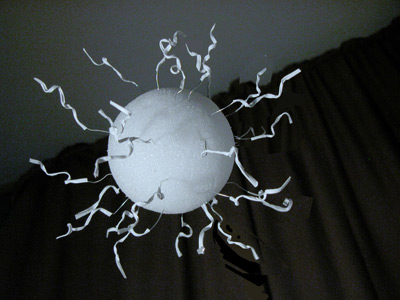
The Barack Obama Experience


Saturday November 1, 2008.

All the lonely people.

Lonely? Arguably, in a political sense.

Excited? No doubt about it. Standing 1 mile from the gates, at the end of the line to see Barack Obama speak, I knew there was something bigger present than the nearly 40,000-strong who showed up see the man talk.

It was a phenomenal sight for little ol' Springfield, Missouri. Employees at business along the line's route gathered outside to look for its end, marveling at its enormity. Cell phones, in the hands of both drivers and passengers of many slow-moving cars, snapped photos of the line. In one such car, a head, tightly wrapped in a faded red hoodie, looked out his passenger-side window. With the purest expression of bewilderment painted on his roughly 20-year old face, he scanned the seemingly endless line of people and asked, "What's this for?"

It's Obama, man.

Walking my mile toward the back of the line, I was cognizant of the crowd's diversity. Thinking back to the Sarah Palin rally, a week earlier, a far-reaching cross-section of people was not so apparent. While the crowd was enthusiastic to see Sarah, the atmosphere created by those to see Barack was festival-like. These people were here to see the Rolling Stones. Tonight, the magnitude and magnetism of the message of one man, reflected in the life's experiences and hopes of both the 18-year old, first-time voting college student, and the 80-year old African-American grandmother, was electric, and positively lit up the high school football stadium where that very man would soon take the stage.

Around 8pm, I made my way through the metal detector, and safely into the stadium. The stands with a clear view of the stage were packed to the gills. The other side of the stadium, partially blocked by the press stand in front of the stage, had people filling seats that provided any kind of view. I found my way onto the football field and picked a spot on the 40 yard line to call my own. The stage was situated in the end zone. Directly behind, was the VIP section, reserved for ticket-holders.

"CHANGE" in white block letters, positioned next to the familiar circular red, white, and blue Obama logo, on a big blue banner, provided the VIP backdrop. Looking to the left was a large American flag, and further to the left was a large Missouri flag, both hanging vertically. The same kinds of handmade signs peppered the Obama VIP section that were prevalent in the Palin VIP section.

"MO (heart) Obama" and "Show Me Change" were 2 such signs.

The rally began with a prayer, the pledge of allegiance, and a couple of inspirational songs from the Lennon brothers (remember the Lennon sisters?). Missouri Secretary of State, Robin Carnahan, took the stage and smartly spoke directly to young voters, giving them some dos and don'ts on election day. Jay Nixon, the Democratic candidate for Missouri Governor, gave an impassioned talk about the remainder of the Democratic ticket. Motown, rock, pop, and country tunes filled the air from the concert sound system in advance of the next speaker.

The beauty of attending events like this, in-person, are the details -- characteristics that make the event special, and something one could never know, otherwise.

Kool and the Gang whipped up the crowd with "Celebration," U2 told us what a "Beautiful Day" it was, and Earth, Wind, and Fire sang "Shining Star." The anticipation was enormous as, arguably, the most famous person in the country was soon to be standing in front of a wildly curious and fiercely adoring rural Missouri audience.

Every little cue from the crowd was scrutinized, as no one wanted to be out of the loop to any important goings-on.

Why are the VIPs turning around and looking behind them?

Why are all the people in the stands cheering?

These two questions were popping up from those around me after a rolling, and seemingly unprovoked, cheer erupted from those in the stands. Stands-people, unlike us on the field, had an aerial view of the road just a few yards away. Stands-people also knew something field-people didn't, as they were now facing the back of the field, gazing intently toward that street. Not to be scooped, I, along with many other fieldsters, turned to look.

It's about 9:30pm and obviously dark. I can't see the street, but I can see the darkened scoreboard at the back end of the field -- its shiny surface brilliantly reflecting the static white lights around the stadium. With its proximity, lights near the street's pavement also bounce off its shiny surface.

In a Jurassic Park moment, much like when the rippling liquid ominously foreshadows the impending dinosaurs...flashing red lights, bouncing off the bottom of the scoreboard, indicated something buzz-worthy going on below. A motorcade was making its way to the front of the stadium. He was arriving.

I must say, that was very cool. The cheering crowd, feeling the unspoken permeating wave of his imminent arrival, obviously thought so, too.

The music's sudden silence cued a tremendous roar from a rapt and knowing audience.

"Ladies and gentlemen, please welcome Senator Claire McCaskill!"

Obama surrogate, Claire McCaskill, gave a rousing talk in advance of her big introduction of the second to last speaker, and perhaps next First Lady, Michelle Obama.

Mrs. Obama spoke for 15 minutes with charisma, intelligence, inspiration, and command of the audience's attention.

"We love you, Michelle!" squealed some fellow behind me.

After nearly 5 hours, it was time. "The next President of the United States," Michelle invoked..."Barack Obama!"

Arms, cameras, and media scissor-lifts raise as people crane on top of others' shoulders and on their own tip-toes to see Barack, his wife, and children, and maybe snap a picture or two or three. The identifiable sense of something larger filling the air, evident to me while in-line, drove an eruption for the man who was now striding vibrantly up the stairs, wearing a pale blue button-down shirt with sleeves rolled to the elbow, waving graciously and flashing that Obama smile.

After hugging and kissing his family, Barack Obama, for the next hour, spoke in his familiar and commanding baritone voice, with a mixture of humor, inspiration, and impassioned urgency.

He spoke to the larger themes he's known for, and those to which many people hunger to hear and feel. The visceral feeling I had was of a thirsty and dry sponge of a crowd aching to soak every bit of what might flow from the oasis of a prophetic Obama spigot.

Setting aside policies and politics, in my opinion, there is valuable currency in one man's ability to inspire so many on such a deeply personal level. It obviously speaks to something special that people from Missouri, Arkansas, Oklahoma, Kansas, and Texas would trade travel time, plus 3 hours in a mile-plus line, on a Saturday night, for the opportunity to hear a single man speak.

As an illustrator, I was also there to do a job -- shoot photos for my reference library. I did my best, but raised, one-armed, tip-toed, nighttime shots often do not equal sharp photos for me. I didn't break that streak, tonight.

Obviously, I'm not stating anything that hasn't already been said many times by many people, but to experience this rally, first-hand, was an experience to bookmark.

With this post, and my Sarah Palin post, I hope to accomplish several things.

First, I want to chronicle 2 experiences, at least for myself, that will be part of our country's larger history.

Second, I want to relay, from one creative person's perspective, two experiences that don't happen every day, to other creatives who might find that perspective valuable.

Thirdly, I think both are good stories.

In my view, this complex and very interesting political season has been captivating theater and tremendous performance art. Illustrators around the country have capitalized on its ample material. I feel fortunate to have been able to participate in this tiny way.

Finally, and most importantly, no matter what prism you choose to view this ending political season, please don't forget to vote!

Saturday, October 18, 2008

Reza Arabnia Portrait

The image you see above is of Reza Arabnia, a native of Iran, CEO of Geico S.p.A. (an innovator in the automotive painting industry), and alumni of the University of San Diego.

This charcoal on paper illustration was done for USD Magazine a few weeks ago.

As an artist (and a perfectionist), I am endlessly analyzing my work, trying to figure out what's good about it, what's bad about it, and how I can make it better. One thing I always aspire to is a confident stroke.

Confidence shines through. Like in people, confidence in art is an attractive quality. When I see a piece of art where every stroke owns its place on the canvas, like there is no other conceivable place in the world it belongs, I am mesmerized. I want to know what the artist was thinking as he or she laid that stroke. I want to sense the pressure of the finger that produced that smudge. I want to feel what they were feeling. A confident stroke fills the art with life. I am drawn to art that takes me on a journey, visually and emotionally. If I'm committing to that journey, the art should leave me better for having taken it. Confidence is like the fuel that powers that journey, and lets me know I'm in good hands.

A timid stroke doesn't burst with life. And, what's the point of lifeless art?

Saturday, October 4, 2008

Jason Campbell

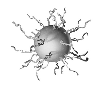
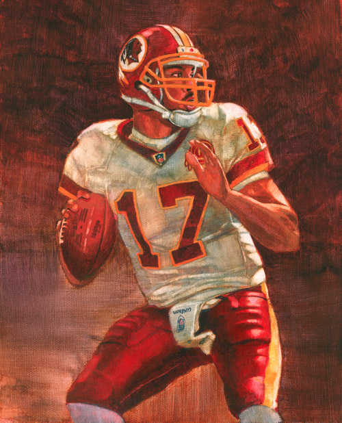
On November 3, 2008, the Pittsburgh Steelers will play the Washington Redskins, at FedEx Field in Hyattsville, Maryland -- a home game for the Redskins. Why in the world does this matter, you might be asking? Why, it's a well-known fact that the outcome of the Redskins' last home game, prior to election day, has correctly predicted the outcome of every presidential election since 1936, with the lone exception of 2004.

If Washington won, the incumbent party remained in office. If the visiting team prevailed, the opposing party took the election.

Of course, this means the nation will be watching November 3rd, with bated breath and maybe terrible towels, to see who will be taking the oath.

It just so happens I have an image to commemorate the event.

Jason Campbell, of the Redskins, is one of the players in the 2008 NFL Heroes football card series, by the Upper Deck Company. He is also one of the players I illustrated for this series.

What is also interesting about this piece is that it ushered in another first for me.

Every so often, I do a Google search for myself, just to make sure my work isn't being infringed upon. While searching I happened upon this link.

To my knowledge, it's the first time my name or my work has appeared on Ebay. But, the disturbing part of that page is that my card is the cheapest of the lot! Ah well. At least they spelled my name correctly.

Saturday, September 20, 2008

Emma: A Widow Among the Amish

Emma Stutzman was married to Tobias, an Amish man with an entrepreneur's spirit. The book for which this illustration was created tells the story of her challenges and the role her faith plays in raising 6 children by herself after his untimely death in 1956 at age 37.

This is book cover number 3 I've completed for Herald Press, and my favorite of the bunch.

Before I decided illustration was my desired career route, I studied graphic design at Iowa State University. One fine morning, as I was noodling diligently with an x-acto and a glue stick harboring little shards of paper from projects gone by on its lumpy surface, my college professor, a booming man who commanded attention, piped-up and said, "Graphic designers are the smartest people, because they know a little bit about everything." I'll admit, I might have thrown in that "smartest people" bit, but the latter half of that quote is accurate. Since they create layouts covering any number of topics, she or he needs to know a bit about the topic so as not not to create some unforeseen faux pas.

I will say, the words "graphic designers" can be interchanged with the word "illustrators," because the same challenges hold true. And, they certainly did, with this illustration. Clothing, hair style, head-wear, colors...buttons vs no buttons...everything needs to be taken into consideration, because if you are intimately familiar with Amish traditions, any inconsistency will be über-apparent.

The assignment was, obviously, to depict Emma with two of her children in the garden, a central part of the story. Rounding up models and clothing is always an interesting feat. It so happens, that weekend I was off to Iowa to visit my parents. My mother is always a willing participant in such craziness. Being a resourceful sort, she happened to round up a 5-year old gregarious girl who loves the camera and was willing to pose as both children.

Before I make the trek northward, I sift my way through every thrift store in a 20-mile radius, netting me a few plain dresses, which I (wash and) bring with me to the frozen tundra of Iowa. Except, it is now July, and the frozen tundra turns into the bloody-hot-and-humid of Iowa, which becomes a new challenge.

So, on a lovely Saturday morning, I, my mother, and my illustrator's assistant father head over to my grandmother's house, just a couple doors down from the little girl, who gets to pose as both the boy and the girl, in button-up shirt and slacks, and a nifty dress from my sister's younger days, respectively. I plan the shoot for the optimal sun position, but before it becomes too hot, to get some good light and interesting shadows. It's late-morning, and approaching the mid-80s. Gotta make the girl's turn quick before she looses attention, and so she doesn't start melting in the sun.

We play all kinds of fun games, including "walk around the patio, pick up the plastic fruit and put it in your bucket," and "name the plastic fruit as your Mom hands it to you and put it in your bucket." She is an excellent sport and gives me a load of terrific pictures. Furthermore, she loves the dress, and takes it home with her to wear the rest of the day.

Then, my Mom gets to play all kinds of fun games, like "walk around the patio, pick up the fruit..." well, you get the idea.

Sifting through the photos is fun and tough at the same time. I like to shoot a mountain of pics, when I can. You see, I work by playing the odds. If I take 1,000 photos, the chances are good that at least one photo will not totally stink.

After sending the sketches, it turns out Emma needs to look a bit younger, so an artist friend of mine happened to have access to a young, photogenic, willing participant who would pass as an Amish mother.

Voilá -- Emma.

The easy part is illustrating it -- which I did, and the art director, editor, and author were pleased with the results...so I was, too.

Sunday, September 7, 2008

McCain and Obama

In just shy of 60 days, the U.S. will have a new President. What's an illustrator's role in such an event?

Like with any subject, there are lots of opportunities for artists to depict others' or their own interpretation. I would argue, however, that politics has provided more fuel for artists than almost any other combustible source. The recent satirical Barry Blitt New Yorker cover of Mr. and Ms. Obama is one such example. Browse the newsstands today, and you're likely to see any number of interpreted angles on whichever issue is getting the once over on Morning Joe. Check the history books and you'll see a plethora of examples, including political cartoons dating back to Benjamin Franklin's "Join, or Die" days. Remember, the eight-pieced snake, ultimately used as a call to the colonies to unite against the British toward independence?

Political illustrations can be incredibly potent because of the thought involved in developing an idea and subsequently depicting a subject matter that can strike a raw nerve with certain segments of the global population.

Even talking about it can set some folks off. In fact, I may be inches away from setting myself off if I go any farther with such partisan talk. (Just kidding, by the way.)

This McCain-Obama image was done especially for my last newsletter, which had as its theme: politics.

The scrollable nature of e-newsletters lent itself to a strong vertical format and telling the story from top to bottom. The sepia-tone was a conscious decision, as it added a hint of color and a bit more richness to the email.

Politics will continue to be a hotbed of activity through that day in November when we walk, or skitter to the polling booth. Inspiration often-times comes from challenges, real or perceived, in one's life. If one can find a positive to our statistically-divided nation, it is that the partisan friction is great fodder for thought-provoking imagery.

Saturday, August 30, 2008

Terrorism

So, are you wrapped up in the Convention sandwich? The Democrats last week and the Republicans this week? Casually? Fervently? Are you addicted to the talking heads, like I may not or may be, or do you watch with the sound turned down? I certainly hope it's not the latter, because that might defeat the purpose of watching a speech.

The image above was done last year for the Bulletin of the Atomic Scientists. The article for which it accompanied spoke about terrorism and the many ways it affects a country and its people, far deeper than just on a national defense level. The author discusses how an attack can trigger a psychological response which can fundamentally change how a nation's people perceive their own security. A person's country and its place in the world plays a large part in defining who a person thinks they are. How can an attack take away from this perception? Does it have to be just a physical attack? Would a psychological attack produce similar results? A terrorist attack also affects how other nations look at the attacked country. It's a total re-framing of the country's values and its sense of identity in the world.

I interpreted that metaphor, visually, with the U.S. flag pictured in a slightly askew frame -- a frame that was symbolically thrown off-center by the literal and emotional effects of an attack.

What is terrorism, anyway? How has your definition of terrorism affected you? Can protection be a form of terrorism? "Perhaps," said the thinking person. But, one thing is for certain, 2008 is a prime time for illustrators who relish interpreting these answers through their own eyes.

Preliminary Sketch

Sunday, August 24, 2008

Citi Slicker

John Reed, former CEO of Citigroup

Julius Caesar walks into a bar. "Gimme a martinus," he says. The bartender casts a sideways glance and asks, "Don't you mean a 'martini'?"

Ceasar retorts, "Listen, if I wanted a double I'd have asked for it!"

What does that have to do with this week's post, you might be asking? When someone pipes up with "(fill-in-the-blank) walks into a bar..." I usually settle in for a story, hopefully amusing, but certainly a little diversion.

This week, I am posting an illustration project replete with its own blog-ready story. You can check out the project in the September issue of Bloomberg Markets magazine, on the stands as I write. It's a cover story spotlighting the executives of Citigroup.

As some of you might know, from following this blog, I was in New York this July for the Illustration Conference. Just prior to the start of the conference, I took some time to look around and enjoy the city. One of my stops was the Top of the Rock, which is an observatory deck atop Rockefeller Center. It overlooks Manhattan from 360 degrees. I've written about the Rock in greater detail, here.

After ascending the 67 floors to the open observatory, I decide it's a good place to check my phone messages. Out comes the Treo, on which I press #2, which speed-dials me to my Missouri residence's land line. The first thing I notice is that the signal stinks on top of the world. You'd think, being closer to the satellites, the signal would be mighty crisp. Not so. After several dropped attempts, I get a choppy signal through, and listen to the message awaiting me on the other end. Hearing only every second or third word, I'm able to put into context that it's a potential assignment for, as mentioned above, Bloomberg Markets magazine. Fantastic!

After staring eye-to-eye with the peak of the Empire State Building, its back down I go. On a bench outside Rockefeller Center, in the corridor between shops, I park myself to follow-up. The job is a one-portrait project depicting the executives of Citigroup, with potentially 3 more, if the sketch for the first goes over well. The medium is charcoal on paper.

When traveling, I've learned to bring a few art supplies with me, for just such an occasion. This trip was no exception. I had also recently purchased a laptop: 1; because it was high time, and 2; for just such an occasion. However, after accepting this job, I realized I needed a scanner and printer in order to cary out my sketches. I could trade time between my hotel room and the nearest Kinkos, but, figuring I'd be hitting my stride on my work at about 3am, I decided to assign $80 bucks from this job's fee to the Madison Avenue Best Buy, two blocks away, on an inexpensive Epson all-in-one printer/copier/scanner.

The parameters of the portraits were to make the executives look less-stiff -- more casual and approachable -- which is one reason they chose illustration over photography. They were to be head and torso depictions, with a gesture, like an expressive hand during conversation. The body was to be loosely rendered, while the face needed to be quite tight.

The photo reference they provided was mainly of just the face, so it was up to me to take care of the torso.

Enter: me.

Luckily, I had packed a sports jacket, shirt, tie, and slacks, so I had the attire, and the torso, to appropriate a male Citi exec.

I didn't pack a tripod, so I needed to find a sturdy place to prop my camera at the appropriate eye level to match the head shots. I also had to find space that would allow the shot to happen with good light and distance to capture enough information.

Enter: the bathroom.

I could prop the camera on the towel rack, step back into the tub -- on my tip toes -- and have both the perfect eye level and some nice lighting from the vanity globes, with reflected light splashing off the porcelain, to-boot. Perfection!

I took a gaggle of shots and looked at them in Adobe Bridge, deciding on what looked good and in what direction I wanted to proceed. The top opening of the room's reading lamp functioned as my light table, as I placed one foot on the desk chair and one foot on the bed, to utilize it as such. Five sketches later, I call it a night

Now, I await the verdict on the sketches for the single portrait, and if the green light will be given to turn loose of the other three. A voicemail is received as I'm tootling around the NYU area. I find an empty bench in the outdoor atrium at the Stern School of Business in which to park myself, and call back on this sunny July afternoon to find out how we're proceeding.

They loved the sketches and have made a choice on their favorite pose. But, not only are we moving forward with the three additional portraits, there will be three more, on top of these, putting the grand total at seven. Fantastic!

My next challenge was logistics -- five more days to do six more preliminary sketches and complete the seven finished portraits. Not usually a problem, but I'm away from home, with only a skeleton studio set-up in my hotel room, and then two days of travel time scheduled, which would bring me home with one day of real studio time. Not enough. I certainly was going to make sure to be in New York for the following day -- my birthday -- but decided I needed to then cut the trip short so I could have at least 2 days at home to finish.

Continuing the bathroom photo shoot another couple days, as the reference came in, I wrapped up four more sketches by 3am Thursday morning. After oversleeping my alarm, a shortened travel day followed. In what turned out to be quite a palatial room in Pittsburgh, after a late-evening, ordered-in pizza, I got dressed, set up my camera on the microwave, propped up with the coffee maker, and stood next to the glowing lamp/light table to shoot some exec-like poses. At 4am Friday morning, the last of my sketches are sent off, and I hit the sack for a couple hours before embarking on my last travel day. All remaining sketch approval comes that afternoon, and I return home that night, after double-digit hours on the road and only a couple of Red Bulls.

Back to work, Saturday, as I race against the clock to push seven head and torso charcoal portraits through for the Monday deadline. Saturday quickly turns to Sunday, which quickly turns to the realization I won't be sleeping Sunday night. I set up my milestones which should have the final work uploaded for the client by Monday morning.

It's now Monday, about 9am, and I'm putting the final touches on the last one. I'm starting to wind down, knowing this big job is close to a finish, maybe enjoy a nice brunch, kick back and bask in the glow of -- yikes, the phone! A last minute change. We need to alter the arm position on two of them. No problem. Fire back up the adrenalin, and race over to the drawing table to render up a couple of arms that hang down, based on two of the many other reference shots I took. They are scanned and composited in Photoshop, and by about 3pm Monday afternoon, everything is uploaded.

The outcome:

The client was super-pleased with the results, as were the chain of command signing off on all parts of the job. And, it did not escape them that I had completed half the job while on the road and traveling. By the way, illustrators working while on the road is certainly not an uncommon tale, but it's always nice when the client recognizes the challenges herein and expresses appreciation for the extra effort.

Speaking of the client, they were terrific to work with, communication was tremendous, and the job was very satisfying on many levels. I am very grateful for the opportunity to help, and personally, it was quite a birthday gift that put the punctuation on an excellent east coast trip.

Sunday, August 17, 2008

Jim Thome

One afternoon I get the call asking if I'd like to help out with the 2008 MLB Masterpiece series of trading cards for the Upper Deck Company. Of course, I'd love to, I say. Over several weeks in the Spring, I am very fortunate to be able to paint many of the game's finest players. Jim Thome of the Chicago White Sox is one of them.

Something that is different about this piece from others on my site is the background -- something beyond the textured aray of non-descript color that occupies the bulk of my other pieces. And, what is particularly interesting about the backgrounds for this series is they are largely comprised of out-of-focus crowds. At the time of their painting, I considered this a new and interesting challenge. I'm always up for a challenge.

I wasn't quite sure what the recipe was for accomplishing the blurred look through painting, but I thought I ought to be able to crack the code. I have all the artistic tools, I said to myself. Once I took my brain out of the equation, I think I did figure out the code. Like nearly every step of my artistic life, once I stop analyzing, things fall into place. I trusted my instincts and started feeling things come together. I say feel, because once I zone out and let things happen, I'm not really thinking. And, that's a preferred state, for me. Once the brain sidles into the equation, the best parts of creativity and emotion (ingredients of a successful illustration, I think) tend to fall apart, at least in my experiences.

Sports assignments suit me in their inherent energy which melds nicely with my propensity for movement. This was a terrific assignment and I'm very appreciative for the opportunity to have participated.

Friday, August 8, 2008

Minimum Deterrence

8.8.08.

We've seen the ads for the Olympics, and Last Friday they finally got underway. How about the opening ceremonies? Truly amazing, I thought; a total display of art -- and illustration. Communication at every level was evident. The torch-bearer traversing the circumference of the stadium, air-bound, casting a larger-than-life shadow was impossible from which to turn away. That moving picture spoke to people of all ages and backgrounds as he, and all he represents, christened the opening of the event. He made a connection, literally and figuratively. Making a connection with others is what drives the world.

What are the different ways to make a connection? Does it have to be face-to-face? In this age of the internet, of course not. It all has to do with communication. How do you communicate? Do you do better verbally or via the written word? Do you have a certain body language that speaks confidence and puts people at ease? Maybe it's what you don't say that speaks volumes.

Take this mode of thought to pictures. I'm an analytical guy, so my Xanadu is the moment when I have deconstructed everything to its symbolic and literal significance. At this time, I will be able to pick any number of items from a figurative toolbox and compose them in a way that most effectively communicates anything at any time with amazing clarity and cleverness, blowing the minds of strong and weak, alike -- in doing so, creating an emotional connection with the audience. This is conceptual illustration at its finest, at least in my eyes, and that to which I aspire.

My slow boat to Utopia led me to another fantastic assignment, and opportunity to connect, from the always-terrific Bulletin of the Atomic Scientists. Minimum deterrence is the concept. Basically, this means certain nations have adopted the policy of harboring just enough nuclear weaponry to be able to launch an effective, and protective retaliation -- not a major offensive. This chosen idea shows the larger concept of many versus few. In this case, a few, or one nuclear weapon can make an un-ignorable statement to a potential foe. Maybe not as strong a statement as a full arsenal, but enough of one to make the opposing force perhaps think twice before striking.

On to the topic, now, of my newsletter. You mean you haven't signed-up for it, yet? If you haven't, I encourage you to do so. if only to watch its evolution. I'm finding it fun creating something new while figuring out what makes for the best, brief, unobtrusive yet profoundly inviting and engaging, periodic vehicle for touching-base with other creative folks. I enjoy writing and I enjoy illustrating, so a newsletter ought to be right up my alley. It is a bi-weekly email that includes musings from me, highlights from the blog, links to important, enlightening, and inspiring material, as well as original content created specifically for those taking their valuable time to read about and see what I'm doing. Drop me a line and I'll send you the latest issue. It's theme was music. You may also sign-up here.

Sunday, August 3, 2008

Facing Fear

This is an image for New Mobility Magazine. The publication focuses on the active wheelchair user, and the cover story in which this illustration accompanies is about about facing our fears.

The main character in the story has lost the use of his legs, and is coming to terms with his newfound disability. Overcome by fear, he falls out of bed, striving to escape the hospital in which he is "imprisoned," as well as the situation that has, in his mind, imprisoned him.

Plagued with despair, he attempts to escape. But over time, he learns to confront his fears and deal with his challenges.

This image depicts the moment he sees the light of a realistic exit to his paralyzing fear; reaching for, and in some way, now embracing the wheelchair he earlier shunned.

I posed for the fellow in the image, atrophying my legs to replicate the reality of such a situation.

This was one of a 2-illustration series, with the other being the cover. I took lots of photo reference in an attempt to capture poses that were both interesting and realistic to the situation, ie. -- a man without use of his legs reaching for something. How would the weight be distributed, and how would one be able to propel one's self without using his or her trunk? How would your legs fall if you couldn't control their position. And, how can I make it work within the composition?

The client agreed this solution fit the bill.

On another note, I've started an e-newsletter. If you enjoy the blog, and would like to keep up-to-date on things in the world of Allan Burch Illustration, I encourage you to sign up. I'm preparing my second installment, and am seeing this as an interesting challenge. The newsletter is a different medium with a different purpose than a website or blog. So, my humble goal is to make it nothing short of an e-newsletter for which people achingly pine. It will be a bi-weekly, and bursting with content, including, but not limited to: a few words from me, some highlights from the blog, and news and links to cool, enlightening, and critically important things in our industry. I also plan to create content specifically for it -- imagery and narrative, and maybe bury a few "Easter eggs" that may just be for my own entertainment, but certainly rewarding for anyone who might find them. I figure, if I can make it interesting for myself, there's a better chance others will find it equally pine-worthy.

Feel free to sign up here.

Monday, July 21, 2008

Jim McMahon

Jim McMahon of the Chicago Bears. This image is part of a series of "NFL Heroes" I painted for Upper Deck. They are on some trading cards that you should be able to find on the shelves.

I really enjoyed this project on a number of levels. I quite enjoy doing portraits, for one, so this project was right up my alley. Plus, it was a thrill for me to be able to illustrate many of the football players I watched as a youngster, and some of the players of today. Two of my favorite drawing subjects, as a wee one, were cars and football players. Drawing is a great way to really understand something. Since drawing involves intricate observation, one is basically constructing something on paper. Subsequently, at a very early age, I knew every nuance of many team emblems, the ins and outs of helmet structure, and the parts of a uniform. How cool, I thought, for things to come full-circle like this.

When Jim McMahon showed up on my roster, I was particularly pleased. You see, the reference was provided, and it was my job to basically follow that reference. I thought McMahon's was especially interesting -- the colors were great, he had some sunlight creating nice shadows on the uniform, and he was one of my favorite players. Who didn't follow the Bears with McMahon, the Fridge, Payton, Singletary, Ditka, and the Superbowl Shuffle team?

By now, it was obvious this illustration was one I would connect with, beyond the norm. It's also an image where I felt like I was starting to hit my stride with the series. I believe the finished painting reflects my enthusiasm.

This illustration is 8" x 10" acrylic on canvas. No digital work.

Lastly, and on another note, you might notice a redesign to my website. From its inception through the last version, my website was done by me. It was interesting teaching myself all the html things I never thought I would know, but, it was time to kick it up a notch. I was very fortunate for the opportunity to have TBH Creative do just that. Tatum Hindman and her team can be found here: www.tbhcreative.com. They took excellent care of both my website and my print branding.

Tuesday, July 15, 2008

Illustration Conference v4

Day 2 and 3 of the Illustration Conference...

Kevin O'Callaghan is a 3D designer/illustrator, principal of O’Callaghan & Company - Art for the Film Industry, and curator and Chair of the 3-D design program in the Advertising and Graphic Design department at New York's School of Visual Arts. He gave the closing keynote speach at ICON 5.

What you see above is a shot from my Palm Treo of the Grand Ballroom just prior to his speech. On either side of the stage are large monitors where inspired 3-D work will soon be shown. The large figures are his creations for the MTV Video Awards a few years ago. You can see, from left-to-right, Britney Spears, Marilyn Manson, Chuck Berry (doing the duck walk), and Gwen Stefani. Behind them is a life-sized sidewalk newsstand kiosk replica, also built by Mr. O'Callaghan and created specifically for this conference. It features illustrated magazine covers surrounding a video screen with looping footage of a proprietor interacting with us, as outsiders looking in...perhaps picking up the latest New Yorker.

By the way, I don't think the New Yorker or cover-illustrator Barry Blitt could ask for better publicity with this week's "Politics of Fear" cover. The mainstream media has run with it, expressing some people's hesitancy in jumping on-board with its intent. It depicts, with satire, Mr. and Mrs. Obama manifesting all the false rumors about them.

Back on the stage, between Britney and Marilyn is Whitney Sherman, ICON 5's president, preparing to introduce the final speaker.

To open the first full day of sessions, New Yorker cartoonist Victoria Roberts read announcements in the persona of her alter ego and one of her cartoon characters, Nona. Nona is a small, colorful, eccentric British woman. I wasn't familiar with her, so I wasn't sure what to make of this oddly charming woman reading in the Queen's English. She was kind of Yoda-ish with her petite stature and Jedi-like command of the audience.

The breakout sessions commenced, and I chose to learn about the "Endless Possibilities" with regards to the ancillary markets, like animation and toys, in which artists can apply their work. I then gained insight on life from an artist rep's viewpoint, and wrapped up the day listening to Brad Holland (always an inspiration) talk about the Orphan Works legislation from the perspective of the Illustrators Partnership of America. Aside from being one of the pioneers of modern-day illustration, and perhaps the most often-copied artist of this generation, Brad Holland is an insanely brilliant individual who was rattling Washington legislators' names and meeting dates off the top of his head as if he were plucking them from his Rolodex, and dispensed the information with ease and just the right digestibility for hungry illustrators, like me.

If you are an artist, designer, photographer, musician, or one who makes their living from the products of your creativity, or derive benefit from your freelancer's creative contributions, or just care about either, I would politely ask you to take two minutes and follow either link below to voice your concern about the proposed Orphan Works bill. As currently written, it short-changes artists by removing some of their rights in protecting their work, and places them in a position of weakness when it comes to pursuing infringements. The letter-writing process is done for you, but customizable, and takes 2 minutes to send.

click here

click here

I wrapped up the evening by walking down to the East River to watch the Macy's fireworks display in a light rain, sans umbrella. Obviously, I could have found a street vendor had I really wanted one, but even in the rain, the experience was amazing.

Saturday kicked off with more of Nona and her wisdom, which segued to Gary Panter. Mr. Panter was an art director for Pee Wee's Playhouse. He entertained us with his art and regaled us with stream-of-conscious conversations and stories about Paul Rubens and his time at the Playhouse.

Gallery 101 was next for me as I gained some insight toward breaking into the gallery scene -- something which is on my radar.

Contract self-defense came next, and its information about smartly negotiating and wading through contracts. Finally the keynote and Carnival Carioca -- a fitting Brazilian-themed party to end the conference.

I'm pretty up on registering my copyright, regularly, so the benefit of these conferences, for me, is two-fold (not counting the obvious networking potential): the calls-to-action, like with the Orphan Works legislation, and the pearls of inspiration that squeeze through, like when Steven Heller (former art director for the New York Times Book Review, and prolific author and educator of all things art and design) or Brad Holland speak. Their success and wisdom oozes through in the things they say and don't say. This dialogue alone is invaluable to me as an opportunity to hear some of the most important voices and creative minds in our industry lending their time and expertise to those who will listen.

If you missed the conference, Steven Heller was conducting podcasts, which will be posted to the Illustration Conference's website in the near future. I plan on checking them out, just to hear his angle.

ICON 5 website

If you are so inclined, I've included a bonus post below, detailing some of my non-conference excursions.

Fool for the City

I spent the rest of my stay in New York City working on a rather large illustration assignment, exploring the city, and enjoying the overall experience. One of the coolest things I've ever done came on the Tuesday following the conference.

The Society of Illustrators, located on 63rd street, holds a jazz and sketch night every Tuesday. I had read about it some time ago, and lamented that I was unable to participate in such a wonderful event, until now. I hopped the train to 59th and Lexington, hiked my way 4 blocks north to 63rd, hung a left and a few doors west, walked right in -- sweaty from the short but sweltering walk. I got there at 6:30pm, just as it was starting. Big mistake. The room, adjacent to the bar, located up the stairs of the older house-like building, with an open gallery space at ground level, and various secretive, roped-off rooms up several flights of stairs, was packed with about 30-40 people. One of the non-roped-off rooms had a young woman at a circular white table taking my $15 for the privilege of drawing 2 outstanding models while gentle jazz played from live musicians, and a bartender served drinks to those who wished for one (or two). Several 2 minute poses followed with 5-minute poses, followed by 10's, and finally 20 minute poses. I gladly made due with either my lap or the back of a chair as an easel to hold my drawing pad, and my free hand to hold vine charcoal twigs and a kneaded eraser.

The room was packed with artists of all ages with all matter of medium, wet and dry, drawing and painting...perhaps with charcoal, like me, or with brilliant indigo ink washes, or pencil, or conte crayon, or you name it.

The final 20-minute pose ended at 9:30pm, which came too soon. I walked the 18 blocks south, back to my hotel in the sticky evening air. The unmissable art-deco Chrysler building, illuminated in white, stayed in front of me as the steam forcefully rose from the orange and white barber shop-striped exhausts on the street, as well as the ever-present steam streaming from the manholes and captured in the white, yellow-orange, and red taxicab lights. Totally beautiful.

My birthday happened to be the next day, Wednesday, the 9th, so how cool to spend it in the the city at the Museum of Modern Art, marveling at the special Dali exhibit on the 6th floor. Aside from the walls and walls of originals, always smaller that you think they'll be, were his film projects. The exhibit included his artistic-inspired scene from the Twilight Zone-flavored Hitchcock film, Spellbound (with his 20 ft. x 40 ft. black and white background mural to the dream scene on display), to his 7-minute Fantasia-inspired Disney-animated collaboration, Destino. Amazing, I thought. Check out the on-line exhibit for a taste.

MoMA

I grabbed the express train downtown to hit one more restaurant recommendation before I left. Teany's is the name: tea + ny = Teany. It's a vegetarian restaurant built by Moby, the techno artist and music licensing afficianado. I took the stairs down from the sidewalk and grabbed a seat on the couch, at a round, silver table. The space was small with about 12-15 two-seat tables packed together in three rows of four or five, and Moby music softly wafting in the air. I had a faux turkey club with a red cooler (raspberry and mint tea with a splash of cranberry juice). I'm not yet a vegetarian, but I love trying new things, and I loved trying this eatery. If you are vegetarian, and you like tea, and you like Moby, you should certainly place Teany on your must-visit list. I have some other vegetarian recommendations that deserve places on that same list. Let me know if you are interested, and I'll gladly share (thanks so much to the individual who shared with me).

Before the day started, though, I did the mandatory standing outside at the Today show -- oohing and ahhing when Matt Lauer, Merideth Vierra, Al Roker, and Natalie Morales came out. Tiki Barber rode in on a Harley. On the vegetarian theme, I also watched Martha Stewart and Matt cook meatless burgers. There was a lot of cooking going on out there, and it sure did smell good. There are plenty of people doing prep work and moving lights and cameras in advance of the segments shot outside. If you happened to watch that day, you did see me on-camera. As Al Roker was coming back from what it's going to be like in my neck of the woods, at about 9am, he stood in front of a group of people, myself being one. I was toward the back, allowing the kids, families, and folks who really, really wanted to be on T.V. to be up front. I kept an eye on the monitor to see if I could spot me. Waving my arms would do no good as that was the position of everyone directly behind Al. So, I suavely shifted my body from left to right. On the monitor, behind Al's right shoulder, I spied a dark-haired fellow, in a red shirt, carrying a black shoulder strap bag, suavely shifting himself from left to right.

Check "appear on the Today show" off my life's list of things to accomplish.

It's back to the art next week. I have a newsletter starting up very soon and a revamped website set to launch even sooner -- so keep your eyes open for some new and exciting stuff just around the bend.

Monday, July 7, 2008

Illustration Conference v3

The Conference eased into being on Wednesday as I attended a New York studio tour. Of the several choices, I picked Pentagram -- a design firm, started by five partners (hence, the name), and with offices in London, San Francisco, Austin, Berlin, and New York. Their work spans the gamut of graphic design, packaging, products, architecture, and many other things that can bear the fruits of visual thinking.

Our small group was led to Grand Central Station for the train ride to the south side of town -- interesting in itself as that was my foray into the subway ride. We were met by the Communications Director who showed and explained their portfolio of work, then toured us around the former nightclub that is now their 5th Avenue office building.

Paula Scher is one of Pentagram's partners and designer of the identity for the 2008 Shakespeare in the Park productions. Throughout Central Park, one can see her wonderful constructionist-inspired posters for Hamlet and Hair -- one of which I've snapped above.

Stanley Hainsworth gave the opening keynote. His soothing voice led us through his travels from acting to creative director positions at Nike, Lego, Starbucks, and his current position at Tether, his own company devoted to all things hand-crafted.

I'm always fascinated by people and what makes them tick. One can read so much into folks if one looks at the details. Mr. Hainsworth was standing at the front of the ballroom, before 400-500 other creative beings, waiting to be introduced. He was hard to miss. The hair along his receding hairline was shaped like what occurs after throwing a large rock into a body of water. Around the edge where the hair met his head, it stood up at a 60-degree angle -- unusual, but totally appropriate. His personal style reflected a sense of ownership of his individuality, reflected in his visual identity -- one which was crafted through curiosity and self-teaching, which is always inspiring to me. He shared his philosophy through an engaging talk -- one in which I took away a renewed sense of ownership to the potential of my career.

The evening then turned to The Palms room where a reception commenced, featuring the all-illustrator band, The Halftones. It co-featured an open bar and lots of mingling.

I was recently watching an HBO documentary on Chuck Connelly, titled, The Art of Failure: Chuck Connelly Not For Sale. Mr. Connelly is an artist whose career arc peaked (so far) in the 80s. This film takes a snapshot of him today, referencing the unlimited potential of his past (he came on the art scene with Julian Schnabel and his hands were doing the painting in the Nick Nolte flick, New York Stories), and paints a character study of a man who seems to have sabotaged his opportunities through an overbearing ego. As a result, he has alienated many of his relationships -- professional or otherwise -- leaving him challenged to make a living as an artist.

Two things I take away from this conference are -- it's about professional tenacity and building relationships. These were two things I knew to be true before I arrived in New York, but one of the virtues of these conferences is they tend to positively confirm, in practice, what I have come to discover on my own, sometimes only in theory. Why is that important if I already knew it? In my opinion, it is always beneficial to physically see the positive results of practice in addition to the theory. I think it tends to give me the push I need to propel my work to another level.

Day 2 coming soon.

Saturday, July 5, 2008

Illustration Conference v2

(Empire State Building with unidentified woman flipping me the peace sign)

Ah, the start of the conference. Here goes.

The Roadshow was the big happening and one for which I was gearing up. The Roadshow is an event where art directors and art buyers from the New York area are invited to meet artists who have set up space to show their work and promote their services. It's like a mini-trade show.

Setup was at 4pm and the show began at 5pm, with art directors walking in around 5:30pm. I took my material to the Grand Ballroom from my 4th floor room and set up my half of a black-shrouded 2-person table. I met my "neighbors" -- three very nice guys. Then, dressed to kill, behind freshly-pressed brochures, tearsheets, knock-out business cards, and a portfolio consisting of 16 of my latest and greatest, I waited for the action to begin.

Mark Heflin, the man behind the American Illustration-American Photography annuals, and organizer of the Roadshow, welcomed everyone and made a few announcements. In the Ballroom, music played over the sound system and 2 open bars were strategically placed in the far corners of the room, one very close to my table. Banners of the sponsoring organizations -- Adobe, theispot, PRATT, and others hung along the banister of the second floor. The artists, art buyers, and people involved with the illustration industry began to walk the aisles. The goal for us illustrators was to form as many new relationships as possible, preferably with live art buyers. My result -- I made some new connections, said hello to some of my existing connections, and had an overall good response. There was a last push of people as the gates were closing, and folks were attempting to hit any table they may have missed before last-call. I already have ideas for the next Roadshow.

The opening ceremonies were July 3, and I will post about that very soon.

Tuesday, I did some more sightseeing. I hung out at St. Patrick's Cathedral for a bit, got some religion, and then made my way to Rockefeller Center. There is an observatory at the top of the building called the Top of the Rock. In Branson, where I live dangerously close, that is the name of a Jack Nicklaus-designed restaurant/golf course that sits atop a picturesque bluff. In New York, it's the top of Rockefeller Center. I purchased a Rock/MOMA combo ticket, which allowed me to make my way to the observatory and get into the Museum of Modern Art, which I will do next week.

The waiting process was interesting as the history and historical significance of the building was explained in videos. Coincidentally, after the last one, it was my line's turn to board the elevator which would take us up 67 floors in less than 1 minute. In we go. Lights go down. Through the glass ceiling, we see the shaft is lined with blue lights that converge into the distance and fly by as we ascend. Projected on this ceiling are snippets of shows relevant to the building, like Bonanza and Chevy Chase opening Saturday Night Live.

Floors 67-70 are the observation decks, fenced in with 8-10 ft-tall plexiglass barriers to keep us from stumbling over the edge. The view is predictably amazing. A 360-degree view of Manhattan -- curvature of the earth and all.

If I'm away from my studio for more than a few days, I have learned to bring a few art supplies with me. It's better to have some on-hand if a client calls than having to scramble obtaining supplies. I know this is probably a rare practice among illustrators, but I make it a point to be both accessible and available as much as humanly possible. I love what I do and want to be able to help out whenever I can. Even at the Top of the Rock, where I tested the cell-phone signal by checking my voicemail.

As it turns out, an assignment was waiting for me on the other end. A large enough one to necessitate my finding the nearest Best Buy to purchase an inexpensive Epson all-in-one printer/scanner/copier. Coupled with my laptop and Wacom tablet -- which I also thought to bring along for just such an occasion -- half of my hotel room has been now transformed to an office/studio. I wouldn't have it any other way.

The people I talked to got a kick out of it.

More to come.

Monday, June 30, 2008

Illustration Conference v1

NOTE: To read about the Sudan Scholarship Foundation illustration, please scroll down to the post immediately below this one.

I'm taking an unusual approach with my blog over the next couple of weeks. As I write, I'm in NYC for the Illustration Conference -- a big event for illustrators and the illustration industry. It happens every 2-3 years and it's a rare opportunity to bring a widespread group of creative folks together, talk about solutions to pressing issues facing the industry (like copyright and the proposed Orphan Works legislation), provide ideas on how to better run one's business, and generally provide a re-energizing and a creative shot in the arm. Things get going on Wednesday July 2, so today's post is my reacquaintance with the big city and a look at one of the 100 photographs I shot today. It's also a behind-the-scenes look at my thought processes before paint hits canvas.

This ballet dancer was posing at Columbus Circle among the hip hop dancers and Statue-of-Liberty-adorned performance artists. The air hinted of horse, from the carriage rides parked by the curb, and she seemed flush with artistic potential -- great form, lines, lighting, and gestural flow. Her legs were always positioned with toes pointed out. Her posture just ached "ballet dancer." She also had a small entourage of people with her -- one was carrying some bags and one was shooting photographs. She gave a couple of poses for her photographer and then relaxed as they decided what to do next. This down-time is when I like to engage. The candid moments, to me, are often times more interesting than the staged poses. Her guard is let down, she breaks character, and we witness the convergence of the act of being a dancer and the reality of being a human.

With my camera, I walked up and down Broadway and spent a moment at my Mecca -- the Ed Sullivan Theater, where the Letterman show is held and will unfortunately be in repeats the whole time I'm here. I strolled down to Times Square, spent a moment in Central Park, caught a peek at the Empire State Building, and grabbed a couple sidewalk hot dogs.

Coming from a town about the size of the hotel I'm staying in, I always relish returning to the city. I love the pace, the energy, the color, the culture, the diversity...I even love the driving. These people are pros.

It all feeds into my creativity and makes me a better artist.

Stay tuned...

Sunday, June 22, 2008

Sudan Scholarship Foundation

This is an illustration completed for USD Magazine at the University of San Diego. I do quite a bit of work for Universities, and USD is one of the best.

Depicted here is a USD graduate by the name of Daniel Akech James, as well as 2 of the beneficiaries of the Sudan Scholarship Foundation, formed by Mr. James.

From its website --

The Sudan Scholarship Foundation (SSF) seeks to help those gifted Sudanese refugee students who have been expelled to drop out from high schools in light of the evacuation of Kakuma refugee camp and other refugee camps by the United Nations Higher Commissioner for Refugees (UNHCR).

Mr. James works to give educational opportunities to the young people of Sudan in spite of many challenges to his own well-being, which are recounted at his blog. It's very interesting reading, to say the least. If you have a moment, please give it a look, here. USD Magazine did a profile of him and his work by shining a spotlight on his blog. The illustration above accompanies this profile

The artwork painted itself very nicely. I say painted itself, because some illustrations do, while others, equally rewarding, don't come equally as easily. I don't know if it was the right combination of paint and my secret medium, or if the planets were aligned just so, but I remember the brushstrokes and the paint doing just as I wished -- the textures were perfect and the paint lifted out nicely (not easily done with acrylics).

The warmth in the palette lends itself to the positivity of the Foundation, as do the radiant strokes, particularly noticeable behind Daniel.

My next blog entry will be from the Big Apple, as I arrive for the Illustration Conference. I'll have my laptop in-hand, my digital camera in-tow, and my thesaurus packed so as to sufficiently relay the most brilliant adjective for the hopefully non-brick-wall-view from my hotel room.

Sunday, June 8, 2008

Barack Obama, Democratic Nominee

Regular followers of this blog will notice the image above can be found elsewhere within these pages. But, the timing is very ripe for a re-posting of Senator Obama, who just last week became the Democratic nominee for President of the United States.

Regardless of whether one agrees with his politics, he or she would be hard pressed to successfully deny the historical significance that comes with his nomination. As unremarkable as it should have been, when it became official, I found myself taking a seat to consider its significance, like so many others. It's quite interesting how perception and reality can differ. I wasn't expecting the weight of history to be as heavy as it was on me.

Back to the illustration. It was created in May of 2007 when the 2008 political season was just starting, and Obama was just an intriguing character sneaking into the public consciousness. At that time, most people were putting money on Hillary like she was Big Brown at the Belmont. Da' Tara would go on to win the Belmont Stakes and upset the field.

On another note, I was alerted to Chas Fagan being interviewed on C-SPAN this weekend. Chas is a portrait artist and sculpturist who has done paintings and sculptures of many presidential figures. He was speaking about a Lincoln bust he completed, as part of the Lincoln bicentennial celebration. He was fielding questions that I found very interesting and abnormally relevant to the current docket of assignments on my schedule (which I must keep secret until finalized, but one's a biggie -- for me anyway). Anyone interested in portrait painting and art in general should try to catch it, if you can. Explore Chas' work here.

DNA Capturing Bead

Here is a cool job I recently completed for the Bulletin of the Atomic Scientists, keeper of the Doomsday Clock -- a symbol referenced heavily in popular culture. Minutes to Midnight, a 2007 album by Linkin Park, is titled after the aforementioned clock.

This project called for a colorful illustration of a DNA capturing bead, which is a tool used in genetic sequencing.

One of the reasons I am blogging about this illustration is so I can show off my crafty handiwork. Reference is always key. I'll shoot or acquire photo reference when needed, and if the object of my desired requirement doesn't exist...I'll build it. I happen to have quite a laboratory of foam core items I've built as props. This bead will be perched between my 3-foot high foam and paper missile and my life-size mock test tube rack with complete set of acetate test tubes.

The recipe to craft a DNA capturing bead is thusly: one part 4-inch diameter styrofoam sphere, about 20-30 5-inch long, hand made wire and artist's tape "twist ties," and a sturdy metal rod to act as a stem to the DNA bead "lollipop." Take a screwdriver and twist the wires into curly Q's and other interesting shapes that replicate DNA formations. Be sure to arrange the wire and tape "ties" into an organic, random, yet well-designed composition. Place the rod and composed bead in a glass jar, like a vase propping the creation up. Set up some dramatic lighting, let the shadows do their thing, and be sure to rotate as necessary to explore all angles as you photograph away.

It took a dash into town to reason through and come up with this recipe as I bulldogged my way from aisle to aisle deciding if pipe cleaners, silly straws, or gardening wire would best represent DNA strands. After dumping an armload of weirdness onto the checker's conveyor belt, I hightailed it home to build my bead, shoot it, and prepare two sketches.

The single bead was chosen, and a colorful representation was produced. The freedom was great and the creation turned out kind of cool, I think. It's received some positive reviews, so I thought I would share.

two of my reference photos


my sketches


Saturday, May 31, 2008

Boy

Boy, oh boy, what a month it's been. Three weeks ago, I posted about The Wall. Today, I'm able to sneak some time in to get my blog back into shape. My plate hath overfloweth -- but what a great predicament in which to find one's self. 2008 continues to be a very nice year for Allan Burch Illustration and it's fortuitous to have this blog to journal about it, chronicle the events, and speak to fellow illustrators, art directors, and students.

There are lots of illustrations to post in the coming months. In exactly one month I will be kissing the pavement of Manhattan, as I overlook Madison Avenue and prepare for the Illustration Conference. I plan on shooting thousands of photos for my library and engaging in as much sensory overload as I can bear, in addition to meeting and learning from my illustration colleagues. I know it will only elevate my work and provide another shot in the arm, as it always does. Coupled with the vibrating energy of New York City, the experience is sure to be stellar. If you are going to be there, be sure to drop me a line.

The image for this week's post was another self-assigned illustration with the headline "Growing Up as a Boy." The story spoke to the unique challenges boys face as they try to find their place in the world, as compared to girls, who, obviously, have their own challenges to embrace. I interpreted this in a subtle way. It could be seen as a straightforward profile of a boy, looking kind of pensive. One could also see a tree-like shape, starting at the ground in the lower left, traversing up the trunk of the neck, and into the back and crown of the head. The tree being a metaphor and symbol for growth.

The strokes are bold, and the palette is minimal, yet vibrant and warm. I think the strokes -- expressive, yet conforming to a realistic approach -- bring life to the piece, and echoes the concept of growth and the living, breathing human boy.