Saturday, March 29, 2008

The Kyoto Protocol

Question: How do you illustrate the Kyoto Protocol without spinning it?

Answer: There are about a million ways, probably. In this illustration for the Bulletin of the Atomic Scientists, we weed out all but one.

The Kyoto Protocol was agreed on December 11, 1997, when the 3rd Conference of the Parties to the treaty met in Kyoto, Japan, and entered into force on February 16, 2005. It aims to essentially bring participating countries together in an effort to reduce the greenhouse gases that contribute to global warming by 5–6% of the 1990 levels.

The gist of the assignment was that the essay accompanying it had no strong opinion about the treaty. Its purpose was to enlighten and inform. The illustration, subsequently, needed to reflect this non-opinion and give the viewer an idea of the treaty's purpose without saying it is good or bad. So, my task became how to illustrate countries coming together to reduce greenhouse gases.

For the Bulletin (one of THE all-time great clients), I always knock out a voluminous amount of preliminary sketches in order to flesh out as many (hopefully quality) angles as possible, as well as give the client flexibility to choose the solution that best fits their vision for the article, as well as their overall vision for the publication (I also go the extra mile with preliminary sketches because I am conscientious about providing an above-and-beyond service from initial contact through final art). This sketch was the chosen winner. The single hand represents the unified countries reducing (erasing) greenhouse gases emitting from a slew of smokestacks. Of course the trick is not only coming up with the idea, but also composing it, visually, into something pleasing to the eye and behaving according to our laws of good design, yet also be immediately communicative. All parties were very pleased, which pleases me doubly.

This segues into an interesting question and a continuation of a very intriguing discussion I was pleased to have with one of the generous followers of this blog. Does an artist run the risk of becoming pigeon-holed by depicting a topic that might be polarizing?

I definitely do not think my image strikes enough fear into viewers' hearts to warrant a concern, but what about an illustration that steps onto the bleeding edge of an extreme opinion? Will this artist be called-out with mock-disdain on The Colbert Report? As an artist and a business-person, I can only hope I end up on Stephen's show. But my larger answer is, in my opinion, no. I can, however, think of two examples of art that, not long ago, caused a mass-movement of consciousness. Remember the recent Ronald Reagan cover of TIME Magazine? It showed an illustrated tear streaming down his face that led to just such an appearance on the Report. Remember the O.J. cover back in the day, illustrated -- by an illustrator -- with great effect to evoke a mood? Both illustrations caused many people to think the magazine had just sneakily doctored photos to make Reagan and O.J. look bad. Both artists are hugely popular in the illustration field and have suffered no scars from these incidents. In fact, of those carrying the torches and pitchforks, at the time, I would wager the vast majority didn't know the artists' names, and even fewer would remember their names today. I would also suspect many art directors were watching from the sidelines with amusement and awe at the publicity. I know I was.

I know art has the potential to effect change. There is a great book out called The Design of Dissent by Milton Glaser and Mirko Ilić. It showcases art and design that exemplifies its potential power -- speaking on many levels and cutting the viewer to the core about war, peace, government, humanity, and the lack thereof. The ideas are brilliant, as are the artists who came up with them. Will they, or similar artists, be ostracized from doing something more benign because of their strong opinions? Doubtful. In my view, those who come up with great solutions will be prized for just that by those who make the decisions to hire. Of course, if one's portfolio is riddled with an overtly substantial amount of work featuring the same angle on a particular topic, or topics cut from the same talking points, then, yes, I would say there is risk. Problem-solving then ceases to be the point. His or her stance on X, Y, and Z becomes the point.

If you are savvy enough, over time, to cover the left and the right with equal love or hate, then your opinions become irrelevant. It's akin to a quality news anchor to whom you cannot distinguish a political affiliation. If an illustrator can bring that level of trust to their brand by having a body of work depicting pure problem-solving, rather than partisanship, then I would say the odds of you being golden are quite substantial. That means an intelligent, far-sighted approach to your work and defining what you want from it.

Don't be afraid to try something. Decide not to do something because it does not fit your vision for your work.

"But, that's just my opinion...I could be wrong." (Dennis Miller)

Friday, March 14, 2008

Yesterday

"Yesterday." What does that mean? When I need to title my illustrations for competitions or other reasons, I tend to grab from songs that pop into my head as I look at them. So what is it about that song from the McCartney songbook that screamed to me as I looked at this charcoal on Canson paper illustration, digitally toned and colored?

The story in the picture is one of seeming joy with the young woman looking happy, rather than melancholy...dressed like she is perhaps at some festive place, having a good time -- not exactly reflecting on troubles or looking for a place to hide away -- or is she? Maybe she's the one who went away. This image could be used as a dichotomy to a dark theme. That's a trick I use when thinking of ideas -- the opposite. How can you know happiness without sadness? Therefore, it stands to reason something happy can be used to force the opposite emotion, when in the correct context and with visual clues for the viewer to pick up and ultimately figure out the game the illustration is trying to play. Here, there aren't enough visual clues, I think, to play that game. She is too happy and there is nothing else, besides her dark hair, to suggest darkness of mood.

This was actually a personal piece that seems to receive a lot of good feedback. I used it as part of my promotional poster for the Road Show at the 2005 Illustration Conference in San Francisco. The Road Show is an event held before the official opening of the conference where illustrators congregate and claim space to promote their services to art directors -- like a trade show, but instead of booths, the participants occupy real estate at a table. There was live music, and design and illustration legend Seymour Chwast was there signing his new book. It was a great addition to that year's conference, and I look forward to participating in the same event at this year's conference in New York City. Drop me a line if you plan on being there.

So what does the title mean? Like art, it's in what the viewer brings to it. Take a listen and see if you think it fits...

Sunday, March 9, 2008

Hurricane Katrina


Hurricane Katrina came ashore in August of 2005. Everything about it and its mismanagement is very well-documented. Also well-documented, perhaps not as well as it should be, is that, as this post is written, new Orleans is still picking up the pieces of the Hurricane's destruction -- physically and psychologically. I wished to illustrate this.

In composing the art, something that said "New Orleans" should obviously be integral to the scene. Then, there needs to be an element that represents the "scar" left from a storm's wrath.

Water stain

The water stain is something people relate to in their own way. It's a reminder of an intrusion by water, and everyone will have their own experiences to connect with the consequences of this intrusion.

I am drawn to art that leaves something for the viewer. I enjoy the interactivity and surprise that is possible with illustration. At the bare minimum, one's own "style" is a degree of interactivity. If an illustrator plays his or her cards right, they are producing something that leaves a bit of themselves on the canvas -- the brush stroke, point of view, drawing style, sense of mood, texture, color, etc. But, what truly distinguishes one from another is their thought process. Being able to find that part of you that is different from the next illustrator in the sourcebook, and use it to tell a story is one of the core challenges of an illustrator.

I think one of the least productive things one can do is try to find your style or try to find your way of thinking. Let it come to you. It's already there, usually buried beneath who knows what. Keep moving forward and it will forge its way to the surface. Put yourself in the best environment for your intended end-result to come to fruition. For an illustrator, I think that means to always draw, paint, create, and engage one's self in what's happening in the industry. Somewhat obvious advice, but one would be surprised at how far ahead of the game one would be by just doing these things.

It took me many moons to understand this my own self.

Saturday, March 1, 2008

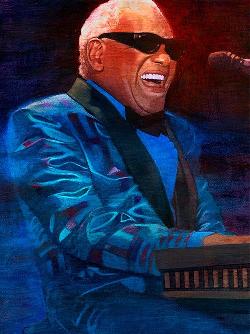
Ray Charles


"You got the right one...baby!" Probably how a younger generation remembers Ray Charles -- from his Pepsi commercials. I'll admit, that's the first thing that popped into my head when I looked at this image for the blog. Although, I'm particularly fond of his role in "The Blues Brothers." The illustration was done for Ameristar Casinos a few years ago, and used in a promotional brochure that featured the musical acts performing there at the time, with Ray being one. What I remember most about this image was painting the jacket and the unique challenge of trying to replicate its sheen while capturing the feel of folded fabric and the checkered pattern.

What I tried to capture with this image was the juxtaposition of a moment-in-time snapshot of his energy and spirit against a rock-solidness of form and composition that echoes the fact that he is Ray Charles. This was helped along by the color easing off the side of his face and the back of his jacket, all playing off the more solid and flat forms of his clothing. The lapel, shirt, and tie are basically flat shapes of color. And, even though the jacket is full of folds and shapes, it has a certain flatness about it, leaving the areas of interest and greatest contrast to the warmly-lit face, sliced in two by the blackness of his glasses.

As an illustrator, one of my goals is to keep moving forward, always striving to achieve that utopia in my mind that is my visual, conceptual, and stylistic voice which reverberates in me at the cellular level. That is what all artists and probably every living being strives to achieve. So, looking back at work just a few years ago, compared to today, it is interesting to see things I might handle differently or certain challenges, then, that wouldn't be, today. What are they, you ask? I'm not tellin.' That would dilute the viewing experience and take away from what is one of my favorite illustrations. But, one can take a look through the blog, and probably form a chronological lineage of my work, if one were so inclined.

detail


In the mean-time, here is an important tune from his repertoire, and influence in Kanye West's big hit. Can you hear the lines?


Love the look of this and the undercurrents brewing.