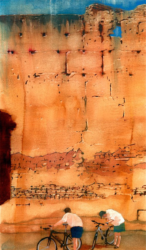
 Boy, oh boy, what a month it's been. Three weeks ago, I posted about The Wall. Today, I'm able to sneak some time in to get my blog back into shape. My plate hath overfloweth -- but what a great predicament in which to find one's self. 2008 continues to be a very nice year for Allan Burch Illustration and it's fortuitous to have this blog to journal about it, chronicle the events, and speak to fellow illustrators, art directors, and students.
There are lots of illustrations to post in the coming months. In exactly one month I will be kissing the pavement of Manhattan, as I overlook Madison Avenue and prepare for the Illustration Conference. I plan on shooting thousands of photos for my library and engaging in as much sensory overload as I can bear, in addition to meeting and learning from my illustration colleagues. I know it will only elevate my work and provide another shot in the arm, as it always does. Coupled with the vibrating energy of New York City, the experience is sure to be stellar. If you are going to be there, be sure to drop me a line.
The image for this week's post was another self-assigned illustration with the headline "Growing Up as a Boy." The story spoke to the unique challenges boys face as they try to find their place in the world, as compared to girls, who, obviously, have their own challenges to embrace. I interpreted this in a subtle way. It could be seen as a straightforward profile of a boy, looking kind of pensive. One could also see a tree-like shape, starting at the ground in the lower left, traversing up the trunk of the neck, and into the back and crown of the head. The tree being a metaphor and symbol for growth.
The strokes are bold, and the palette is minimal, yet vibrant and warm. I think the strokes -- expressive, yet conforming to a realistic approach -- bring life to the piece, and echoes the concept of growth and the living, breathing human boy.


