Saturday, July 5, 2008

Illustration Conference v2

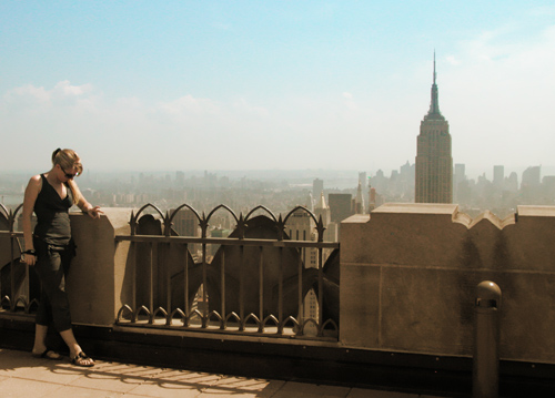
(Empire State Building with unidentified woman flipping me the peace sign)

Ah, the start of the conference. Here goes.

The Roadshow was the big happening and one for which I was gearing up. The Roadshow is an event where art directors and art buyers from the New York area are invited to meet artists who have set up space to show their work and promote their services. It's like a mini-trade show.

Setup was at 4pm and the show began at 5pm, with art directors walking in around 5:30pm. I took my material to the Grand Ballroom from my 4th floor room and set up my half of a black-shrouded 2-person table. I met my "neighbors" -- three very nice guys. Then, dressed to kill, behind freshly-pressed brochures, tearsheets, knock-out business cards, and a portfolio consisting of 16 of my latest and greatest, I waited for the action to begin.

Mark Heflin, the man behind the American Illustration-American Photography annuals, and organizer of the Roadshow, welcomed everyone and made a few announcements. In the Ballroom, music played over the sound system and 2 open bars were strategically placed in the far corners of the room, one very close to my table. Banners of the sponsoring organizations -- Adobe, theispot, PRATT, and others hung along the banister of the second floor. The artists, art buyers, and people involved with the illustration industry began to walk the aisles. The goal for us illustrators was to form as many new relationships as possible, preferably with live art buyers. My result -- I made some new connections, said hello to some of my existing connections, and had an overall good response. There was a last push of people as the gates were closing, and folks were attempting to hit any table they may have missed before last-call. I already have ideas for the next Roadshow.

The opening ceremonies were July 3, and I will post about that very soon.

Tuesday, I did some more sightseeing. I hung out at St. Patrick's Cathedral for a bit, got some religion, and then made my way to Rockefeller Center. There is an observatory at the top of the building called the Top of the Rock. In Branson, where I live dangerously close, that is the name of a Jack Nicklaus-designed restaurant/golf course that sits atop a picturesque bluff. In New York, it's the top of Rockefeller Center. I purchased a Rock/MOMA combo ticket, which allowed me to make my way to the observatory and get into the Museum of Modern Art, which I will do next week.

The waiting process was interesting as the history and historical significance of the building was explained in videos. Coincidentally, after the last one, it was my line's turn to board the elevator which would take us up 67 floors in less than 1 minute. In we go. Lights go down. Through the glass ceiling, we see the shaft is lined with blue lights that converge into the distance and fly by as we ascend. Projected on this ceiling are snippets of shows relevant to the building, like Bonanza and Chevy Chase opening Saturday Night Live.

Floors 67-70 are the observation decks, fenced in with 8-10 ft-tall plexiglass barriers to keep us from stumbling over the edge. The view is predictably amazing. A 360-degree view of Manhattan -- curvature of the earth and all.

If I'm away from my studio for more than a few days, I have learned to bring a few art supplies with me. It's better to have some on-hand if a client calls than having to scramble obtaining supplies. I know this is probably a rare practice among illustrators, but I make it a point to be both accessible and available as much as humanly possible. I love what I do and want to be able to help out whenever I can. Even at the Top of the Rock, where I tested the cell-phone signal by checking my voicemail.

As it turns out, an assignment was waiting for me on the other end. A large enough one to necessitate my finding the nearest Best Buy to purchase an inexpensive Epson all-in-one printer/scanner/copier. Coupled with my laptop and Wacom tablet -- which I also thought to bring along for just such an occasion -- half of my hotel room has been now transformed to an office/studio. I wouldn't have it any other way.

The people I talked to got a kick out of it.

More to come.

Monday, June 30, 2008

Illustration Conference v1

NOTE: To read about the Sudan Scholarship Foundation illustration, please scroll down to the post immediately below this one.

I'm taking an unusual approach with my blog over the next couple of weeks. As I write, I'm in NYC for the Illustration Conference -- a big event for illustrators and the illustration industry. It happens every 2-3 years and it's a rare opportunity to bring a widespread group of creative folks together, talk about solutions to pressing issues facing the industry (like copyright and the proposed Orphan Works legislation), provide ideas on how to better run one's business, and generally provide a re-energizing and a creative shot in the arm. Things get going on Wednesday July 2, so today's post is my reacquaintance with the big city and a look at one of the 100 photographs I shot today. It's also a behind-the-scenes look at my thought processes before paint hits canvas.

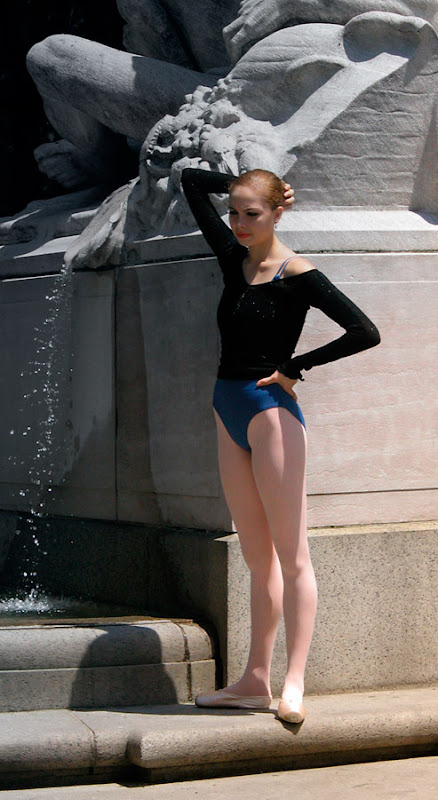
This ballet dancer was posing at Columbus Circle among the hip hop dancers and Statue-of-Liberty-adorned performance artists. The air hinted of horse, from the carriage rides parked by the curb, and she seemed flush with artistic potential -- great form, lines, lighting, and gestural flow. Her legs were always positioned with toes pointed out. Her posture just ached "ballet dancer." She also had a small entourage of people with her -- one was carrying some bags and one was shooting photographs. She gave a couple of poses for her photographer and then relaxed as they decided what to do next. This down-time is when I like to engage. The candid moments, to me, are often times more interesting than the staged poses. Her guard is let down, she breaks character, and we witness the convergence of the act of being a dancer and the reality of being a human.

With my camera, I walked up and down Broadway and spent a moment at my Mecca -- the Ed Sullivan Theater, where the Letterman show is held and will unfortunately be in repeats the whole time I'm here. I strolled down to Times Square, spent a moment in Central Park, caught a peek at the Empire State Building, and grabbed a couple sidewalk hot dogs.

Coming from a town about the size of the hotel I'm staying in, I always relish returning to the city. I love the pace, the energy, the color, the culture, the diversity...I even love the driving. These people are pros.

It all feeds into my creativity and makes me a better artist.

Stay tuned...

Sunday, June 22, 2008

Sudan Scholarship Foundation

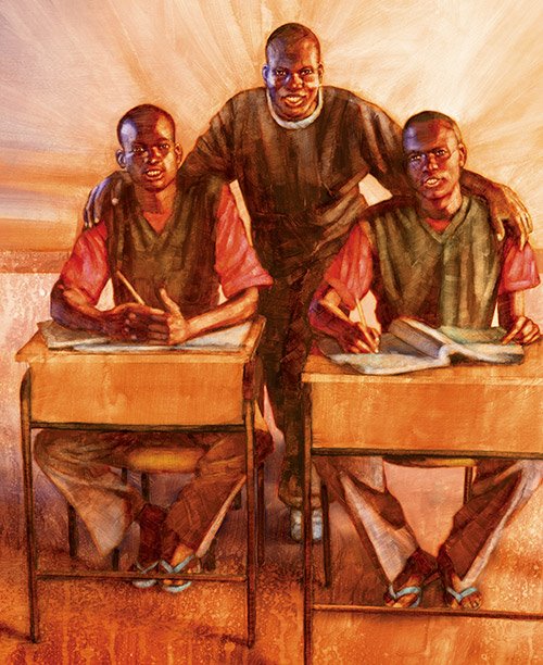
This is an illustration completed for USD Magazine at the University of San Diego. I do quite a bit of work for Universities, and USD is one of the best.

Depicted here is a USD graduate by the name of Daniel Akech James, as well as 2 of the beneficiaries of the Sudan Scholarship Foundation, formed by Mr. James.

From its website --

The Sudan Scholarship Foundation (SSF) seeks to help those gifted Sudanese refugee students who have been expelled to drop out from high schools in light of the evacuation of Kakuma refugee camp and other refugee camps by the United Nations Higher Commissioner for Refugees (UNHCR).

Mr. James works to give educational opportunities to the young people of Sudan in spite of many challenges to his own well-being, which are recounted at his blog. It's very interesting reading, to say the least. If you have a moment, please give it a look, here. USD Magazine did a profile of him and his work by shining a spotlight on his blog. The illustration above accompanies this profile

The artwork painted itself very nicely. I say painted itself, because some illustrations do, while others, equally rewarding, don't come equally as easily. I don't know if it was the right combination of paint and my secret medium, or if the planets were aligned just so, but I remember the brushstrokes and the paint doing just as I wished -- the textures were perfect and the paint lifted out nicely (not easily done with acrylics).

The warmth in the palette lends itself to the positivity of the Foundation, as do the radiant strokes, particularly noticeable behind Daniel.

My next blog entry will be from the Big Apple, as I arrive for the Illustration Conference. I'll have my laptop in-hand, my digital camera in-tow, and my thesaurus packed so as to sufficiently relay the most brilliant adjective for the hopefully non-brick-wall-view from my hotel room.

Sunday, June 8, 2008

Barack Obama, Democratic Nominee

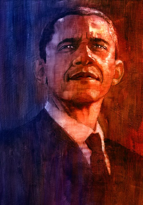
Regular followers of this blog will notice the image above can be found elsewhere within these pages. But, the timing is very ripe for a re-posting of Senator Obama, who just last week became the Democratic nominee for President of the United States.

Regardless of whether one agrees with his politics, he or she would be hard pressed to successfully deny the historical significance that comes with his nomination. As unremarkable as it should have been, when it became official, I found myself taking a seat to consider its significance, like so many others. It's quite interesting how perception and reality can differ. I wasn't expecting the weight of history to be as heavy as it was on me.

Back to the illustration. It was created in May of 2007 when the 2008 political season was just starting, and Obama was just an intriguing character sneaking into the public consciousness. At that time, most people were putting money on Hillary like she was Big Brown at the Belmont. Da' Tara would go on to win the Belmont Stakes and upset the field.

On another note, I was alerted to Chas Fagan being interviewed on C-SPAN this weekend. Chas is a portrait artist and sculpturist who has done paintings and sculptures of many presidential figures. He was speaking about a Lincoln bust he completed, as part of the Lincoln bicentennial celebration. He was fielding questions that I found very interesting and abnormally relevant to the current docket of assignments on my schedule (which I must keep secret until finalized, but one's a biggie -- for me anyway). Anyone interested in portrait painting and art in general should try to catch it, if you can. Explore Chas' work here.

DNA Capturing Bead

Here is a cool job I recently completed for the Bulletin of the Atomic Scientists, keeper of the Doomsday Clock -- a symbol referenced heavily in popular culture. Minutes to Midnight, a 2007 album by Linkin Park, is titled after the aforementioned clock.

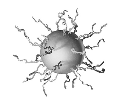
This project called for a colorful illustration of a DNA capturing bead, which is a tool used in genetic sequencing.

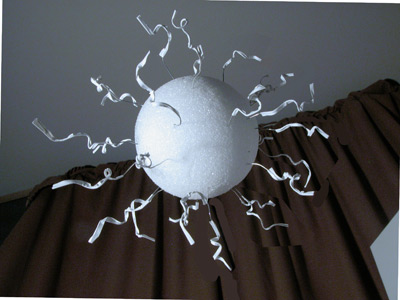
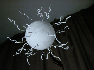
One of the reasons I am blogging about this illustration is so I can show off my crafty handiwork. Reference is always key. I'll shoot or acquire photo reference when needed, and if the object of my desired requirement doesn't exist...I'll build it. I happen to have quite a laboratory of foam core items I've built as props. This bead will be perched between my 3-foot high foam and paper missile and my life-size mock test tube rack with complete set of acetate test tubes.

The recipe to craft a DNA capturing bead is thusly: one part 4-inch diameter styrofoam sphere, about 20-30 5-inch long, hand made wire and artist's tape "twist ties," and a sturdy metal rod to act as a stem to the DNA bead "lollipop." Take a screwdriver and twist the wires into curly Q's and other interesting shapes that replicate DNA formations. Be sure to arrange the wire and tape "ties" into an organic, random, yet well-designed composition. Place the rod and composed bead in a glass jar, like a vase propping the creation up. Set up some dramatic lighting, let the shadows do their thing, and be sure to rotate as necessary to explore all angles as you photograph away.

It took a dash into town to reason through and come up with this recipe as I bulldogged my way from aisle to aisle deciding if pipe cleaners, silly straws, or gardening wire would best represent DNA strands. After dumping an armload of weirdness onto the checker's conveyor belt, I hightailed it home to build my bead, shoot it, and prepare two sketches.

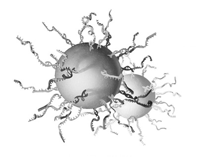
The single bead was chosen, and a colorful representation was produced. The freedom was great and the creation turned out kind of cool, I think. It's received some positive reviews, so I thought I would share.

two of my reference photos


my sketches


Saturday, May 31, 2008

Boy

Boy, oh boy, what a month it's been. Three weeks ago, I posted about The Wall. Today, I'm able to sneak some time in to get my blog back into shape. My plate hath overfloweth -- but what a great predicament in which to find one's self. 2008 continues to be a very nice year for Allan Burch Illustration and it's fortuitous to have this blog to journal about it, chronicle the events, and speak to fellow illustrators, art directors, and students.

There are lots of illustrations to post in the coming months. In exactly one month I will be kissing the pavement of Manhattan, as I overlook Madison Avenue and prepare for the Illustration Conference. I plan on shooting thousands of photos for my library and engaging in as much sensory overload as I can bear, in addition to meeting and learning from my illustration colleagues. I know it will only elevate my work and provide another shot in the arm, as it always does. Coupled with the vibrating energy of New York City, the experience is sure to be stellar. If you are going to be there, be sure to drop me a line.

The image for this week's post was another self-assigned illustration with the headline "Growing Up as a Boy." The story spoke to the unique challenges boys face as they try to find their place in the world, as compared to girls, who, obviously, have their own challenges to embrace. I interpreted this in a subtle way. It could be seen as a straightforward profile of a boy, looking kind of pensive. One could also see a tree-like shape, starting at the ground in the lower left, traversing up the trunk of the neck, and into the back and crown of the head. The tree being a metaphor and symbol for growth.

The strokes are bold, and the palette is minimal, yet vibrant and warm. I think the strokes -- expressive, yet conforming to a realistic approach -- bring life to the piece, and echoes the concept of growth and the living, breathing human boy.

Sunday, May 4, 2008

The Wall

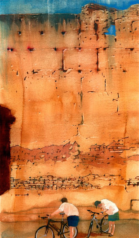
This illustration was part of a series I produced for Bicycling Magazine a while back for a story about two brothers' bicycling trip across Morocco.

My intent with this piece was to give the viewer a flavor for the story, without literally interpreting it. The large cracking adobe wall provided a nice backdrop for a large, perhaps imposing and exotic locale. Warm colors echo the environment. And, the two bicyclists obviously represent the brothers, who look slightly out of place in front of this funky wall.

Not long before I received the call for this assignment, I was residing in Kansas City. From time-to-time, I would people-watch and shoot photos for potential reference -- a pastime I continue to this day. One of those days, I was walking around Loose Park, just south of the Country Club Plaza, and saw these two fellows checking out their bikes near the sole park fountain -- maybe just a routine look-see or maybe diagnosing trouble. In any event, I took a few shots. How fortuitous they would come in handy for this very assignment.

One of the powers of illustration is its ability to further a story and say a number of things with very little. Effective illustration comes in so many shapes and forms. Subtlety happens to be a form that I gravitate toward. The posture of the bikers says something (Why are they bent over and what are they looking at?), their placement in front of the wall says something (What's up with the wall and what is the connection with the cyclists?), and the colors say something (a warm palette versus a cool one, denoting different moods). Together, these elements (I hope) speak as one and solve the visual challenge while leading the viewer down a path that whets the appetite for what they are about to read.