Saturday, June 9, 2012

May: Kentucky Derby Day -- The Captains of Industry Calendar

THE CLIENTS

Eyerus + Visual Communications Studio
The Captains of Industry

THE ASSIGNMENT

A calendar, illustrated in the style of '70s Blaxploitation movie posters. Each month will focus on an extremely esoteric holiday (or a popular holiday handled in an extremely esoteric way), all staring The Captains of Industry.

The Captains of Industry are: Graham Funke and StoneRokk, two innovative and eclectic DJs known for their creativity, sense of humor, and opinionated worldviews. You may find them working high-profile corporate and celebrity events around the country, or at their Las Vegas residencies at the Palms Casino Resort. They are "Your favorite DJ's favorite DJs."™

THE CHALLENGE: MAY

May's featured holiday is Derby Day. In an homage to 1985's James Bond entry, A View to a Kill (starring Roger Moore, as Bond, Christopher Walken as villain, Max Zorin, and Grace Jones, as slinky red-caped villainess, May Day), the guys are posed as the team behind the Kentucky Derby winner. With restrained jubilation (as if they've been there, before), the guys bask in adulation in the Winner's Circle at Churchill Downs.

THE PROCESS

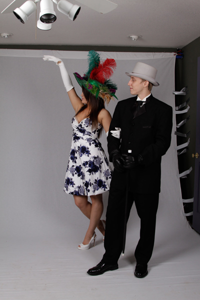
The Capts took part in a photo shoot, exploring different expressions and postures as the winning owner and jockey -- from subtle to over-the-top -- with their victorious horse. Their vision was very much with a nod to the Derby scenes in A View to a Kill. Graham (the owner) is Max Zorin. The Zorin Industries blimp flies, overhead, as a further punctuation to the scene.


The potential for storytelling is huge, here, from the extravagant hats and attire of race-goers, to the flamboyancy of the jockey's outfit, to the magnetic draw of the crowd, calling us to hide characters within.

How should I lay the foundation?

My reference gathering began with figuring out what the Winner's Circle really looks like. We want to lend integrity to the scene.

A perspective view, rather than a straight-on view, brings another level of interest and allows me to build space and depth. A low vantage point retains a sense of power which runs constant, throughout the calendar, and echoes the Blaxploitation posters we're using as inspiration.


HOW TO START?

My direction was approved and the favored poses were chosen. Now, it's time to fill in the blanks with reference -- including details such as the exact attire of Max Zorin (Which lapel does the flower go on?), the exact layout of the Winner's Circle at Churchill Downs (including the design of the flag atop the building), and the best jockey outfit to create for StoneRokk.

For the latter, I scoured the web, looking at contemporary outfits, vintage outfits, and all manner of jockey-inspired fashion from around the world. I decided on bold, geometric shapes -- a familiar constant, and favorite amongst the jockey community -- and used complementary colors for maximum attention. As a final flourish, I added a faux shoulder dressing to designate StoneRokk's royal position among jockey-kind.


Then, to my lovely models, Melodie and Ricky, to give me their best exuberant race-goer.


As promised, observant viewers will see dignitaries in the crowd, including Max Zorin, himself, as well as his pal, May Day. If you are very observant, you may even see Mr. Kentucky (Fried Chicken), Colonel Sanders, who is also the model for Graham's May 'stache.


Thanks, again, to the amazing team at Eyerus for allowing me the opportunity to be involved, for their direction, and for fostering an environment for creativity that any illustrator would cherish. Thanks, too, to The Captains of Industry for conceiving such a wonderfully-inspired collection of ideas for the world to devour, as well as for their very generous write-up about the project and their kind words toward me. See it, here.

You may secure your own calendar at The Capts Online Haberdashery.

Over the coming weeks, I will show and tell the stories behind each month's art. Stay tuned. Tell your friends. You won't be disappointed!

Allan Burch is an award-winning illustrator and portrait artist, providing solutions for editorial, book, advertising, and institutional projects.
View more of his work»
Sign-up for his newsletter»
Purchase prints»

Friday, June 8, 2012

2012 Illustration Conference Rhode Show


Image, above, copyright: Chris Buzelli + Jessica Hische.

Hello, out there!

If you are in the Providence, RI area on Friday, June 15, 2012, be sure to stop by and see me at the Rhode Show, as part of the Illustration Conference. Here are the details:

When: Friday, June 15th, 6:30 - 10:00pm
Where: Renaissance Hotel
Symphony Ballroom
5 Avenue of the Arts
Providence RI, 02903

What is the Rhode Show?

It will be a gathering of over 60 artists from across the country in a portfolio showcase and marketplace event. If you are looking for an illustrator for your next project, this is the place to be. If you are looking for cool illustrated products to buy, directly from the artist, this is the place to be. I'll have some lovely pieces to look at, including the Captains of Industry calendar, featured on this blog, some handsome cards to take with you, and some limited edition 8.5" x 11" prints to purchase. Stop by and say, "Hello!". I'd love to meet you and discuss what I can do for you.

 Allan Burch is an award-winning illustrator and portrait artist, providing solutions for editorial, book, advertising, and institutional projects.
View more of his work»
Sign-up for his newsletter»
Purchase prints»

Thursday, May 10, 2012

April: Tax Day -- The Captains of Industry Calendar

 
THE CLIENTS
 
Eyerus + Visual Communications Studio
The Captains of Industry

THE ASSIGNMENT


A calendar, illustrated in the style of '70s Blaxploitation movie posters. Each month will focus on an extremely esoteric holiday (or a popular holiday handled in an extremely esoteric way), all staring The Captains of Industry.

The Captains of Industry are: Graham Funke and StoneRokk, two innovative and eclectic DJs known for their creativity, sense of humor, and opinionated worldviews. You may find them working high-profile corporate and celebrity events around the country, or at their Las Vegas residencies at the Palms Casino Resort. They are "Your favorite DJ's favorite DJs."™

THE CHALLENGE: APRIL

April's featured holiday is Tax Day. The guys wanted to express the less-than-positive feelings many people have about this time of year, as our hard-earned money flies out the window. That would equate to surrounding the IRS building with what appear to be explosives, and preparing to engage them with a classic plunger-style detonator. But, please notice, the plunger has not been depressed. The guys want to maintain plausible deniability about the whole thing.

THE PROCESS

The Capts took part in a photo shoot, yielding some pretty hilarious results, exploring the concept of two cat-burglers, with vintage influence and exaggerated expressions.


My first order of business was to find suitable reference of the official IRS building, in Washington D.C. Otherwise, it's just some building. Along with the guys, the building is a major part of the visual story, not only in concept, but also physical size. I need to have an idea of what it looks like, so I can plan my compositional options.


I thought the strong low perspective would be a good solution. It allows me to cleanly include the building, without cropping, tell the story about the explosives and flying moneybags, give the guys a position of strength as we look up at them, and echo the stylings of the '70s Blaxploitation movie posters we are using as inspiration.

After basic sketch approval, it came time to flesh out the details and explosive choices.

After setting the stage with recognizable missiles and planting the idea in viewers' minds that no good is afoot, my goal is to get a little ridiculous with the kinds of things the guys may or may not have brought to the scene.

Among the additions, you may find a catch-all, unidentified suspicious package, behind the sign; a shoe bomb, comprised of a tennis shoe stuffed with dynamite -- perhaps, Acme brand; old-school bowling ball-shaped bombs, plucked from the hands of Adam West, maybe; and a DIY suicide vest, strapped to a department store mannequin. Someone may have even taken the time to string explosive line through every window of the government building, somehow evading any raised eyebrows from security folk.


HOW TO START?

The final sketch is approved. So, let's get started on the final art. In a departure from our mustache for every occasion, it was decided to eliminate Graham's facial hair. Since he is ski mask-clad, a 'stache would hide his identity too much. For the record, I am depicting him in the comp, above, rockin' a "G. Gordon Liddy."

I had my model, Ricky, help me fill in the blanks of anything I felt needed supplemental reference. In this case, it came in the way of gloved hands in the correct positions. Hands are always super-important in any visual composition, because they are so complex and expressive. I thought it best to take the extra time to get them right. I'll spare you, my gentle reader, the plethora of reference I accumulated of an extended third digit, in gloves.


You'll see how angles and perspective help tell the story, here, leading the eye around the scene and back to the guys. Angles are generally more interesting than static verticals or horizontals. When in doubt, work the angles.

A triad color scheme is a good go-to place to start. It's a natural balance, simple enough to deal with when time is of the essence, and  complex enough to be interesting. Violet, orange, and green are my choices, here.

Here's the final color art, again.


Thanks, again, to the amazing team at Eyerus for allowing me the opportunity to be involved, for their direction, and for fostering an environment for creativity that any illustrator would cherish. Thanks, too, to The Captains of Industry for conceiving such a wonderfully-inspired collection of ideas for the world to devour, as well as for their very generous write-up about the project and their kind words toward me. See it, here.

You may secure your own calendar at The Capts Online Haberdashery.

Over the coming weeks, I will show and tell the stories behind each month's art. Stay tuned. Tell your friends. You won't be disappointed!

Allan Burch is an award-winning illustrator and portrait artist, providing solutions for editorial, book, advertising, and institutional projects.
View more of his work»
Sign-up for his newsletter»
Purchase prints»

Sunday, March 25, 2012

March: Ian Ziering's Birthday -- The Captains of Industry Calendar


THE CLIENTS

Eyerus + Visual Communications Studio
The Captains of Industry

THE ASSIGNMENT


A calendar, illustrated in the style of '70s Blaxploitation movie posters. Each month will focus on an extremely esoteric holiday (or a popular holiday handled in an extremely esoteric way), all staring The Captains of Industry.

The Captains of Industry are: Graham Funke and StoneRokk, two innovative and eclectic DJs known for their creativity, sense of humor, and opinionated worldviews. You may find them working high-profile corporate and celebrity events around the country, or at their Las Vegas residencies at the Palms Casino Resort. They are "Your favorite DJ's favorite DJs."™

THE CHALLENGE: MARCH

March's featured holiday is Ian Ziering's birthday. Mr. Ziering was born on March 30, 1964. You will remember him as Steve Sanders in the original Beverly Hills 90210. So, how do The Capts celebrate this day through illustration? Mash it up with gangsta rap, another cultural benchmark of the '90s.

THE PROCESS

The Capts took part in a photo shoot, exploring their inner-gangsta. The original thought was to live the thug life with Beverly Hills attire, but that was quickly abandoned for full-fledged thug.


Not being an aficionado in Beverly Hills 90210 lore, I gave myself a crash course on its workings -- the characters, The Peach Pit hangout spot, and Steve Sanders' black '89 Corvette, among them. The black 'Vette would be the logical intermediary between the 90210 world and the N.W.A. world (N.W.A. are one of the most influential artists of the gangsta rap genre), so the guys should be posed against it.

Here are a couple of composition secrets: when there is high volume and finite time involved, one must rely on certain successful rules-of-thumb and apply them, throughout. If I don't follow this system, I'm left to re-invent the wheel with each illustration, which is not the most effective use of my time when deadlines loom. In addition, this mode of thought adds another sense of consistency to my brand, which not only reinforces it, but eliminates surprises for the client.

Throughout this calendar, I built my compositions using pyramids and perspective. Can you see them in the following sketches?

Why pyramids? Because, angles are more interesting than static horizontals and verticals.

Why perspective? Because, perspective is like an angle in the third dimension. Perspective adds depth, visual complexity, and interest.


HOW TO START?

The middle rear-view 'Vette sketch was approved, with a few modifications. So, let's get started on the final art.

The Catps had a definite look in mind for their gangsta attire, from the Eazy E Locs, right down to their Nike Cortez shoes. I did extensive research on it all, acquired appropriate clothing props, and put it together with a supplemental photo shoot, with my fantastic models Ricky and Melodie. My goal was make sure I had the best working photo reference I could put together, so there was no guessing going into the final.

I'm pretty proud of my homemade UZI and Glock 9mm, smartly modeled in pseudo-gangsta stylings, by Ricky.


Melodie and Ricky also gave me a few 90210-style reference shots, in period-attire, with extra emphasis on the tussling.


We swapped my original Beverly Hills street sign with the more iconic sign, and we dropped in some of the characters in the background, including Mr. Sanders, himself. To top it off, why not add a final homage in the form of a logo?

In each month, Graham is rockin' a different mustache, integral towards telling the story for that month. Here, Graham is, naturally, rockin' the "Eazy E" 'stache.

Here's my final black and white comp.


Here's the final color art, again.


Thanks, again, to the amazing team at Eyerus for allowing me the opportunity to be involved, for their direction, and for fostering an environment for creativity that any illustrator would cherish. Thanks, too, to The Captains of Industry for conceiving such a wonderfully-inspired collection of ideas for the world to devour, as well as for their very generous write-up about the project and their kind words toward me. See it, here.

You may secure your own calendar at The Capts Online Haberdashery.

Over the coming weeks, I will show and tell the stories behind each month's art. Stay tuned. Tell your friends. You won't be disappointed!

Allan Burch is an award-winning illustrator and portrait artist, providing solutions for editorial, book, advertising, and institutional projects.
View more of his work»
Sign-up for his newsletter»
Purchase prints»

Saturday, February 18, 2012

President's Day -- The Captains of Industry Calendar


THE CLIENTS

Eyerus + Visual Communications Studio
The Captains of Industry

THE ASSIGNMENT


A calendar, illustrated in the style of '70s Blaxploitation movie posters. Each month will focus on an extremely esoteric holiday (or a popular holiday handled in an extremely esoteric way), all staring The Captains of Industry.

The Captains of Industry are: Graham Funke and StoneRokk, two innovative and eclectic DJs known for their creativity, sense of humor, and opinionated worldviews. You may find them working high-profile corporate and celebrity events around the country, or at their Las Vegas residencies at the Palms Casino Resort. They are "Your favorite DJ's favorite DJs."™

THE CHALLENGE: FEBRUARY

February's featured holiday is President's Day. The idea, here, is The Capts, chiseled atop Mt. Rushmore with our other immortalized presidents. But, the additional twist is that it is to be depicted in the style of a cheesy 1950s postcard one might have found at any gas station -- in this instance, likely any South Dakota fuel stop.

THE PROCESS

The Capts took part in a photo shoot, exploring all sorts of expressions, from the not-so-presidential to the presidential. My first sketches depicted that range, with presidential winning out.


My research included studying all manner of these '50s postcards -- what colors and shapes are prevalent, what typefaces are used, and how do they use touristy imagery to tell their stories?


My other challenge was to create an appealing illustration that captures the essence of an inherently ugly design. It also means adding a few subtle savory extras that makes a viewer want to come back for seconds.

HOW TO START?

The guys on the mountain is obviously the main story, so I needed to make sure to construct them in such a way that looked like they belonged, without question, stoney and all. As per our theme of a different 'stache for every story, Graham is seen rockin' the Chester A. Arthur, here on the mount.

The graphic treatment below the faces is pretty dominant, too. A wavy font motion seems to be a recurring theme on these postcards. It happened to work with this composition, so I embraced it.

The interior text images should be typically touristy and add to the scene, without distracting from the faces. What better choices than a landscape, bison, and the ever-popular fireworks? I matched a couple of fonts for "Greetings from" and "Mount Rushmore," and off I went.


Color is always very important. Here, it's not only important for creating a strong design, but also for cooking up an appropriate retro-chic flavor. I spent time experimenting with a striping color combo that looks last century yet beautifully-ugly, while also complementing the overall palette. Slightly-saturated earth tones seemed to do the trick. I couldn't forget to make decisions about the widths of the stripes to further create interest and elevate the composition.

What about the clouds? Not just any cloud formation will do. It needs to be a cumulus formation.

Why?

The cumulus clouds have more shapes for viewers to sink their teeth into. Plus, they interact with the faces in a more interesting way, echo the bold shapes of the mountain, and create more definitive leading lines which guide the viewer through the composition.

THE DETAILS

To further the idea that this is a retro postcard, why not add a ribbed paper texture that appears as if it's chipping away? And, that's just what I did.

Thanks, again, to the amazing team at Eyerus for allowing me the opportunity to be involved, for their direction, and for fostering an environment for creativity that any illustrator would cherish. Thanks, too, to The Captains of Industry for conceiving such a wonderfully-inspired collection of ideas for the world to devour, as well as for their very generous write-up about the project and their kind words toward me. See it, here.

You may secure your own calendar at The Capts Online Haberdashery.

Over the coming weeks, I will show and tell the stories behind each month's art. Stay tuned. Tell your friends. You won't be disappointed!

Allan Burch is an award-winning illustrator and portrait artist, providing solutions for editorial, book, advertising, and institutional projects.
View more of his work»
Sign-up for his newsletter»
Purchase prints»

Wednesday, January 18, 2012

A Sodom and Gomorrah New Year! -- The Captains of Industry Calendar


THE CLIENTS

Eyerus + Visual Communications Studio
The Captains of Industry

THE ASSIGNMENT


A calendar, illustrated in the style of '70s Blaxploitation movie posters. Each month will focus on an extremely esoteric holiday (or a popular holiday handled in an extremely esoteric way), all staring The Captains of Industry.

The Captains of Industry are: Graham Funke and StoneRokk, two innovative and eclectic DJs known for their creativity, sense of humor, and opinionated worldviews. You may find them working high-profile corporate and celebrity events around the country, or at their Las Vegas residencies at the Palms Casino Resort. They are "Your favorite DJ's favorite DJs."™

THE CHALLENGE: JANUARY

January's featured holiday is New Year's Day. In the style of The Captains, this can be no ordinary Rockin' New Year. This must be epic. It must be biblical. Its debauchery must cause the cursed to want to return to the nefarious bosom of Beelzebub just for the safe haven. Amidst the wrath of the Almightly and ensuing eternal chaos, The Captains emerge from the charred rubble, Baby New Year in-tow.

THE PROCESS

Prior to the sketch phase, The Captains took part in a photo shoot, wearing approximate clothing and staging various poses appropriate to each month's scene, as they envisioned it. The resulting images allowed us to pick and choose from a variety of angles and expressions to create the best illustration. The photos made for quite entertaining viewing, too.

Here they are, preparing to rock in the new year with faux toddler (aka -- paint roller).


Also prior to the sketch phase, I did extensive research on '70s Blaxploitation movie posters, to be sure I understood their pulp magazine-like color palettes, dramatic compositional stylings, and in-your-face narrative approach. Favorite inspiration included: Superfly, Shaft's Big Score!, and Coffy.


HOW TO START?

An epic New Year's Eve party requires plenty of debauchery. So, naturally, I spent time researching debauchery. The trick is to present it in a way that is not gratuitous and uninteresting, but witty, engaging, and allows one's mind to create a final punch line. Engaging the viewer's mind adds another layer of interest, as well as adds real and perceived complexity to a scene.

Part of the look of '70s Blaxploitation movie posters is in the perspective. I decided to use a lower viewpoint, here, to make the scene seem larger and more imposing. The lower angle also adds a sense of heroism to The Captains, emerging in front.

Before launching into the final art, I staged a photo shoot to give me information for the passed-out partiers. A reminder to illustrators out there: don't skimp on your reference! Your college professors weren't joking. Make it easy on yourself in the long run.

My fantastic models (and me) all had fun pretending to be passed out and completely out of commission New Year's revelers. The resulting images gave me plenty of options to create a middleground of spent humanity. Here's one of my faves. His identity has been hidden to avoid incrimination.


I wanted to create a visual flow around the guys, subtly pointing the eye back to Baby New Year, kicking and screaming its way into 2012. The blazen cave entrance is a good place to start. If you get lost, there are plenty of visual helpers to point you in the right direction. Take a look around and you'll be either entertained or offended. Either way is perfectly okay.

THE DETAILS

I had, probably, too much fun coming up with debaucherous detail, strewn throughout. I'd still be adding things, today, if I could. Although, it's one thing to have a mountain of ideas and a creative concept, it's totally another to execute them in a way that tells the story and doesn't waste a millimeter of space -- meaning every item should be composed in a pleasing way which both leads the eye and successfully helps tell the story.

The largest items, like The Captains and the high-contrast cave opening, are very prominent, and among the most important components of the illustration. Like a theatrical play, they set the stage. Using details to both lead the eye and allow some visual rest, I created subtle breaks in implied lines where I wanted the eye to gravitate. For example, the "road sign" breaks the edge of the composition on the left, drawing the eye into it and its goings-on, as well as helping to lead the viewer through the complex composition. The pointy party hat on the supine partier on the far right also breaks the edge of the composition and directs the eye back up to StoneRokk, whose bottle directs the eye back down through the scene.

Use your skills of perception and see how many details you can find in the illustration. Drop me a line and I'll point out some hidden gems.


To put a punctuation mark on the holiday, Graham is rockin' a mustache (and accompanying sideburns) I affectionately call, "The Ron Jeremy." Each month features a 'stache integral to the story.

Thanks, again, to the amazing team at Eyerus for allowing me the opportunity to be involved, for their direction, and for fostering an environment for creativity that any illustrator would cherish. Thanks, too, to The Captains of Industry for conceiving such a wonderfully-inspired collection of ideas for the world to devour, as well as for their very generous write-up about the project and their kind words toward me. See it, here.

You may secure your own calendar at The Capts Online Haberdashery.

Over the coming weeks, I will show and tell the stories behind each month's art. Stay tuned. Tell your friends. You won't be disappointed!

Allan Burch is an award-winning illustrator and portrait artist, providing solutions for editorial, book, advertising, and institutional projects.
View more of his work»
Sign-up for his newsletter»
Purchase prints»

Sunday, November 20, 2011

Country Doctor


The assignment:

Create an illustration to reflect the compassionate relationship between doctor and patient for a book of short stories about country doctors.

The challenge:

In order to capture a compassionate, intimate scene, I felt it important to create a close sense of space -- using the bedside and curtain partition, as well bringing the viewer outside looking in through the room door. All this helps create context. A warm, lovely light helps to add emotion and a sense of intimacy.

It was also important not to make it about specific people, which is what can happen when faces and eyes are involved. Through viewing angles and use of light, I attempted to make the faces a lesser area of focus.

The process:

My mother and father just happened to be visiting at about the time this assignment was given. I asked if they would be the subjects. They graciously agreed. We then proceeded to do a photo shoot at their hotel room.

It was about 2 hours of some of the silliest doctor-patient conversation one would ever hear -- certain to cause heads to roll at the AMA. But, I captured some terrific poses.

From this, I crafted several sketches.


The last entry was the chosen candidate for the final.

It was a pleasure, not only to be involved with the project, but to also be able to immortalize my parents in this way. To me, every nuance reveals the compassionate relationship they share -- here, as doctor and patient.

Allan Burch is an award-winning illustrator and portrait artist, providing solutions for editorial, book, advertising, and institutional projects.
View more of his work»
Sign-up for his newsletter»
Purchase prints»