Saturday, August 30, 2008

Terrorism

So, are you wrapped up in the Convention sandwich? The Democrats last week and the Republicans this week? Casually? Fervently? Are you addicted to the talking heads, like I may not or may be, or do you watch with the sound turned down? I certainly hope it's not the latter, because that might defeat the purpose of watching a speech.

The image above was done last year for the Bulletin of the Atomic Scientists. The article for which it accompanied spoke about terrorism and the many ways it affects a country and its people, far deeper than just on a national defense level. The author discusses how an attack can trigger a psychological response which can fundamentally change how a nation's people perceive their own security. A person's country and its place in the world plays a large part in defining who a person thinks they are. How can an attack take away from this perception? Does it have to be just a physical attack? Would a psychological attack produce similar results? A terrorist attack also affects how other nations look at the attacked country. It's a total re-framing of the country's values and its sense of identity in the world.

I interpreted that metaphor, visually, with the U.S. flag pictured in a slightly askew frame -- a frame that was symbolically thrown off-center by the literal and emotional effects of an attack.

What is terrorism, anyway? How has your definition of terrorism affected you? Can protection be a form of terrorism? "Perhaps," said the thinking person. But, one thing is for certain, 2008 is a prime time for illustrators who relish interpreting these answers through their own eyes.

Preliminary Sketch

Sunday, August 24, 2008

Citi Slicker

John Reed, former CEO of Citigroup

Julius Caesar walks into a bar. "Gimme a martinus," he says. The bartender casts a sideways glance and asks, "Don't you mean a 'martini'?"

Ceasar retorts, "Listen, if I wanted a double I'd have asked for it!"

What does that have to do with this week's post, you might be asking? When someone pipes up with "(fill-in-the-blank) walks into a bar..." I usually settle in for a story, hopefully amusing, but certainly a little diversion.

This week, I am posting an illustration project replete with its own blog-ready story. You can check out the project in the September issue of Bloomberg Markets magazine, on the stands as I write. It's a cover story spotlighting the executives of Citigroup.

As some of you might know, from following this blog, I was in New York this July for the Illustration Conference. Just prior to the start of the conference, I took some time to look around and enjoy the city. One of my stops was the Top of the Rock, which is an observatory deck atop Rockefeller Center. It overlooks Manhattan from 360 degrees. I've written about the Rock in greater detail, here.

After ascending the 67 floors to the open observatory, I decide it's a good place to check my phone messages. Out comes the Treo, on which I press #2, which speed-dials me to my Missouri residence's land line. The first thing I notice is that the signal stinks on top of the world. You'd think, being closer to the satellites, the signal would be mighty crisp. Not so. After several dropped attempts, I get a choppy signal through, and listen to the message awaiting me on the other end. Hearing only every second or third word, I'm able to put into context that it's a potential assignment for, as mentioned above, Bloomberg Markets magazine. Fantastic!

After staring eye-to-eye with the peak of the Empire State Building, its back down I go. On a bench outside Rockefeller Center, in the corridor between shops, I park myself to follow-up. The job is a one-portrait project depicting the executives of Citigroup, with potentially 3 more, if the sketch for the first goes over well. The medium is charcoal on paper.

When traveling, I've learned to bring a few art supplies with me, for just such an occasion. This trip was no exception. I had also recently purchased a laptop: 1; because it was high time, and 2; for just such an occasion. However, after accepting this job, I realized I needed a scanner and printer in order to cary out my sketches. I could trade time between my hotel room and the nearest Kinkos, but, figuring I'd be hitting my stride on my work at about 3am, I decided to assign $80 bucks from this job's fee to the Madison Avenue Best Buy, two blocks away, on an inexpensive Epson all-in-one printer/copier/scanner.

The parameters of the portraits were to make the executives look less-stiff -- more casual and approachable -- which is one reason they chose illustration over photography. They were to be head and torso depictions, with a gesture, like an expressive hand during conversation. The body was to be loosely rendered, while the face needed to be quite tight.

The photo reference they provided was mainly of just the face, so it was up to me to take care of the torso.

Enter: me.

Luckily, I had packed a sports jacket, shirt, tie, and slacks, so I had the attire, and the torso, to appropriate a male Citi exec.

I didn't pack a tripod, so I needed to find a sturdy place to prop my camera at the appropriate eye level to match the head shots. I also had to find space that would allow the shot to happen with good light and distance to capture enough information.

Enter: the bathroom.

I could prop the camera on the towel rack, step back into the tub -- on my tip toes -- and have both the perfect eye level and some nice lighting from the vanity globes, with reflected light splashing off the porcelain, to-boot. Perfection!

I took a gaggle of shots and looked at them in Adobe Bridge, deciding on what looked good and in what direction I wanted to proceed. The top opening of the room's reading lamp functioned as my light table, as I placed one foot on the desk chair and one foot on the bed, to utilize it as such. Five sketches later, I call it a night

Now, I await the verdict on the sketches for the single portrait, and if the green light will be given to turn loose of the other three. A voicemail is received as I'm tootling around the NYU area. I find an empty bench in the outdoor atrium at the Stern School of Business in which to park myself, and call back on this sunny July afternoon to find out how we're proceeding.

They loved the sketches and have made a choice on their favorite pose. But, not only are we moving forward with the three additional portraits, there will be three more, on top of these, putting the grand total at seven. Fantastic!

My next challenge was logistics -- five more days to do six more preliminary sketches and complete the seven finished portraits. Not usually a problem, but I'm away from home, with only a skeleton studio set-up in my hotel room, and then two days of travel time scheduled, which would bring me home with one day of real studio time. Not enough. I certainly was going to make sure to be in New York for the following day -- my birthday -- but decided I needed to then cut the trip short so I could have at least 2 days at home to finish.

Continuing the bathroom photo shoot another couple days, as the reference came in, I wrapped up four more sketches by 3am Thursday morning. After oversleeping my alarm, a shortened travel day followed. In what turned out to be quite a palatial room in Pittsburgh, after a late-evening, ordered-in pizza, I got dressed, set up my camera on the microwave, propped up with the coffee maker, and stood next to the glowing lamp/light table to shoot some exec-like poses. At 4am Friday morning, the last of my sketches are sent off, and I hit the sack for a couple hours before embarking on my last travel day. All remaining sketch approval comes that afternoon, and I return home that night, after double-digit hours on the road and only a couple of Red Bulls.

Back to work, Saturday, as I race against the clock to push seven head and torso charcoal portraits through for the Monday deadline. Saturday quickly turns to Sunday, which quickly turns to the realization I won't be sleeping Sunday night. I set up my milestones which should have the final work uploaded for the client by Monday morning.

It's now Monday, about 9am, and I'm putting the final touches on the last one. I'm starting to wind down, knowing this big job is close to a finish, maybe enjoy a nice brunch, kick back and bask in the glow of -- yikes, the phone! A last minute change. We need to alter the arm position on two of them. No problem. Fire back up the adrenalin, and race over to the drawing table to render up a couple of arms that hang down, based on two of the many other reference shots I took. They are scanned and composited in Photoshop, and by about 3pm Monday afternoon, everything is uploaded.

The outcome:

The client was super-pleased with the results, as were the chain of command signing off on all parts of the job. And, it did not escape them that I had completed half the job while on the road and traveling. By the way, illustrators working while on the road is certainly not an uncommon tale, but it's always nice when the client recognizes the challenges herein and expresses appreciation for the extra effort.

Speaking of the client, they were terrific to work with, communication was tremendous, and the job was very satisfying on many levels. I am very grateful for the opportunity to help, and personally, it was quite a birthday gift that put the punctuation on an excellent east coast trip.

Sunday, August 17, 2008

Jim Thome

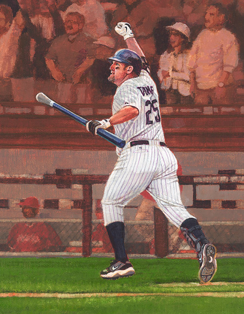
One afternoon I get the call asking if I'd like to help out with the 2008 MLB Masterpiece series of trading cards for the Upper Deck Company. Of course, I'd love to, I say. Over several weeks in the Spring, I am very fortunate to be able to paint many of the game's finest players. Jim Thome of the Chicago White Sox is one of them.

Something that is different about this piece from others on my site is the background -- something beyond the textured aray of non-descript color that occupies the bulk of my other pieces. And, what is particularly interesting about the backgrounds for this series is they are largely comprised of out-of-focus crowds. At the time of their painting, I considered this a new and interesting challenge. I'm always up for a challenge.

I wasn't quite sure what the recipe was for accomplishing the blurred look through painting, but I thought I ought to be able to crack the code. I have all the artistic tools, I said to myself. Once I took my brain out of the equation, I think I did figure out the code. Like nearly every step of my artistic life, once I stop analyzing, things fall into place. I trusted my instincts and started feeling things come together. I say feel, because once I zone out and let things happen, I'm not really thinking. And, that's a preferred state, for me. Once the brain sidles into the equation, the best parts of creativity and emotion (ingredients of a successful illustration, I think) tend to fall apart, at least in my experiences.

Sports assignments suit me in their inherent energy which melds nicely with my propensity for movement. This was a terrific assignment and I'm very appreciative for the opportunity to have participated.

Friday, August 8, 2008

Minimum Deterrence

8.8.08.

We've seen the ads for the Olympics, and Last Friday they finally got underway. How about the opening ceremonies? Truly amazing, I thought; a total display of art -- and illustration. Communication at every level was evident. The torch-bearer traversing the circumference of the stadium, air-bound, casting a larger-than-life shadow was impossible from which to turn away. That moving picture spoke to people of all ages and backgrounds as he, and all he represents, christened the opening of the event. He made a connection, literally and figuratively. Making a connection with others is what drives the world.

What are the different ways to make a connection? Does it have to be face-to-face? In this age of the internet, of course not. It all has to do with communication. How do you communicate? Do you do better verbally or via the written word? Do you have a certain body language that speaks confidence and puts people at ease? Maybe it's what you don't say that speaks volumes.

Take this mode of thought to pictures. I'm an analytical guy, so my Xanadu is the moment when I have deconstructed everything to its symbolic and literal significance. At this time, I will be able to pick any number of items from a figurative toolbox and compose them in a way that most effectively communicates anything at any time with amazing clarity and cleverness, blowing the minds of strong and weak, alike -- in doing so, creating an emotional connection with the audience. This is conceptual illustration at its finest, at least in my eyes, and that to which I aspire.

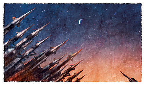
My slow boat to Utopia led me to another fantastic assignment, and opportunity to connect, from the always-terrific Bulletin of the Atomic Scientists. Minimum deterrence is the concept. Basically, this means certain nations have adopted the policy of harboring just enough nuclear weaponry to be able to launch an effective, and protective retaliation -- not a major offensive. This chosen idea shows the larger concept of many versus few. In this case, a few, or one nuclear weapon can make an un-ignorable statement to a potential foe. Maybe not as strong a statement as a full arsenal, but enough of one to make the opposing force perhaps think twice before striking.

On to the topic, now, of my newsletter. You mean you haven't signed-up for it, yet? If you haven't, I encourage you to do so. if only to watch its evolution. I'm finding it fun creating something new while figuring out what makes for the best, brief, unobtrusive yet profoundly inviting and engaging, periodic vehicle for touching-base with other creative folks. I enjoy writing and I enjoy illustrating, so a newsletter ought to be right up my alley. It is a bi-weekly email that includes musings from me, highlights from the blog, links to important, enlightening, and inspiring material, as well as original content created specifically for those taking their valuable time to read about and see what I'm doing. Drop me a line and I'll send you the latest issue. It's theme was music. You may also sign-up here.

Sunday, August 3, 2008

Facing Fear

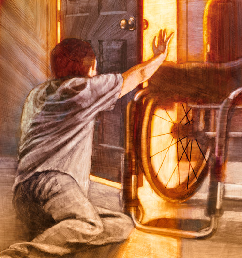
This is an image for New Mobility Magazine. The publication focuses on the active wheelchair user, and the cover story in which this illustration accompanies is about about facing our fears.

The main character in the story has lost the use of his legs, and is coming to terms with his newfound disability. Overcome by fear, he falls out of bed, striving to escape the hospital in which he is "imprisoned," as well as the situation that has, in his mind, imprisoned him.

Plagued with despair, he attempts to escape. But over time, he learns to confront his fears and deal with his challenges.

This image depicts the moment he sees the light of a realistic exit to his paralyzing fear; reaching for, and in some way, now embracing the wheelchair he earlier shunned.

I posed for the fellow in the image, atrophying my legs to replicate the reality of such a situation.

This was one of a 2-illustration series, with the other being the cover. I took lots of photo reference in an attempt to capture poses that were both interesting and realistic to the situation, ie. -- a man without use of his legs reaching for something. How would the weight be distributed, and how would one be able to propel one's self without using his or her trunk? How would your legs fall if you couldn't control their position. And, how can I make it work within the composition?

The client agreed this solution fit the bill.

On another note, I've started an e-newsletter. If you enjoy the blog, and would like to keep up-to-date on things in the world of Allan Burch Illustration, I encourage you to sign up. I'm preparing my second installment, and am seeing this as an interesting challenge. The newsletter is a different medium with a different purpose than a website or blog. So, my humble goal is to make it nothing short of an e-newsletter for which people achingly pine. It will be a bi-weekly, and bursting with content, including, but not limited to: a few words from me, some highlights from the blog, and news and links to cool, enlightening, and critically important things in our industry. I also plan to create content specifically for it -- imagery and narrative, and maybe bury a few "Easter eggs" that may just be for my own entertainment, but certainly rewarding for anyone who might find them. I figure, if I can make it interesting for myself, there's a better chance others will find it equally pine-worthy.

Feel free to sign up here.

Monday, July 21, 2008

Jim McMahon

Jim McMahon of the Chicago Bears. This image is part of a series of "NFL Heroes" I painted for Upper Deck. They are on some trading cards that you should be able to find on the shelves.

I really enjoyed this project on a number of levels. I quite enjoy doing portraits, for one, so this project was right up my alley. Plus, it was a thrill for me to be able to illustrate many of the football players I watched as a youngster, and some of the players of today. Two of my favorite drawing subjects, as a wee one, were cars and football players. Drawing is a great way to really understand something. Since drawing involves intricate observation, one is basically constructing something on paper. Subsequently, at a very early age, I knew every nuance of many team emblems, the ins and outs of helmet structure, and the parts of a uniform. How cool, I thought, for things to come full-circle like this.

When Jim McMahon showed up on my roster, I was particularly pleased. You see, the reference was provided, and it was my job to basically follow that reference. I thought McMahon's was especially interesting -- the colors were great, he had some sunlight creating nice shadows on the uniform, and he was one of my favorite players. Who didn't follow the Bears with McMahon, the Fridge, Payton, Singletary, Ditka, and the Superbowl Shuffle team?

By now, it was obvious this illustration was one I would connect with, beyond the norm. It's also an image where I felt like I was starting to hit my stride with the series. I believe the finished painting reflects my enthusiasm.

This illustration is 8" x 10" acrylic on canvas. No digital work.

Lastly, and on another note, you might notice a redesign to my website. From its inception through the last version, my website was done by me. It was interesting teaching myself all the html things I never thought I would know, but, it was time to kick it up a notch. I was very fortunate for the opportunity to have TBH Creative do just that. Tatum Hindman and her team can be found here: www.tbhcreative.com. They took excellent care of both my website and my print branding.

Tuesday, July 15, 2008

Illustration Conference v4

Day 2 and 3 of the Illustration Conference...

Kevin O'Callaghan is a 3D designer/illustrator, principal of O’Callaghan & Company - Art for the Film Industry, and curator and Chair of the 3-D design program in the Advertising and Graphic Design department at New York's School of Visual Arts. He gave the closing keynote speach at ICON 5.

What you see above is a shot from my Palm Treo of the Grand Ballroom just prior to his speech. On either side of the stage are large monitors where inspired 3-D work will soon be shown. The large figures are his creations for the MTV Video Awards a few years ago. You can see, from left-to-right, Britney Spears, Marilyn Manson, Chuck Berry (doing the duck walk), and Gwen Stefani. Behind them is a life-sized sidewalk newsstand kiosk replica, also built by Mr. O'Callaghan and created specifically for this conference. It features illustrated magazine covers surrounding a video screen with looping footage of a proprietor interacting with us, as outsiders looking in...perhaps picking up the latest New Yorker.

By the way, I don't think the New Yorker or cover-illustrator Barry Blitt could ask for better publicity with this week's "Politics of Fear" cover. The mainstream media has run with it, expressing some people's hesitancy in jumping on-board with its intent. It depicts, with satire, Mr. and Mrs. Obama manifesting all the false rumors about them.

Back on the stage, between Britney and Marilyn is Whitney Sherman, ICON 5's president, preparing to introduce the final speaker.

To open the first full day of sessions, New Yorker cartoonist Victoria Roberts read announcements in the persona of her alter ego and one of her cartoon characters, Nona. Nona is a small, colorful, eccentric British woman. I wasn't familiar with her, so I wasn't sure what to make of this oddly charming woman reading in the Queen's English. She was kind of Yoda-ish with her petite stature and Jedi-like command of the audience.

The breakout sessions commenced, and I chose to learn about the "Endless Possibilities" with regards to the ancillary markets, like animation and toys, in which artists can apply their work. I then gained insight on life from an artist rep's viewpoint, and wrapped up the day listening to Brad Holland (always an inspiration) talk about the Orphan Works legislation from the perspective of the Illustrators Partnership of America. Aside from being one of the pioneers of modern-day illustration, and perhaps the most often-copied artist of this generation, Brad Holland is an insanely brilliant individual who was rattling Washington legislators' names and meeting dates off the top of his head as if he were plucking them from his Rolodex, and dispensed the information with ease and just the right digestibility for hungry illustrators, like me.

If you are an artist, designer, photographer, musician, or one who makes their living from the products of your creativity, or derive benefit from your freelancer's creative contributions, or just care about either, I would politely ask you to take two minutes and follow either link below to voice your concern about the proposed Orphan Works bill. As currently written, it short-changes artists by removing some of their rights in protecting their work, and places them in a position of weakness when it comes to pursuing infringements. The letter-writing process is done for you, but customizable, and takes 2 minutes to send.

click here

click here

I wrapped up the evening by walking down to the East River to watch the Macy's fireworks display in a light rain, sans umbrella. Obviously, I could have found a street vendor had I really wanted one, but even in the rain, the experience was amazing.

Saturday kicked off with more of Nona and her wisdom, which segued to Gary Panter. Mr. Panter was an art director for Pee Wee's Playhouse. He entertained us with his art and regaled us with stream-of-conscious conversations and stories about Paul Rubens and his time at the Playhouse.

Gallery 101 was next for me as I gained some insight toward breaking into the gallery scene -- something which is on my radar.

Contract self-defense came next, and its information about smartly negotiating and wading through contracts. Finally the keynote and Carnival Carioca -- a fitting Brazilian-themed party to end the conference.

I'm pretty up on registering my copyright, regularly, so the benefit of these conferences, for me, is two-fold (not counting the obvious networking potential): the calls-to-action, like with the Orphan Works legislation, and the pearls of inspiration that squeeze through, like when Steven Heller (former art director for the New York Times Book Review, and prolific author and educator of all things art and design) or Brad Holland speak. Their success and wisdom oozes through in the things they say and don't say. This dialogue alone is invaluable to me as an opportunity to hear some of the most important voices and creative minds in our industry lending their time and expertise to those who will listen.

If you missed the conference, Steven Heller was conducting podcasts, which will be posted to the Illustration Conference's website in the near future. I plan on checking them out, just to hear his angle.

ICON 5 website

If you are so inclined, I've included a bonus post below, detailing some of my non-conference excursions.