
 One of the staples of my illustrative diet is black and white charcoal portraiture. In 1997 I was a fresh-faced illustrator advertising on a new site called theispot.com. One of the pieces I placed in my on-line portfolio was a black and white charcoal portrait which I had produced in college. After a year on theispot with only nibbles, it was time to either renew or jump ship. I opted to jump ship. Shortly after my decision was official, I received a phone call from Science Magazine. On the strength of the lone black and white piece, they asked me to participate in a year-long project to illustrate the authors of a weekly essay on science and society. The illustrations would be black and white charcoal portraits. I subsequently reversed my decision and have been with the ispot ever since.
The project for Science Magazine led to a multi-year relationship with this tremendous organization and its tremendous people. Cynthia Faber Smith, who has since moved on, is still perched high on my list of art directors who have set the standard for excellence and generosity. Preston Huey was a complete joy to work with and resides in my professional network at LinkedIn.
Professionally, what grew from this amazing assignment was more portrait work. Steadily, business publications, universities, entertainment companies, and annual report designers would call about the charcoal work. It has bloomed into some of the best assignments and working relationships any illustrator could imagine.
Aside from a beautiful depiction beyond a typical photograph, there are some practical advantages to the illustrated portrait. Not that you'd want to, but some have taken advantage of the easy ability to take 5 years or 15 pounds off the subject. Also, sometimes the only usable photo is a postage stamp-sized, pixelated web thumbnail. There is no time to track the subject down and shoot new photos before the deadline. In this case, an illustrated portrait would be the perfect solution. I think I've used the complete gamut of reference, and have yet to come close to meeting a photo from which I could not work. They also add an elegant touch to your brand -- something extra that distinguishes you from the crowd.
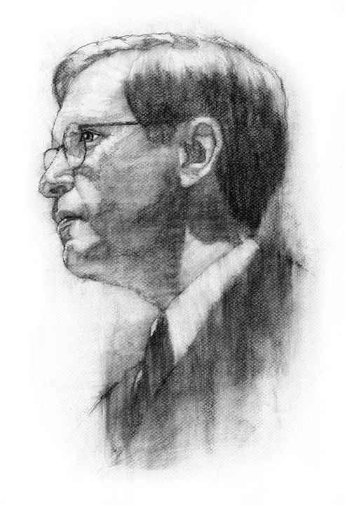
The portrait above was commissioned for the Columbia Business School through Zehno Cross Media Communications, while the one below was for one of my great clients, the University of Chicago Magazine.


7 comments:
Alan, I’ve been browsing by your blog for over a month and I really enjoy your illustrations. Your portrait style is very interesting. I enjoy the textures that are created, it tends to bring life to the paintings. Just wanted to say great job and keep them coming.
What kind of paper are you using? Very cool...
Thanks, Heather!
I'm using Canson Mi Teintes paper (drawing on the textured side).
Since you answered, I thought I'd bug you one more time and ask how the heck you got charcoal to smudge that way. It looks almost like you used water. I've never seen anything like it.
Ah...my trade secret. j/k!
I use a blending tortillion -- one that's not too old and worn down, and with just the right amount of pressure, on top of an "underdrawing," that lends itself to a watercolor look.
Check out my step-by-step, here:
http://tinyurl.com/mruclh
Thanks! I do portraits myself and I can do realism, but nothing this unique - I envy your technique. I will definitely look at your tutorial.
Hi Allan. If you don't mind, I would like to know what amount of time is a decent timeline/turnaround portrait like the ones you show above.
I really like them, I do some drawing like- solo and as hobby,
And I want to start doing finished -and decent- work. :) Would like to have a -standard on timing to see how much dwelling is too much, or where do I pick up the pace.
I would appreciate it a lot
Thanks.
N
Post a Comment