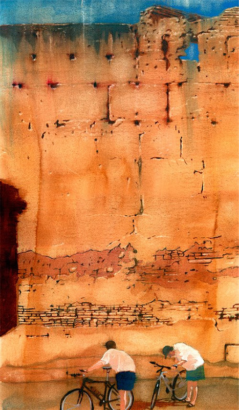
 This illustration was part of a series I produced for Bicycling Magazine a while back for a story about two brothers' bicycling trip across Morocco.
My intent with this piece was to give the viewer a flavor for the story, without literally interpreting it. The large cracking adobe wall provided a nice backdrop for a large, perhaps imposing and exotic locale. Warm colors echo the environment. And, the two bicyclists obviously represent the brothers, who look slightly out of place in front of this funky wall.
Not long before I received the call for this assignment, I was residing in Kansas City. From time-to-time, I would people-watch and shoot photos for potential reference -- a pastime I continue to this day. One of those days, I was walking around Loose Park, just south of the Country Club Plaza, and saw these two fellows checking out their bikes near the sole park fountain -- maybe just a routine look-see or maybe diagnosing trouble. In any event, I took a few shots. How fortuitous they would come in handy for this very assignment.
One of the powers of illustration is its ability to further a story and say a number of things with very little. Effective illustration comes in so many shapes and forms. Subtlety happens to be a form that I gravitate toward. The posture of the bikers says something (Why are they bent over and what are they looking at?), their placement in front of the wall says something (What's up with the wall and what is the connection with the cyclists?), and the colors say something (a warm palette versus a cool one, denoting different moods). Together, these elements (I hope) speak as one and solve the visual challenge while leading the viewer down a path that whets the appetite for what they are about to read.


3 comments:
Hey Allan! Really enjoy this one, love the texture that was created for the wall. Have been really busy as of late and I hope your doing good!
Funny, to funny! That ratio (90/10), does that include you paying for my Crayola Crayons? I don't want to push you over the rail and maybe "Masterson & Burch Illustrations" sounds good too. Yes, my name goes first, haha.
If I don't talk to you before the conference, think of me being there in spirit and I'm sure you'll have a good run of the place.
Matt
Good for people to know.
Post a Comment