Showing posts with label music. Show all posts

Saturday, August 21, 2010

Lady Gaga

Love or hate her, one can't deny the Gaga.

Wild, outlandish, and over the top help define Lady Gaga, pop music performer and current Twitter queen (more followers than anyone else). Her sunglasses and pyrotechnic bra turns her into Gaga and hides Stefani Joanne Angelina Germanotta. I wanted to challenge myself and take a more intimate look at the the human being rather than the public persona.

When looking for reference, one problem I encountered was, she looks an awful lot like Madonna in many of them. At her essence, what makes Gaga, Gaga? For me, it's her facial features -- her nose and mouth, particularly. I needed to reveal her eyes, too. Her ever-present shades only serve to further hide, creating an unwanted obstruction between me and her.

The colors should be mostly muted and kind of un-pretty, speaking to the sometimes un-pretty vulnerable side of everyone. The artistic challenge came in creating something subtle and mostly devoid of color, but still giving the viewer a retinal stimulation and a reason to want to explore the image.

It's a relatively simple composition, so there needed to be complexity, somewhere, as a balance. The brush strokes are kind of interesting to look at, but color needs to play an important role. I decided to use the rouge in her cheek as a focal point and communication tool. Coupled with her subtle, but unusual head wear, the shock of red hints at the vibrant performer side of Gaga.

The cool balances the warmth and adds just enough depth, while keeping the composition almost abstract. A shift in the color palette to a yellow/green slant removes a level of predictability and adds a bit of complexity to not only the color itself, but also to its functionality as a communication tool and how it defines form.

This was also done as a demo with my 2010 intern, Andrew Towler. For the past 2-1/2 months, he's helped run my business and learn about both the art and profession of illustration. I sincerely thank him for his assistance and for being an important part of Allan Burch Illustration.

Allan Burch is an award-winning illustrator and portrait artist, providing solutions for editorial, book, advertising, and institutional projects.
View more of his work»
Sign-up for his newsletter»
Purchase prints»

Saturday, July 4, 2009

Michael Jackson

Young vs not-so-young.

Performer vs the person.

Decisions, decisions.

Michael Jackson is a very complex figure. How do I do justice to such complexity?

The answer, I believe, is in creating a deceptively simple composition, focusing on the man. Upon dissection, however, I hope one might see a whole host of complexities.

I contemplated illustrating the dancer. There would, indeed, be lots of potential for dynamic illustrations -- movement, lighting, emotion...all right there in any of the kinetic snapshots that were his live performances, videos, and stage appearances.

How about the latter-day MJ? I could exploit the face, no doubt. There are a multitude of stories under his skin. We all know them. If not, they are easily Googleable.

Plus, I'm coming from a place where I remember the spectacle of 1983-ish, when Thriller made him the king.

To me, that era Michael Jackson was Michael Jackson. Slowly, thereafter, he shed that skin, so to speak, and ceased to be that person.

Anyway, I wanted to do a portrait with that person foremost in mind. Yet, I had to include an allusion to his future self and the tribulations that would accompany him.

The guy above is circa late-80s, early-90s. He's starting to transition in appearance, headed toward the downward spiral, but still the young man of whom we took note.

The colors in this illustration are also simple. They are pretty flat, actually. The face has minimal rendering, the shirt is very much a basic red shape, the hair is a basic shape, and the background is a basic gray shape.

They have to be, though. The strokes are very complex. Countering the basics in color are very textured and raw strokes -- evidence of human intervention, and an echoing of the complexities that defined the man.

There is no way a complicated color scheme could have stood a chance. Believe me, I tried. Either the mark or the color had to take dominance.

The mark won.

The gray background speaks to the less-than-vibrant future awaiting him, but the brilliant Thriller red speaks of that which he is about to leave behind.

It's tragic and celebratory, at once.

Lastly, it's in the eyes.

Eye contact is important. We form connections with total strangers by making eye contact. Somehow, I feel like I learn everything about a person in that split second of contact.

As such, I thought it important the viewer be forced to look Michael in the eye while drawing his or her own conclusions about it all.

How much more complex can it get?

My thanks to illustrator, Becca Johnson, whose assistance and artistic input helped bring this illustration to fruition.

Allan Burch is an award-winning illustrator and portrait artist, providing solutions for editorial, book, advertising, and institutional projects.
View more of his work»
Sign-up for his newsletter»
Purchase prints»

Sunday, June 14, 2009

Billie Joe Armstrong of Green Day

"Say your prayers and light a fire." ~ from 21st Century Breakdown

It would have been easy to illustrate Billie Joe Armstrong, of Green Day, in a very animated pose with mouth a-twistin' to "¡Viva La Gloria!." That's how one expects to see him, right? However, in such a pose, the image starts to become all about the photo. I wanted to bring to life something more contemplative.

Round about 6:56 am, one fine day, I was in my car listening to the song, "Warning," on Lithium (54 on your Sirius-XM dial for XM subscribers). I thought to myself, Billie Joe Armstrong would make an interesting subject for an illustration. This is appropriate timing, too, since his band's latest effort is fresh on our minds.

This summer, I'm fortunate to be working with an amazing young illustrator named Becca Johnson. What better time to jump on Billie Joe, than as a demo?

With bold strokes, I engaged in a process, very cleverly coined by Becca, as "unpainting." It's very proprietary. In fact, I may have already said too much.

After knocking out phase one, we brought the piece into Photoshop, where the process shifted to value and then color.

With repetition, and as I become more comfortable with my process, or style, if you will, I'm always looking to strip away the unnecessary and distill paintings to the essence of what may (or may not) make them work. Glancing through the blog, one thing I notice is Billie's brush strokes are more prominent, and evidence of the human touch is on display with greater note than in some of my prior works.

With color, the obvious would have been to lather this piece in green. It turns out, Billie Joe's eyes are, indeed, green. So, look as you might, the only two spots of the aforementioned color are peering, contemplatively, in your direction.

Allan Burch is an award-winning illustrator and portrait artist, providing solutions for editorial, book, advertising, and institutional projects.
View more of his work»
Sign-up for his newsletter»

Saturday, January 26, 2008

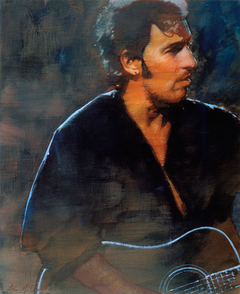
Bruce Springsteen

Bruce Springsteen -- one of my favorite pieces. It gets a lot of hits on both my website and the various other portfolio sites in which I participate. It made the Communication Arts Illustration annual and both the Los Angeles and New York Society of Illustrators annuals. People have inquired about purchasing it (which I'm willing to do, by the way).

I did this illustration shortly after college, which initiated one of the "golden ages" of my development as an illustrator. I had moved back home, after my freelance work ran dry, working at the local Hy-Vee grocery store stocking shelves by night and working feverishly during the day building my portfolio. I found some reference one day that inspired me to create another Bruce Springsteen illustration. You see, in college, as an assignment, I did a Springsteen illustration. So why do another? All I do know, is it seemed like the right thing to do. But, it didn't come easily. I made one pass at it and failed. It had become labored-looking, and had no integrity or direction. It didn't look like I knew what I was trying to accomplish. So, I scrapped it and tried again. Some of my favorite pieces are the result of second attempts. This time it came together like the planets lining up. When a painting paints itself, as Bruce did, one tends to bookmark the occasion in their mind. When it was complete, I felt like it could be something special -- it said much with deceptive simplicity. When it fortunately snagged all kinds of space in the annuals, I decided I might be onto something. In many ways, it has proven a benchmark for my measurement of later pieces. It is also one of the few I have done that tends toward a cool color palette.

One thing that helps this piece hold up over time is the fact that Sprinsteen seems to hold on to this look. He looks about the same now as he did in 1995, which is good for me, as I can continue to ride this image. If an artist likes a musician's work, it shows in the illustration. Bruce is certainly one of the great storytellers in music. Today, he hangs on my wall, with the other illustrations that needed framing for one reason or another, keeping an eye on all things to his left.

Check out this version of "Fire." You can feel the energy aching to burst through. Bruce wrote this for Elvis in '77, but Elvis died shortly thereafter.


And, here is a duet with Melissa Etheridge. "Thunder Road" unplugged. Pretty cool.


And, speaking of Melissa Etheridge unplugged, here is a killer version of "Maggie May."

Sunday, December 2, 2007

Midnite Vultures

Midnite Vultures was nominated in 2001 for Album of the Year at the 43rd annual Grammy Awards. Other nominees that year were The Marshall Mathers LP from Eminem, Kid A from Radiohead, You're the One from Paul Simon, and the winner -- Two Against Nature by Steely Dan.

I was thrilled to work on this portrait for the Grammy Awards. I had my choice of artists to paint and I thought Beck would prove the best subject for me. His music is somewhat uncategorizable, so there is a bit of mystery about that aspect of him. Plus, if you listen to his lyrics, one can spend days deciphering the meaning to each and every allegory. I thought this slightly off-kilter image with undefined sweater shape would tell a nice subtle story.

As I worked on this illustration, I had the CD on constant rotation. "Sexx Laws" and "Debra" are a couple of my faves. When the big night rolled around, I tuned-in to CBS, looking at the full house of musical dignitaries, watching Madonna open the show with "Music." It was a surreal feeling knowing Mariah Carey, Pete Townsend, Blue Man Group, Elton John, Marilyn Manson, Snoop Dogg, Sweet Honey in the Rock, or God-knows-who might be holding my art in their hands that very minute -- a very wild feeling, and one of my cooler jobs to date. I hope to have another opportunity to help.

Cool song. Cool video


detail

Sunday, November 11, 2007

Music

Here's another illustration based on one of my San Francisco photos. While walking around the Nob Hill area, I spotted this belly dancer performing for tips. Accompanying her were a couple of men who gave her an exotic rhythm with drums they rested across their knees. Seconds before I depressed the shutter, a breath of wind caught her skirt. Click.

For an expressive photograph, you can't go wrong with a street performer like a dancer or singer. There is an element of rawness and unpolished beauty to these performers which adds a personal touch to their story.

The pose in itself is beautifully fluid, but I accentuated the twist in the torso and the jut of the hip to give it a little extra movement. Like the other color images on this blog, preceding this one, I did a monochromatic painting in acrylics, scanned it into my computer, and gave it adjustments in tone and color. Needless to say, the process is a bit more involved than that. However, I like having the flexibility afforded by Photoshop to try things out, make mistakes, correct problems, explore, and discover something new.

detail

Saturday, October 6, 2007

Just Like Me

I was driving down the highway recently, listening to Squizz on 48 and the Pumpkins. Enjoying their smashingness. I thought to myself, I should do a portrait of Billy Corgan. He's an interesting character and might cater well to an illustrated portrait.

I was happy to see the Smashing Pumpkins get back together. It seems like his is the type of voice you either love or hate. I wanted to capture his energy and impassioned vocal stylings as well as his kinetic restraint.

I always use fluid and active brushwork, leaving evidence of where I was at that particular moment in time. Coupled with a shock of color, it's an effective technique to relay the energy of my subject. This engages the viewer immediately and pushes her or him toward a particular frame of mind. It adds another dimension to the visual experience.

I think it's also of note to mention his clothing. The title of this entry is from a line in the Pumpkins' song "Zero," one of my favorites. In my mind's eye, if the word "zero" were to be represented with clothing, I believe Billy's wearing it.

detail


Saturday, September 1, 2007

Amy Winehouse


Amy Winehouse has such descriptive features--great eyes and full lips that distinctively and uniquely curve upward at the corners, punctuated with a Monroe -- not to mention her wild mane of hair. Her back-story is a bit troubled and she's been in the news recently canceling shows while they try to make her go to rehab.

I wanted to capture her edge and accentuate her lines to create something interesting. I exaggerated the posture, giving extra sway in her back, letting her left arm hang straight down. The bold energetic strokes and color are two things I'm experimenting with at the moment, and I think they compliment her.

After doing the monotone "underpainting" with acrylic, I take the art into the computer where I adjust my tones, apply color, and refine detail. This process lets me hang on to the spontaneity of the underpainting and affords me the ability to experiment with anything--color, tone, texture--without fear of losing any of that energy and spontaneity. I think it's a process that's added a dimension to my work, provided me greater flexibility, and allowed me to complete my illustrations quicker. This piece was uncommissioned.

Maybe the best quote I've heard so far about her Back to Black album, from itunes:

"This album is so good it makes me want to punch somebody."

(an AMAZING song)


face detail