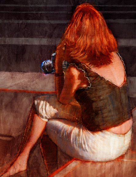
 Sometimes, the coolest photos make for the most challenging illustrations, for me, anyway.
My talented model, Jana, and I conducted a photo shoot one fine Saturday. Of the 1,100+ shots she allowed me, is a series in which she is sitting on a gray/green couch, against a muted purple wall, on top of ochre hardwood flooring. Sunlight is streaming through my west windows, bathing the scene with wonderful shapes and patterns of light.
There's lots of color in my house.
My philosophy when shooting is to play the law of averages. If I shoot 1,100 shots, odds are I'll come away with at least 1 nice shot, right? Of course, with an emotive and confident model, the odds increase. And, it's my experience, even with a seemingly timid model, there are lots of amazing shots to be had. Beautiful light, unusual points of view, and even the slightest sense of mood can make for some tremendous photographs.
But, Jana is confident and emotive, so her shots exude the same.
This particular photo of her, twisted away from the viewer and looking at something with a sense of immediacy, brought just the right amount of mystery to a scene. The beautiful lines, shapes, and forms created by her pose were just perfect for illustrating.
My challenges:
1. Harmonizing value
In the photo, the shadows and light help create a successful composition. The value structure should remain in the illustration. But, there should be room for color and interest within the shadows, since they are so dominant. The viewer needs a reason to explore them within an illustration.
2. Harmonizing color
I wanted there to be a purpose to the color and resist making the whole illustration a typical glowing sunlight scene filled with pretty colors.
3. Telling a story
I wanted there to be some narrative to the scene and go beyond just a pretty picture.
My solutions:
1. Harmonizing the value
Value is more important than color, so this challenge was solved early on. Value dictates a composition. All 2-D design needs to work in b/w before it can work in color.
I kept the shadows dark, yet light enough to show brush texture and color. With the strong, delineated areas of light and dark, this illustration quickly became a compositional study, first, and a scene, second.
2. Harmonizing color
I tried brilliant, hot color, everywhere.
No good -- too much of all the same intensity.
I tried mostly blues and purples surrounding the figure with the hair, blouse, and arm in brilliant warmth.
No good -- too obviously pretty and uninteresting.
I tried less-saturated local color with brilliant warmth in the hair, blouse, and arm.
Good.
There is a hierarchy of color intensity directing the eye and less-intense areas providing places for the eye to rest. Plus, there is enough subtle, complex color in the shadows and non-figure areas to encourage exploration. And, the color usage helps bring a mood and tell a story.
My palettes are usually quite simple -- predominantly warm with just enough cool to balance, or vice versa. This one is somewhat up for debate, but I'm saying it's predominantly cool (muted, almost gray colors surrounding the figure), with warms in the torso to balance the palette.
3. Telling a story
She should be looking at something over her right shoulder, rather than the blank wall in my photo.
A picture!
That picture frame on the wall gives her a reason to look and adds just enough to pull off a story. And, that blade of light cutting it adds a bit of interest and leads the eye.
What is she looking at and why is she twisting so much to see it? You'll have to email me for the answer.
Still, the scene is very photo-centric and could verge toward becoming too staid at any moment. There needed to be some immediacy and tension.
Cropping!
To accentuate her anxious posture and support an anxious scene, I shifted her leftward, clipping her off the edge of the page.
The incomplete figure brings a bit of tension and some mystery as to what is so important off the left side of the page that we're being forced to shift our focus that direction.
The small dark corner of the couch in the lower right corner is just enough stoppage to keep one's eye from leaving the page.
So, there's my journal entry for today.
My thanks to Jana for her help in creating this illustration.
Allan Burch is an award-winning illustrator and portrait artist, providing solutions for editorial, book, advertising, and institutional projects.
•View more of his work»
•Sign-up for his newsletter»
•Purchase prints»


