Showing posts with label woman. Show all posts

Wednesday, October 19, 2016

Kendra


THE ASSIGNMENT

Create a thick, rich, painterly portfolio piece.

THE CHALLENGE

Create a multi-layered, beautiful illustration filled with immediacy and dimensionality, while also working as a flat abstraction.

GETTING STARTED

I dabble in photography. A nice byproduct of this is I have an abundance of source material when I want to play, a bit, with the paint.

One such photo session was with one of my favorite collaborators, Kendra Scott. We tend to create magical images, together. This particular session was a metamorphosis-themed concept, transitioning — visually and metaphorically — from a beautiful facade to raw vulnerability. You can see and read about this beautiful and emotional session, HERE and HERE.

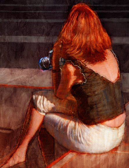
One of my favorite images, from our experience, was this simple, yet elegant, back shot. The sensual forms and shapes would provide lots of opportunity to juxtapose bold strokes and textures, and see what might pan out, in a painting.


Using the paint in a sculptural way, I strove for economy of mark-making — a few marks to define the dimension of a shoulder blade or a mass of hair.

Red is one of my favorite colors to exploit, in a piece of art. It’s an automatic call-to-arms, visually, and emotionally. It lets the subconscious know there is a bundle of emotion, residing, within.

What better way to exploit red, than with green, its complement?

The photo has a much more subdued background, which works, for the photograph. But, for my illustration, there needed to be more for the eye to touch and experience. I decided it needed to remain a non-descript background, but still be filled with detail and depth, to add that richness and energy I was looking for. Layers of lines, shapes, dots, and negative space, all trigger the mind, in different ways, while still harmonizing within that single background space. The green colors are just subdued, enough, to not overpower the main statement of the red. That’s important for color balance.

THE FINAL ART

To further enhance a sense of beautiful, painterly mark-making that also happens to create a recognizable series of forms, a ragged black border seemed to be the perfect final touch. In addition to creating a frame, the border intersects and blends into the figure, separating the picture into three shapes (negative space to the left and right of the figure, and the figure, itself). In doing these things, the frame starts to trick the eye into choosing between a 3-dimensional form or a flattened abstraction. The mind is always trying to make choices as it attempts to make sense of the world.

This complex journey into a piece of art is what makes an eye want to come back and investigate. The question of what is real vs what is illusion is one of the most important questions art can pose to a viewer. It is just one aspect of art that makes it such an important part of the human experience.

My thanks to the amazing, Kendra, for creating beautiful images, with me, and helping to make this artwork, possible.


Allan Burch is an award-winning illustrator and portrait artist, providing solutions for editorial, book, advertising, and institutional projects.
View more of his work»
Sign-up for his newsletter»
Purchase prints»

Saturday, January 16, 2010

Letters to Angela

Picture-making is an ongoing learning experience.

This one started with a really cool photo of Christy adjusting her hair clip. Nothing out of the ordinary about that, right? True enough, but this particular photographic moment-in-time has some especially interesting things happening.

Compositionally, her arms and hands are positioned beautifully while not obstructing the face or creating visual confusion in any way. The shadow on her left arm connecting to the cast shadow on the wall connecting to the contour of her body at the bottom of the picture, leading the eye back upward, is quite an interesting and lovely shape, and a lucky catch by my 'lil Nikon.

I thought it a very "iconic" pose just ripe for a fine art creation.

Christy is one of my terrific models. Among the many emotive poses she struck, this is one of my favorites. It's a slightly unusual capture with the pose and shadow combination. It's also filled with excellent mood, contrast, form, and beauty.

For me, an illustration, speaking in terms of picture-making rather than concept, is usually about the image or the mark on the board. For a straightforward image, like a person seated in a chair, I like to pump up the mark-making to add visual interest and give the viewer a reason to investigate the picture. Conversely, for a very intricate and unusual image (like Manhattan, seen in an earlier post), I tend to tone down the wild marks and let the image take center stage. A fierce competition between marks and image can blow a perfectly good picture.

With this image, I set out to make the marks a predominant player. I had also intended something different for the background than what you see, here. As the piece progressed, though, I found myself tightening up the strokes to accommodate the originally intended intricate background which would become lost among painterly strokes.

Things were looking too tame with my original background. So, I worked up this graffiti and stone wall backdrop. It seemed to give the image a little more edge and is more complementary to the expressive strokes I wanted to keep.

I also like the resulting mood and mysterious story that doesn't reveal itself too soon.

My thanks to Christy for making this illustration possible.

Allan Burch is an award-winning illustrator and portrait artist, providing solutions for editorial, book, advertising, and institutional projects.
View more of his work»
Sign-up for his newsletter»
Purchase prints»

Monday, January 11, 2010

Witness

Have you ever felt like this?

One of the beautiful things about making art is its capacity for self-expression. Sometimes you win a few, sometimes you lose a few, when the work is done. But, if one is lucky, he has a chance to be expressive during the process, and leave a little of himself on the paper or board or canvas.

When I need to unleash a few demons, I like to do a charcoal drawing. In this case, I pulled from my cache of photo reference and found a moody shot of Tasha who happens to be eliciting just the mood in the photograph that I'm feeling.

It's a tension-filled, closed pose, with arms and legs crossing her body. She's looking away from you and not revealing her eyes through the shadow, so you are left with a bit of mystery.

There is an air of vulnerability. Why do all things lead to the mirror and why is it facing you, the viewer?

Tasha is one of my phenomenal models who turns every pose into a work of art.

Even after engaging my instincts and emotions to lay down the artistic marks, I still needed to tap the left side of my brain to go through my checklist of items that lead to good picture-making.

When I'm done, I'm hopefully left with a cool, deep, and emotional creation that no one can take away from me. And, after one of those days when I feel like the world has taken an extra large chunk from my person, to create something of my own and for myself is very satisfying.

Allan Burch is an award-winning illustrator and portrait artist, providing solutions for editorial, book, advertising, and institutional projects.
View more of his work»
Sign-up for his newsletter»
Purchase prints»

Monday, November 2, 2009

Black Light

Sometimes, the coolest photos make for the most challenging illustrations, for me, anyway.

My talented model, Jana, and I conducted a photo shoot one fine Saturday. Of the 1,100+ shots she allowed me, is a series in which she is sitting on a gray/green couch, against a muted purple wall, on top of ochre hardwood flooring. Sunlight is streaming through my west windows, bathing the scene with wonderful shapes and patterns of light.

There's lots of color in my house.

My philosophy when shooting is to play the law of averages. If I shoot 1,100 shots, odds are I'll come away with at least 1 nice shot, right? Of course, with an emotive and confident model, the odds increase. And, it's my experience, even with a seemingly timid model, there are lots of amazing shots to be had. Beautiful light, unusual points of view, and even the slightest sense of mood can make for some tremendous photographs.

But, Jana is confident and emotive, so her shots exude the same.

This particular photo of her, twisted away from the viewer and looking at something with a sense of immediacy, brought just the right amount of mystery to a scene. The beautiful lines, shapes, and forms created by her pose were just perfect for illustrating.

My challenges:

1. Harmonizing value

In the photo, the shadows and light help create a successful composition. The value structure should remain in the illustration. But, there should be room for color and interest within the shadows, since they are so dominant. The viewer needs a reason to explore them within an illustration.

2. Harmonizing color

I wanted there to be a purpose to the color and resist making the whole illustration a typical glowing sunlight scene filled with pretty colors.

3. Telling a story

I wanted there to be some narrative to the scene and go beyond just a pretty picture.

My solutions:

1. Harmonizing the value

Value is more important than color, so this challenge was solved early on. Value dictates a composition. All 2-D design needs to work in b/w before it can work in color.

I kept the shadows dark, yet light enough to show brush texture and color. With the strong, delineated areas of light and dark, this illustration quickly became a compositional study, first, and a scene, second.

2. Harmonizing color

I tried brilliant, hot color, everywhere.

No good -- too much of all the same intensity.

I tried mostly blues and purples surrounding the figure with the hair, blouse, and arm in brilliant warmth.

No good -- too obviously pretty and uninteresting.

I tried less-saturated local color with brilliant warmth in the hair, blouse, and arm.

Good.

There is a hierarchy of color intensity directing the eye and less-intense areas providing places for the eye to rest. Plus, there is enough subtle, complex color in the shadows and non-figure areas to encourage exploration. And, the color usage helps bring a mood and tell a story.

My palettes are usually quite simple -- predominantly warm with just enough cool to balance, or vice versa. This one is somewhat up for debate, but I'm saying it's predominantly cool (muted, almost gray colors surrounding the figure), with warms in the torso to balance the palette.

3. Telling a story

She should be looking at something over her right shoulder, rather than the blank wall in my photo.

A picture!

That picture frame on the wall gives her a reason to look and adds just enough to pull off a story. And, that blade of light cutting it adds a bit of interest and leads the eye.

What is she looking at and why is she twisting so much to see it? You'll have to email me for the answer.

Still, the scene is very photo-centric and could verge toward becoming too staid at any moment. There needed to be some immediacy and tension.

Cropping!

To accentuate her anxious posture and support an anxious scene, I shifted her leftward, clipping her off the edge of the page.

The incomplete figure brings a bit of tension and some mystery as to what is so important off the left side of the page that we're being forced to shift our focus that direction.

The small dark corner of the couch in the lower right corner is just enough stoppage to keep one's eye from leaving the page.

So, there's my journal entry for today.

My thanks to Jana for her help in creating this illustration.

Allan Burch is an award-winning illustrator and portrait artist, providing solutions for editorial, book, advertising, and institutional projects.
View more of his work»
Sign-up for his newsletter»
Purchase prints»

Thursday, August 6, 2009

Black Flowers and the Anatomy of an Internship

What I find so remarkable about the photograph that serves as this illustration's reference is its combination of strength, beauty, mood, and symbolism.

The lighting strikes the surfaces, just so, illuminating strength in the arm, a blood-coursing fragility-of-life vein in the hand, and symbolism in the soft, cradling-a-baby pose, while also shrouding the scene with darkness -- both literally and in terms of emotion.

The pose and photo were unplanned. In fact, this was probably just a transition from one pose to another that happened to be captured with my Nikon. These types of unplanned moments-in-time are what I live for with my photo shoots, and tend to be best facilitated by a tremendously emotive model (which I was lucky to have).

The Challenges

For this kind of especially rough and expressive charcoal technique to take shape, there needs to be a chip on my shoulder and/or an aggressive concept to the art. Unfortunately (or fortunately), neither were the case on this particular Saturday. I wasn't carrying a beef against anything, nor was the pose conducive to unrest. In fact, it's a very gentle pose.

But, this kind of contradiction can make for an especially interesting illustration, if handled successfully.

I set forth with Becca, my summer intern, at my side, intently watching my every throw-down with the charcoal.

After snapping my extra-soft vine to pieces, due to overzealous mark-making, I wrapped-up the "underdrawing" part of the illustration to what I was hoping would be the psychologically beef-inducing, angst-ridden, Lollapalooza-lite sounds of "Lithium" (channel 54 on your XM radio dial).

No dice on the beef-inducement.

Into Photoshop we go.

Here, I pull the local and global values together, making the piece work together a little better and more clearly defining my areas of focus. The wallpaper also makes its way onto the background -- symbolic as it reflects the flower, bringing to mind family and the loss of a child...my underlying concept.

Honestly, at this point, I'm starting to sweat a little. I'm not feeling it. The strokes are competing with the wallpaper pattern, and the delicate, yet dramatic lighting isn't coming across to my liking. Plus, all the marks are getting in the way of the composition. I can't tell what I'm supposed to be looking at.

With hesitation, I ask Becca, "Do you have any thoughts on what's happening?"

Much to my relief, she sees the challenges, but also really likes what's happening. Looking beyond my insecurities about the less-than-visible composition, she's keen on the imperfections and the drawn-from-life impact shining through.

Not only does this bode well for the salvation of the piece, it also means I may avoid ending our internship on a stinker.

However, I still need to address my concerns. After trial and error, I realize the lighter shapes need to be better defined, and the darker shapes need the same treatment. The whole piece needs to become more graphic, in my eyes. The reason for this is, the marks, while expressive, shouldn't override the composition and story. They should help tell the story and not create visual confusion. Without this further definition, I am confused. If I'm confused, others are going to be confused.

Confusion = bad illustration.

Several hours later, a little adjustment, a little hint of color, and I'm feeling it.

Feeling it = blog-worthy illustration

Now, a hopefully-not-too-self indulgent word about my extraordinary summer.

As mentioned above, and throughout this blog, I've been fortunate enough to be working with Becca Johnson, an illustration student from the Savannah College of Art and Design, in Savannah, Georgia, as my first ever intern.

This means I've finally given myself permission to admit I have enough of a workload to keep 2 people busy, nearly full-time.

Going into our internship, I knew she should serve the role of my business partner, not just a "lowly" grunt-work-doing intern. This is the only way our internship can work, in my eyes. There is no point in limiting her role, especially since any intern of mine, not from the Forsyth, Missouri area, will need to commit to an extended duration in the middle of nowhere -- picturesque to be sure, but culture-shock nowhere, nonetheless. This kind of investment on Becca's part deserves everything I can possibly share in return. Plus, this should foster the best environment for learning.

So, we set forth with a daunting to-do list, and she became my business partner for 2 short, intense months.

64 days later, our list of accomplishments for Allan Burch Illustration is quite impressive, by anyone's standards, and will continue to resonate for months to come. A partial list includes: conceptualizing and executing a very creative (and very cool) direct mail promotional campaign, creating a thoughtfully crafted on-line limited edition print shop, and confirming two substantial one-person gallery shows.

I consider myself exceedingly fortunate to have crossed Becca's path, and extend to her my sincere thanks for both her outstanding work and for sharing her remarkable talents and resources, at every turn, toward the betterment of Allan Burch Illustration. Thanks, too, for helping me become a better artist, business person, and pseudo-teacher.

See her illustrative work, here.

Hear her vocal work, here.

Allan Burch is an award-winning illustrator and portrait artist, providing solutions for editorial, book, advertising, and institutional projects.
View more of his work»
Sign-up for his newsletter»
Purchase prints»

Sunday, July 26, 2009

Jersey Girl

This is about love, man, not hate.

Throughout the summer, I've had the opportunity to share my illustration processes and techniques with my outstanding intern, Becca Johnson -- an illustration student at the Savannah College of Art and Design, in Savannah, Georgia.

This week, she also serves as the model for this illustration.

Photo shoots are a major part of my process. I find reference to be key. I also find it infinitely easier to photograph the exact reference I need, rather than try to hunt down something similar.

Becca and I had an opportunity to conduct a minor shoot a few weeks ago, but this week, I wanted to conduct something a little more major.

My goal was to create an illustration befitting the series that includes my existing illustrations: Plenty, Good Enough, and Fistful of Steel. All of which are seen elsewhere on this blog.

Their common denominator being a snapshot of love, hate, or any of the complex emotions that result, therein.

In order to create such an emotive illustration, I outlined a few of my goals for the shoot.

An arresting image
Without a powerful visual, I'm already digging myself out of a hole, with little chance of engaging the viewer.

A real and visceral sense of emotion
This can be a tricky task, especially in a potentially manufactured setting of a photo shoot.

Spontaneity
Some of the most beautiful poses come from unplanned, split-second moments in time, revealing nuanced complexity that could never be staged.

A sense of symbolism
I'm looking for a visual cue that will speak volumes to the viewer through an inherent, universal language.

I like to go into my shoots with a general outline, like the one above, but leave plenty of room for the unexpected. That's always when the killer shots happen.

And, killer shots I received.

1.5 hours, hundreds of remarkably emotive poses, and 3 beautiful acoustic songs later (she's an amazing singer/songwriter/performer), I was sitting on 842 juicy photographs, all aching to be turned into illustrations.

Examining each, under the criteria outlined above, I weeded my treasure trove down to the top 12.

The spontaneity of this umbrella pose, coupled with the mood, movement, and composition created by the shapes and values gave it the green light.

My next questions: In what context do I place her, and how do I keep the scene from becoming an obvious "woman in love" shot?

I experimented quite a bit, and found, for both composition and mood trickery, the colors should be subdued and mostly cool, allowing the figure to stand out. A gloomy stage would then set up my emotional twist.

The umbrella and rain against a gray, graffiti-riddled brick wall, hopefully, takes the viewer on a ride that takes a turn when the other contextual clues reveal themselves -- the warm glow of the figure, the alluring posture, and, lastly, the "LOVE" logo on the wall.

The right reference and the right model makes all the difference to me. My enormous thanks to Becca for allowing me this illustration and the many more, sure to come, from what was one of the strongest photo shoots I have had the pleasure of conducting.

Check out Becca's work, here.

Allan Burch is an award-winning illustrator and portrait artist, providing solutions for editorial, book, advertising, and institutional projects.
View more of his work»
Sign-up for his newsletter»
Purchase prints»

Monday, May 11, 2009

Fistful of Steel

This was a personal piece, completed for my own entertainment.

I wanted to do something moody, compositionally interesting, and slightly dark, on a number of levels.

I was able to get my hands on a photograph of a young woman, whose pose created some great angles and movement, not to mention some nice play of light and shadows.

Sometimes, I like to accentuate these lines through exaggeration. Here, the exaggerated lines allowed a strong angular composition, complimented with an unusual, vertical shadow on her face.

I liked it.

When working on personal pieces, like Fistful of Steel, I allow myself more freedom to fail. What this means is, I make the mark and I own it -- almost daring it not to work. I place total trust in what abilities I have, let the chips fall where they may, and lay down the stroke -- knowing there is no other place on the page it belongs.

I did indeed lay down some expressive strokes of charcoal to render the gal, and among what resulted was a very textured dappling of marks defining her arm -- bringing to mind a tattoo. So, why not add a tattoo and complete the effect?

This was a fun exercise and a much-needed way to release some creative energy.

Allan Burch is an award-winning illustrator and portrait artist, providing solutions for editorial, book, advertising, and institutional projects.
View more of his work»
Sign-up for his newsletter»

Saturday, January 10, 2009

Illustration West 47

Addiction

Voyeurism

January 1, 2009.

I'm doing whatever I do on a New Year's day -- watching football, watching news, watching snow not fall, or perhaps other equally interesting activities -- when my left front Levis pocket begins to vibrate, sometime around noonish. No troubles...just my Palm Treo letting me know of an incoming email.

It's New Year's, for Pete's sake, let the email be, one could argue.

One may be right, but, as we all know, deadlines don't wait for the holidays.

But, this particular email was not job-related. It was a notification that two of my works had been accepted to the Illustration West 47 juried annual and exhibition.

Illustration West is a product of the Society of Illustrators of Los Angeles, and one of the 4 shows to which I submit work every year in hopes of acceptance. American Illustration, Communication Arts, and the New York Society of Illustrators are the other 3 shows. Of course, there are many other annuals out there, but I try to limit the bleeding to these four.

There are varied arguments to the merits of entering such annuals.

Some don't do it because it's not a good investment of their time and energy, and their industry reputation is well-established.

Others do, because, if accepted, it can be a valuable means of advertisement -- being nestled amongst some of the highest quality work of the year, as judged by a panel of industry peers.

Being accepted to the (major) shows can also be viewed as a means of validation -- that one's art is relevant in 2009 and that a body of respected figures in our field deems one's work worthy to pass a certain standard of excellence.

Some of my earliest experiences in discovering illustrators came from perusing the annuals in the cozy little reading room in the Design building on the campus of Iowa State University. Gary Kelly, Brad Holland, Mark English, and Guy Billout lit up the pages and captivated my attention to their problem-solving skills and technical wizardry.

So, for me, the annuals hold particular value, and their entry fees remain part of my yearly budget.

Knock on wood, I've had some nice luck with the IW shows, and I'm very appreciative for having these two pieces selected for this year's annual.

All work will be displayed on-line at www.si-la.org, and exhibited at Gallery Nucleus in March.

If you'd like to read about them, you may check out my addiction monkey here, and Voyeurism here.

Allan Burch is an award-winning illustrator and portrait artist, providing solutions for editorial, book, advertising, and institutional projects.
View more of his work»
Sign-up for his newsletter»

Sunday, April 6, 2008

Sacajawea

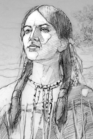
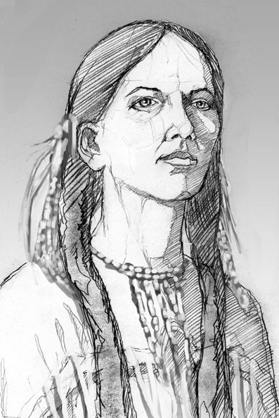
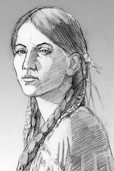
This is a book cover illustration of Sacajawea I recently completed for Harcourt Publishers -- a very fun job and a very cool job.

The project called for a fairly straightforward portrait of her at about age 17. Several challenges arose. My first became finding a model about that age and shooting photos in clothing and hair style that as closely as possible replicated my intended depiction.

The problem was, I didn't yet know what I wanted to depict or how I wanted to portray the figure. That usually comes after the photos are shot. I'll see some great lighting or unpredictable nuance that will drive the illustration.

I lucked out with the model -- a friend's daughter just happened to be the perfect age. I had a few ideas to get us started. Then, as we tried different angles, I started to zero in on the lighting and compositions that seemed to be working best. Things started to come together in my mind's eye. I took several hundred photos, and I cannot more greatly express how pleased I was with the shoot and resulting photos. That always bodes well for a job. The next task was weeding down the shots to a manageable number of the best, from which to create my sketches.

Hair and costume were the next challenges. Since there are no photos of Sacajawea, her face is fairly open to interpretation. We know she was a member of the Shoshone tribe and died in 1812. Of course, she was integral to the Lewis and Clark expedition. I scoured the net for others' depictions, as well as general research about her and her tribe, so as to not portray anything unacceptably inaccurate. I believe what I've depicted doesn't violate this goal. I integrated the clothing, necklace, hair style, hair decor, and braids after the photos were shot.

The end-goal for me was not just a straightforward portrait, but one that also says dignity and strength. I think that is accomplished with the expression, posture, lighting, and color.

I wished to keep the colors on the warm side, complimenting the reds and yellows within the figure. The subtle blues in the beads balances things out.

My preliminary sketches.


My client chose the camera-right-facing pose, you see, above.

You can order the book, written by Joseph Bruchac, HERE.

My thanks to Harcourt Publishers, for the project, and to our model, Caitlin Brady, for helping re-create Sacajawea, for the world to see.

Allan Burch is an award-winning illustrator and portrait artist, providing solutions for editorial, book, advertising, and institutional projects.
View more of his work»
Sign-up for his newsletter»
Purchase prints»

Sunday, January 13, 2008

Voyeurism

Yet another of my San Francisco images. While I was people watching, a couple caught my eye. Particularly this woman. They looked to be not from the U.S., probably in their 40s. They were both dressed smartly and summery. She had a camera and they were both scanning the Union Square, looking at the people. Once and a while, she'd take a shot. They would talk to each other in lower tones periodically, perhaps conferring about the person she was about to photograph. It was a fairly high-end camera, and she looked to have had experience with photography. I wondered what she was looking for.

Her shock of red hair captured my attention, which drew me into her story, and looking at the clues to try and deduce her story. I thought an image of the attractive, seductive woman holding the camera, perhaps herself the voyeur, might be a unique take on the concept. Particularly when composed in such a way to ask who exactly is the voyeur -- the viewer or the woman. Maybe both.

The lines of the plaza become design elements to reflect the angles in the figure. One of my favorite parts is the foot terminating precisely in the lower left corner. The red throughout becomes a strong presence, stemming from the hair and accentuating a mood.

Maybe she has a photograph of me on her blog.

Sunday, January 6, 2008

Let's Dance

I saw Rob Thomas do a version of the David Bowie tune, "Let's Dance," on PBS recently. It was shown as part of his concert at the Red Rocks Amphitheater. It was a pretty credible rendition, in my opinion. I thought it a fitting title for this illustration that was used on my 2007 Christmas card. My intent was to have this image up for the holidays, but work and travel precluded this. So, Obama remained for 2 additional weeks, which turned out very topical with the recent wave he's created.

But back to the image this week, which was prepared months in advance for the express purpose of my card. I thought it captured the celebration and color of the season, and also alludes to the partnership I engage with my clients.

Working with a great art director is a very rewarding symbiotic partnership. When you find yourself in a good professional relationship, it's something that should be celebrated, in my opinion. In this business, markets, situations, budgets, and positions can and do change. When the creative planets align just so, if for one job or many, I think it's important to take a moment and recognize it.

A blast from the past.


detail