Showing posts with label concept. Show all posts

Sunday, August 4, 2013

August: National Aviation Day -- The Captains of Industry Calendar


THE CLIENTS

Eyerus + Visual Communications Studio
The Captains of Industry

THE ASSIGNMENT

A calendar, illustrated in the style of '70s Blaxploitation movie posters. Each month will focus on an extremely esoteric holiday (or a popular holiday handled in an extremely esoteric way), all staring The Captains of Industry.

The Captains of Industry are: Graham Funke and StoneRokk, two innovative and eclectic DJs known for their creativity, sense of humor, and opinionated worldviews. You may find them working high-profile corporate and celebrity events around the country, or at their Las Vegas residencies at the Palms Casino Resort. They are "Your favorite DJ's favorite DJs."™

THE CHALLENGE: AUGUST

August's featured holiday is National Aviation Day. National Aviation Day is celebrated on August 19 -- designated as the anniversary of Orville Wright's birthday, and an occasion to celebrate the creation and advancement of aviation. A Titanic-esque aviation snafu is no match for The Capts, as they celebrate their day by raising a glass to the high life.

GETTING STARTED

The Capts took part in a photo shoot to aid in my visual reference. As you can see, they had no trouble getting straight into character, complete with trophy pup. You'll also notice Graham (on the left) using his foot to deny some poor sap entrance to their private raft.


With these images and direction from my art director, it is time to marry concept and vision.

THE PROBLEMS TO SOLVE

- Tell a complex, visually rich story of of a Titanic nature with a sense of order and humor
- Cramming the scene with sight gags and pop culture references that complement the humorous story
- Bring a sense of over-the-top tropical ease to The Capts which aptly contrasts the fervent panic they are oblivious to all around them

For my initial sketch, I started from a low vantage point, giving the guys the majority of the story and power


We needed to give more importance to the interesting story happening, behind them. So, The Capts shrunk in prominence and the frantic passengers filled the water


Approved! Now to have some fun detailing the stories happening with the passengers struggling to distance themselves from the wreckage. A photo shoot allowed me to explore these folks. I asked Melodie and Ricky to take it over-the-top, which yielded some very humorous results.


THE FINAL ART

With the help of Matthew, my art director, we fleshed out quite a few interesting stories for those who take the time to feast upon the scene. They include a Kate Winslet and Leonardo DiCaprio Titanic reenactment, a few scenes from the 1970 disaster movie, Airport (look for a cigar-chomping George Kennedy), plenty of every-man-and-woman-for-themselves battles, a few nuns and sharks, for good measure, and Otto and his lovely inflatable companion, from 1980's, Airplane, calmly rowing away with a wink and a smile.


THE SECRET 'STACHE

Each month of this calendar features Graham rocking a different mustache, integral to each story. This month, he is sporting what I affectionately call, "the Isaac." The name refers to the grinning, epically-'stached bartender from the 1977-1986 television show, Love Boat, memorably portrayed by Ted Lange.


Thanks, again, to the amazing team at Eyerus for allowing me the opportunity to be involved, for their direction, and for fostering an environment for creativity that any illustrator would cherish. Thanks, too, to The Captains of Industry for conceiving such a wonderfully-inspired collection of ideas for the world to devour, as well as for their very generous write-up about the project and their kind words toward me. See it, here.

You may still be able to secure your own calendar at The Capts Online Haberdashery.

Allan Burch is an award-winning illustrator and portrait artist, providing solutions for editorial, book, advertising, and institutional projects.
View more of his work»
Sign-up for his newsletter»
Purchase prints»

Monday, November 15, 2010

The Adventures of Danny and the Dingo


® & ©2010 Fuel TV, Inc. All Rights Reserved.

THE CLIENT

Eyerus + Visual Communication Studio (the agency)
FUEL TV

THE ASSIGNMENT

With a tongue-in-cheek nod to Drew Struzan's Smokey and the Bandit II movie poster, create an illustration reflecting the chaos and craziness of the upcoming 4th season of the FUEL TV show, The Adventures of Danny and the Dingo.

THE CHALLENGE

Create something wild and wacky, with as many visual detours as possible, and a Burt Reynolds/Dom DeLuise-ish movie poster vibe. The 2 main characters would take center stage while the chaos and mini story lines that succumb to the gravitational pull of a Danny and the Dingo experience orbit about their feet.

THE PROCESS

Research

I began by screening some episodes from the show, which stars Danny Kass, 2-time Olympic snowboarding medalist, and Australian snowboarding personality, The Dingo. This helped me get a feel for the show and its characters.

When taking on a job, I like to learn as much as possible about every component, so I feel confident speaking on its behalf -- which is what I'm entrusted to do, in a way.

This project took some initial sketching to find its concept. It started out with more of a Cannonball Run II nod, with the craziness bursting out at the viewer.


The client opted to go the Smokey and the Bandit II route, instead. They liked the storytelling potential of smaller elements swirling around large main characters.


This season takes place, largely, in the snowy climes of places like Alaska and Switzerland. So that sort of scenery needed to form the basis of the illustration's landscape -- setting the tone.

Snowboarders, snowmobilers, wakeboarders, heli-boarders, dogsledders, goat-milkers, fishing-boat-gun-shooters, trophy-truckers, RV-riders, Euro-sports-car-drivers, lederhosen-clad dudes, German-beer-maid gals, police and rescue vehicles, and any other crazy folks we could think of needed to feel welcome in this illustration.

Taking a respectful cue from Mr. Struzan's aforementioned poster, I set out to glean from its humor and general idea.

This type of assignment is a good exercise for illustration students to understand what makes an illustration work. There are a lot of decisions that went in to the making of Drew Struzan's poster, from the placement of the vehicles and the value composition within that swirl of vehicles, to the large figure poses, to the cloud composition, to the color of Bandit's jacket.

Sketches

We tried a few options with the guys in center stage, but they didn't seem to quite cut it.


In what I'm claiming as about a 3rd degree of separation to extra-coolness, Danny and the Dingo were called to a house in Los Angeles for a quick photo shoot just for this project. I was poised at my computer, on-call for when the agency received the photos and sent them to me. I would plug them into the layout and shoot it back for final approval. Upon approval, I would immediately turn my attention to the final, as our deadline was rapidly approaching.

It happened, I did it, and we got it...approval, that is.


The Final

If you are an illustration student, you've probably heard over and over -- there's no substitute for good reference. It's true. Listen to your professor, especially, if you're trying to work realistically. Bad reference will sink your ship, and quickly.

With the help of my intern, Andrew, I tracked down reference for the background: clouds, Swiss Alps, Alaskan fishing boat, Brandenburg Gate/Berlin Wall, Swiss airport, Berlin Tower, wakeboarders, snowboarders, snowmobilers, and dogsledders. I also researched the snowy ground for something non-descript, yet definitely snowy.

Then, it was time for my camera to come out of its bag.

Since this is such an unusual giant's-view perspective, I wanted to make sure the vehicles and people looked correct. So, I shot 'em.

I scoured the toy shops for scale vehicles of all sorts and set them up at the perspective of the illustration, shooting them group-by-group, lit from upper left, on a sheet of white foam core until I had what I needed.

Then, I needed to contact some models to pose as the characters at the guys' feet.

It was a race against the clock, at this point, and Briana (a lovely Southwest Missouri model) and her husband, Daniel, came through for me on short notice and knocked it out of the park. They completely embraced the humor and tongue-in-cheek undertone. Their participation, in my view, solidified this illustration. Look closely to see all the terrific roles they played. My sincere thanks to them for their perfect participation in this project.


Color

Cool blues would have to rule the landscape. But, then what?

Too much color amongst the cars, below, would be too chaotic and distracting. I kept it somewhat muted, with a few flashes of light on the U.S., Swiss, and German police cars.

Why is Bandit's jacket red?

The rest of the Smokey and the Bandit II poster has very muted tones and colors. The red jacket leads the viewer's eye toward the main character and creates, arguably, the primary area of visual interest. Cover up that jacket with brown and the color composition becomes very blah. The red makes it work. And, there's just enough of it below to harmonize it with the color palette.

So, that's what I needed to do, too.

Thank you Mr. Struzan for the lesson.

This was a very complex and involved project, but also very rewarding. The folks at Eyerus are an illustrator's dream with which to work. I'm very grateful to them for the opportunity to help with this very cool assignment.

This ad can be seen in the December 2010 issue of Transworld Snowboarding Magazine (on newsstands as I write). And, the 4th season of The Adventures of Danny and the Dingo debuts Tuesday November 16 on FUEL TV.

Allan Burch is an award-winning illustrator and portrait artist, providing solutions for editorial, book, advertising, and institutional projects.
View more of his work»
Sign-up for his newsletter»
Purchase prints»

Thursday, August 6, 2009

Black Flowers and the Anatomy of an Internship

What I find so remarkable about the photograph that serves as this illustration's reference is its combination of strength, beauty, mood, and symbolism.

The lighting strikes the surfaces, just so, illuminating strength in the arm, a blood-coursing fragility-of-life vein in the hand, and symbolism in the soft, cradling-a-baby pose, while also shrouding the scene with darkness -- both literally and in terms of emotion.

The pose and photo were unplanned. In fact, this was probably just a transition from one pose to another that happened to be captured with my Nikon. These types of unplanned moments-in-time are what I live for with my photo shoots, and tend to be best facilitated by a tremendously emotive model (which I was lucky to have).

The Challenges

For this kind of especially rough and expressive charcoal technique to take shape, there needs to be a chip on my shoulder and/or an aggressive concept to the art. Unfortunately (or fortunately), neither were the case on this particular Saturday. I wasn't carrying a beef against anything, nor was the pose conducive to unrest. In fact, it's a very gentle pose.

But, this kind of contradiction can make for an especially interesting illustration, if handled successfully.

I set forth with Becca, my summer intern, at my side, intently watching my every throw-down with the charcoal.

After snapping my extra-soft vine to pieces, due to overzealous mark-making, I wrapped-up the "underdrawing" part of the illustration to what I was hoping would be the psychologically beef-inducing, angst-ridden, Lollapalooza-lite sounds of "Lithium" (channel 54 on your XM radio dial).

No dice on the beef-inducement.

Into Photoshop we go.

Here, I pull the local and global values together, making the piece work together a little better and more clearly defining my areas of focus. The wallpaper also makes its way onto the background -- symbolic as it reflects the flower, bringing to mind family and the loss of a child...my underlying concept.

Honestly, at this point, I'm starting to sweat a little. I'm not feeling it. The strokes are competing with the wallpaper pattern, and the delicate, yet dramatic lighting isn't coming across to my liking. Plus, all the marks are getting in the way of the composition. I can't tell what I'm supposed to be looking at.

With hesitation, I ask Becca, "Do you have any thoughts on what's happening?"

Much to my relief, she sees the challenges, but also really likes what's happening. Looking beyond my insecurities about the less-than-visible composition, she's keen on the imperfections and the drawn-from-life impact shining through.

Not only does this bode well for the salvation of the piece, it also means I may avoid ending our internship on a stinker.

However, I still need to address my concerns. After trial and error, I realize the lighter shapes need to be better defined, and the darker shapes need the same treatment. The whole piece needs to become more graphic, in my eyes. The reason for this is, the marks, while expressive, shouldn't override the composition and story. They should help tell the story and not create visual confusion. Without this further definition, I am confused. If I'm confused, others are going to be confused.

Confusion = bad illustration.

Several hours later, a little adjustment, a little hint of color, and I'm feeling it.

Feeling it = blog-worthy illustration

Now, a hopefully-not-too-self indulgent word about my extraordinary summer.

As mentioned above, and throughout this blog, I've been fortunate enough to be working with Becca Johnson, an illustration student from the Savannah College of Art and Design, in Savannah, Georgia, as my first ever intern.

This means I've finally given myself permission to admit I have enough of a workload to keep 2 people busy, nearly full-time.

Going into our internship, I knew she should serve the role of my business partner, not just a "lowly" grunt-work-doing intern. This is the only way our internship can work, in my eyes. There is no point in limiting her role, especially since any intern of mine, not from the Forsyth, Missouri area, will need to commit to an extended duration in the middle of nowhere -- picturesque to be sure, but culture-shock nowhere, nonetheless. This kind of investment on Becca's part deserves everything I can possibly share in return. Plus, this should foster the best environment for learning.

So, we set forth with a daunting to-do list, and she became my business partner for 2 short, intense months.

64 days later, our list of accomplishments for Allan Burch Illustration is quite impressive, by anyone's standards, and will continue to resonate for months to come. A partial list includes: conceptualizing and executing a very creative (and very cool) direct mail promotional campaign, creating a thoughtfully crafted on-line limited edition print shop, and confirming two substantial one-person gallery shows.

I consider myself exceedingly fortunate to have crossed Becca's path, and extend to her my sincere thanks for both her outstanding work and for sharing her remarkable talents and resources, at every turn, toward the betterment of Allan Burch Illustration. Thanks, too, for helping me become a better artist, business person, and pseudo-teacher.

See her illustrative work, here.

Hear her vocal work, here.

Allan Burch is an award-winning illustrator and portrait artist, providing solutions for editorial, book, advertising, and institutional projects.
View more of his work»
Sign-up for his newsletter»
Purchase prints»

Friday, June 19, 2009

Dick Cheney's Melted Mirror Smile

“I think he smells some blood in the water on the national-security issue,” he told me. "It’s almost, a little bit, gallows politics. When you read behind it, it’s almost as if he’s wishing that this country would be attacked again, in order to make his point. I think that’s dangerous politics.”

The above quote came from CIA Chief Leon Panetta, in an interview with The New Yorker. In this interview, Panetta responds to Dick Cheney's speech at the American Enterprise Institute, during which Cheney slams the Obama administration for their (in his eyes) less-than-aggressive stance on national security.

Cheney out for blood. I thought this whole story seemed ripe for illustrating.

I also thought the bulk of the story could be told by utilizing his own features.

After doing a search for photos, I landed a few that just said...him. If you've watched him over the years, you know he has some very distinctive features and mannerisms. One of which is his occasionally snarling mouth.

As I continued studying his mug, I began to see the other idiosyncrasies defining his face -- such as how his right eye seems more open than his left, and how his lower teeth seem to form an angular pyramid-like shape.

I enhanced the snarl, and gave him a bit of a canine tooth -- jutting out for all to see, to let you know he means business.

The eyes -- windows to the soul.

The fact that one eye seems larger than the other is somehow perfect. He's looking at you with the left and elsewhere with the right. Both have rocket-shaped highlights.

Lighting became a tool as the spotlight was placed on the tusk-baring mouth.

Saturation also became a tool, to help focus the viewer's attention.

As I settled in to add color, my only direction was the agitating crimsons in the underpainting were must-keeps.

"Painters are dramatists. Every painting needs protagonists and antagonists." ~ landscape artist, Robert Sweeney.

I realized red was the star, here. It was both helping to carry the story and very symbolic -- blood, anger, aggression.

But, there needed to be balance.

A simple spot of blue -- the cool, peaceful antagonist tasked with taming the Dracula-esque former Vice President.

Perfect.

Out for blood?

At least, politically.

Many thanks to my very talented intern, Becca Johnson, whose assistance and artistic input helped bring this piece to fruition.

Allan Burch is an award-winning illustrator and portrait artist, providing solutions for editorial, book, advertising, and institutional projects.
View more of his work»
Sign-up for his newsletter»

Sunday, December 14, 2008

Bleed the Freak

Anger plus fear is a lethal combination, I've heard. Both, I'm sure, course through the veins of soldiers like the one on this page, every day and all over the world.

Bleed the Freak is a sample image, ultimately destined for my portfolio, at this point. However, I had some parameters for its completion.

The image needed to reflect a dramatic point of view. It also needed to be cold and unwelcoming. I have since added the flash of red, for warmth and added drama. Lastly, it needed to project emotion and tell a bit of a story.

Who is he? What's he reaching for? Where is he? Why is he in anguish?

These are questions a viewer can pose. They are also ones that the viewer can answer, or at least draw some plausible conclusions, based on the context.

I shot some photos and used the one I thought captured a good mix of emotion, shape, light, and composition.

I zoomed-in a bit more on the figure, than what I had shot, to make him further inescapable to the viewer. After the painting phase, I took the art to the computer, where I adjusted the local and global values, as well as the local color, bringing barely saturated teals to the clothing and helmet and the slightest bit of warmth to his skin tones.

To bring some rawness to the image, there needed to be more texture -- another layer or two of obscurity between your eyes and his. I wanted to make it less-clean.

Some radiating wood texture brought a carved look while aiding in an explosive feel, apropos to the subject. On top of it all, a spatter texture, I thought, brought a sense of debris and, obviously, blood -- also appropriate.

Illustrations like this harken to the amazingly well-crafted and complex, yet seemingly spontaneous work one can see in comics and graphic novels -- something that captivated many a young artist. It is a reminder of the pure magic of illustration.

Sunday, December 7, 2008

Peak Oil

In 1956, M. King Hubbert proposed a peak oil production curve. It was and is a bell-shaped curve that shows the rising and peaking of oil production at the point where half of the earth's reserves are depleted, then sloping downward as further production is likely to begin a terminal decline -- marking the end of "cheap oil."

For the November/December 2008 issue of the Bulletin of the Atomic Scientists, I was asked to illustrate this concept.

I began by ideating -- immersing myself in images, sparking ideas, which I then jotted down in my sketchbook, sometimes accompanied by scratchy thumbnails. After amassing several pages worth of ideas, I whittled them down to my 10 or so favorites, and moved to a sketch phase.

Coming up with ideas is one thing, translating them to a visual form is another -- part of the craft of illustration.

I've been interested in symbolism and clichés, lately. Clichés are immediately recognizable, and sometimes it just takes a minor adjustment or looking at it from a slightly different perspective to turn a cliché into something unique and interesting.

Symbolism is something also universally recognized. How many stress dreams have you had? How many involve missing a final test? Maybe, you've also been naked.

Maybe, that's just me.

That's symbolism, nonetheless. It's a tool I like to explore whenever I can. Symbols are interesting in and of themselves, plus, they allow the viewer to bring their own interpretation to the illustration.

Sometimes, I will find reference, other times I will shoot my own. Sometimes I will construct models or purchase props in order to create the very best possible product I can -- after all, it's also about going above and beyond, right? Otherwise, why bother? Your clients are entrusting you to be just as invested in their product as they are.

So, after acquiring my reference, and compositing it all, digitally, into preliminary sketches, I will weed it down to about 4-6 sketches.


In this case, the client liked the oil wells (2nd sketch), but felt the image would better communicate the idea of peak oil by adding the graph, to emphasize the Hubbert curve created by the wells.

I think it adds to the composition.

This illustration happens to be one of my favorite pieces I've done for the Bulletin. I think it communicates the point, the color palette and value pattern work well together, the textures are nice, and the structure of the composition is interesting.

But, it's always the client who needs to think so.

Saturday, November 22, 2008

Pleading Insanity

Here is an illustration created a few years ago for Phoenix Magazine. Unfortunately, as some jobs are, this one was killed for one reason or another. However, one of its results was this dark piece from my archives.

The story it accompanied had to do with prisoners and the potential abuse of the insanity plea. The client knew what they wanted, so it was just a matter of my translating their concept to the page.

As you see above, the intent was to depict a gruff-looking prisoner -- maybe qualified to plead insanity, maybe not -- with shadowy, dreamy figures flitting about, at least raising the possibility of the instability of his mind.

The textural quality of the charcoal on paper drawing lends itself to the cold mood and sense of uneasiness the client was looking to achieve. The harsh light, bisecting the guy's face, both creates drama and alludes to the decision between right and wrong (good and bad, light and dark) when it comes to the issue.

So, who is posing as the prisoner, you are probably asking. Since I tend to pose for my own illustrations, whenever possible, I can say, from the neck down, I am loosely represented.

But, as I'm such a non-threatening sort, my head just would not cut it.

Luckily, a friend, who taught a college-level life-drawing course at the time, happened to have a model who looked like he could have slipped through the barbed wire at the state facility.

It turns out he was a prince of a fellow, but had the mug of a prisoner...at least a prisoner in my illustration.

The end result worked out just perfectly.

Everyone was thrilled, which thrilled me, doubly.

Saturday, February 23, 2008

Not an Addict


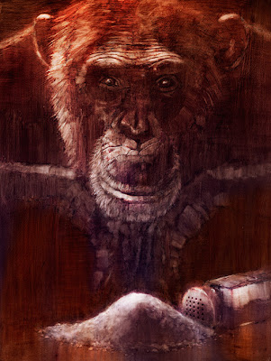
Back in July 2007, TIME Magazine did a cover story on addiction -- the science behind it, hereditary factors, natural tendencies, social influences, and just why people may or may not be prone to addiction. As an exercise, I did an illustration depicting this concept.

At the time, The Soprano's had recently ended it's run, and people were up in arms debating the genius or the outrageous letdown of the final scene. David Chase has voiced his thoughts on what may or may not be behind the lead-up to the cut to black. He said there was no symbolism, but I prefer to think, rightly or wrongly, that there was. In my opinion, "Last Supper" symbolism-meets-2007-Sopranos, in the cafe, meticulously planned and executed...is brilliance!

Anyway, that debate had me thinking about the power of symbolism in art. Something I'm interested in exploring is saying as much as possible with as little as possible. Drawing on people's knowledge and experiences by using symbolism can be an effective tool to do this. The question then becomes: what constitutes a symbol? Does it have to be iconic, like a Freudian cigar, or can it be obscure, like a Rold Gold pretzel stick representing a Freudian cigar?

Here, there is the monkey on the back reference coupled with a lost shaker of salt. I had it on good authority that this reference from "Margaritaville" referred to cocaine. Even if it doesn't, it probably does...to someone.

So, what are you addicted to? Internet social networking, perhaps...blogging, maybe? Who knew "blogging" would become a verb?

In 1996, before "blogging" was a verb, K's Choice, many would argue a one-hit-wonder from the "alternative" genre of 90s rock, recorded an album called Paradise in Me. "Not an Addict" was the first single off this disk. I thought it a symbolic appropriation for this entry's title.

Here's an acoustic version from a solo Sarah Bettens (lead singer).


One of many huge losses to addiction.

Sunday, January 13, 2008

Voyeurism

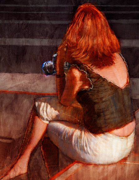
Yet another of my San Francisco images. While I was people watching, a couple caught my eye. Particularly this woman. They looked to be not from the U.S., probably in their 40s. They were both dressed smartly and summery. She had a camera and they were both scanning the Union Square, looking at the people. Once and a while, she'd take a shot. They would talk to each other in lower tones periodically, perhaps conferring about the person she was about to photograph. It was a fairly high-end camera, and she looked to have had experience with photography. I wondered what she was looking for.

Her shock of red hair captured my attention, which drew me into her story, and looking at the clues to try and deduce her story. I thought an image of the attractive, seductive woman holding the camera, perhaps herself the voyeur, might be a unique take on the concept. Particularly when composed in such a way to ask who exactly is the voyeur -- the viewer or the woman. Maybe both.

The lines of the plaza become design elements to reflect the angles in the figure. One of my favorite parts is the foot terminating precisely in the lower left corner. The red throughout becomes a strong presence, stemming from the hair and accentuating a mood.

Maybe she has a photograph of me on her blog.

Sunday, November 18, 2007

Hillary Clinton

Picture a painting by Peter Paul Rubens titled, Immaculate Conception. Picture Hillary Clinton. Picture a pants suit. Put them together and what does one get? One gets this particular illustration that speaks about her and the Democrats finding religion. One also gets an illustration that luckily made it into Illustrators West 46, the juried annual exhibition by the Los Angeles Society of Illustrators. It will be on-line in the spring of 2008.

When I have some extra time, I will do self-assigned illustrations. This piece was based on a TIME Magazine cover story about the Democrats all suddenly finding religion in hopes of reaching a voting segment they've been historically unable to reach. The Republicans have been the party of religion, so this newfound interest by the Dems to start talking more prominently about their religious beliefs seemed worth probing.

What I aim to do whenever I assign myself a TIME cover story is execute it under the same stringent timeframe as is typical for a TIME illustration. It's good practice. I read the story on TIME.com on a Thursday night -- when the new issue is published on-line. I generated some ideas later that night and decided on one to pursue for the finish. Friday, I shot some reference for the pose and did much of the illustration that night. Saturday, I added some final touches and it was totally completed that afternoon. It's very encouraging to have this effort validated by the gracious jurors at the Illustrators West show.

Now, as I add to this blog entry on March 4 -- Ohio and Texas Super-Tuesday -- and as we see Hillary take both states, this image takes on another life -- the martyr, the risen dead, the prodigal daughter? Is the tide turning? Does it matter? What about SNL? Are Tina Fey and Amy Poehler the combined Oprah of the Clinton set? How about religion? Funny how that has serendipitously sneaked it's way into the candidates' conversation. Thanks, Hil.

detail and inspiration


Sunday, September 23, 2007

Atomic Punk

I always love working with Joy Olivia Miller and the Bulletin of the Atomic Scientists (keepers of the Doomsday Clock and 2007 National Magazine Award Winner for General Excellence). I've been lucky enough to contribute regularly to their opening Opinions article. These articles pose a bi-monthly argument that a particular aspect of world affairs, as it relates to global security, isn't as it seems or as it should be. For the November/December issue, the author questions the ability of the scientific community to come together and monitor itself when it comes to initiating and participating in bio-security measures. Trust and ethics play a big part in this.

I always immerse myself in the article, reading and re-reading it multiple times. This allows me to identify all possible angles and ways to distill a complex narrative to its essence. After I have the story figured out, I'll scribble all sorts of potential concepts in my sketchbook accompanied by thumbnails. After I've amassed a sufficient amount of material, the next step is to flesh out my favorites to a more refined sketch form.

4–6 sketches later, I'll send the illustration ideas for consideration. Upon approval, I'll clean up my sketch, shoot any necessary reference, and acquire or build any needed props. For this job, I built a nice acetate beaker to replace the test tube.

There was an obvious effort toward achieving symmetry and implied lines that draw the eye to the crossed fingers. I usually try to keep my palette swayed to the warm side with just a bit of cool color to balance things. The choice of color also contributes to the mood and hopefully places the viewer in a certain urgent mindset from the get-go.

sketch