Showing posts with label charcoal. Show all posts

Tuesday, September 21, 2010

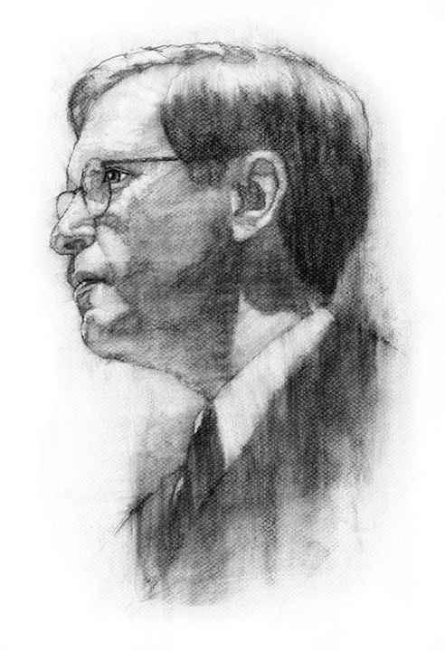
Howard Nusbaum for The University of Chicago Magazine

Howard C. Nusbaum, Ph.D. is Chair of the Department of Psychology at the University of Chicago. He's also a trained cognitive psychologist, whose research examines the area of speech research, and, most recently, the study of wisdom. Check out the Defining Wisdom Project for more information: http://wisdomresearch.org/.

Mr. Nusbaum was also the subject of a charcoal portrait I completed for The University of Chicago Magazine, earlier this year.

For some reason, I always feel as if I'm in my groove whenever I'm fortunate to work with the folks at the U. of C., whether I am or am not. The charcoal marks feel just a little more vivacious and my confidence beams just a little brighter.

Charcoal portraits are a large bulk of my workload, and something I thoroughly enjoy doing. It's fun for me to explore mark-making as I sculpt a face.

I lay down large, vague areas of charcoal and, without committing until I have to, pull details out of the morass until my subject emerges, like a Smilodon out of the La Brea Tar Pits.

Maybe not exactly like that, but close. I'm sculpting, over here.

It's always a pleasure and an honor working with the U. of C. and contributing to their thoughtfully-designed publication.

Things have been ultra-busy for me over the past few months with commissioned illustrations and my newest hobby -- photography. Hence, my lack of posting. Thanks so much to everyone who has checked in, looking for a new post. I sincerely appreciate your loyalty!

I have some neat things coming your way, so stay tuned.

Allan Burch is an award-winning illustrator and portrait artist, providing solutions for editorial, book, advertising, and institutional projects.
View more of his work»
Sign-up for his newsletter»
Purchase prints»

Monday, May 11, 2009

Fistful of Steel

This was a personal piece, completed for my own entertainment.

I wanted to do something moody, compositionally interesting, and slightly dark, on a number of levels.

I was able to get my hands on a photograph of a young woman, whose pose created some great angles and movement, not to mention some nice play of light and shadows.

Sometimes, I like to accentuate these lines through exaggeration. Here, the exaggerated lines allowed a strong angular composition, complimented with an unusual, vertical shadow on her face.

I liked it.

When working on personal pieces, like Fistful of Steel, I allow myself more freedom to fail. What this means is, I make the mark and I own it -- almost daring it not to work. I place total trust in what abilities I have, let the chips fall where they may, and lay down the stroke -- knowing there is no other place on the page it belongs.

I did indeed lay down some expressive strokes of charcoal to render the gal, and among what resulted was a very textured dappling of marks defining her arm -- bringing to mind a tattoo. So, why not add a tattoo and complete the effect?

This was a fun exercise and a much-needed way to release some creative energy.

Allan Burch is an award-winning illustrator and portrait artist, providing solutions for editorial, book, advertising, and institutional projects.
View more of his work»
Sign-up for his newsletter»

Friday, March 20, 2009

Joshua Palmer for USD Magazine

Marine 1st Lt., Joshua M. Palmer, 25, of Banning, California, lost his life due to injuries received from hostile fire in Al Anbar Province, Iraq on April 8, 2004. He graduated from the University of San Diego with a Bachelor's degree in international relations.

This illustration was done for an "In Memoriam" section for USD Magazine.

I've been fortunate to develop a great relationship with the University of San Diego Magazine, and have been lucky enough to create many illustrations for them over the years, including several "In Memoriam" pieces.

For obvious reasons, when many days are Memorial Days for families around the world, this illustration of Mr. Palmer was an honor to do, and a tiny way in which I can pay respect to Joshua and those who serve our country.

I didn't know Joshua, but researching him later, I found him to be a remarkable young man.

He loved to read, was multi-lingual (English, Spanish, and Chinese), and was engaged to be married.

What follows below is an excerpt from his memorial service, and a reminder of the real stories of those we sometimes take for granted. The rest of his story may be read, here.

On April 8th, in the afternoon, Josh’s convoy began taking sniper fire as they entered Fallujah. Josh was a first lieutenant, and led a group of men. Some of the men in the convoy, from another lieutenant’s unit, were injured by the sniper fire. It was determined that someone needed to hunt down the snipers and kill them, before they killed any of the men in the convoy. Josh had been trained in sniper hunting, and volunteered. He led a small group of men into the area where the snipers were. They pinpointed the snipers’ location and ran to the building were the snipers were located. Josh didn’t hesitate, he just ran. When they got there, they began clearing rooms with grenades. When they got to the room where the snipers were, Josh insisted on being in front. Usually officers stay in the back, because their lives are considered more valuable. But Josh had always said that he would never send his men somewhere he wouldn’t go himself, and the test of a true leader was whether or not he led from the front. It was known that there was a very high chance that the person in front would be shot, as they were so close to the snipers, and the snipers were waiting for them. Josh still went in front. He probably knew that he was going to be shot, but he wouldn’t allow someone else to die when he could have prevented it. So he leaned forward and threw the grenade. As he did, he fell a little bit forward, and was shot many times all up his left side and into his neck. Immediately his men pulled him back, and killed the sniper who had shot Josh, the other two snipers were taken prisoner. They pulled Josh to a safe location, where he eventually bled to death.

My best to the Palmers, as well as Joshua's extended family and friends, as we near the 5-year anniversary of his passing.

Allan Burch is an award-winning illustrator and portrait artist, providing solutions for editorial, book, advertising, and institutional projects.
View more of his work»
Sign-up for his newsletter»

Friday, February 20, 2009

Plenty

This is all about vulnerability.

When depicting the female form, most of the time there is an automatic sexual component to the symbolism.

What I'm trying to do with this piece is lead the viewer on a ride that looks like we're headed towards that end, but as the composition is dissected, the intended meaning is exposed.

When I happened upon Nathalie Mark's photograph (the reference for this illustration), I saw just that. And, it was very powerful to me.

In my view, one cannot stage the purity and honesty of an unguarded moment, no matter how hard one tries. One can come close, but there is a last bit of integrity that comes through in such true moments.

With foot rested on the window sill, her relaxed, yet partially deflated posture says she is not trying to be anything to anyone. Furthermore, she is staring back at you -- expressionless and non-judgemental -- daring you to draw your own conclusions, invoke your own expressions, and make your own judgements, while forcing you to see her as a person rather than an object.

My challenge was in capturing this dichotomy and making it all about vulnerability, rather than sexuality.

The emotion that I'm banking belied the taking of the photograph, channeled into me as I rendered the illustration with some of the most unguarded strokes I have ever used in an illustration.

I believe that sort of raw emotion seeps in, through the human mark left on the paper -- another bit of the power of illustration.

There is just the slightest distortion in the form to add an undefinable touch of awkwardness to the scene. My color choice further attempts to shift the mood my direction. And, the text brings communication -- the power of words -- into the equation.

What are you saying...what is she thinking? What was said to inflict the hurt and make her remove all guard?

Allan Burch is an award-winning illustrator and portrait artist, providing solutions for editorial, book, advertising, and institutional projects.
View more of his work»
Sign-up for his newsletter»

Saturday, February 14, 2009

Good Enough

"The way I used to love you
Baby, that's the way I hate you now."

--B. B. King, from the song, "You Done Lost Your Good Thing Now."

Quite frankly, there are plenty of opportunities out there to see the cozy side of Valentine's Day. What about the other side?

One of my favorite artistic techniques to call attention to something is to bring to mind its opposite.

How do you call to mind the opposite of love? Is love always a good thing?

Assuming for a moment that it is, what is that minute like when one realizes things have gone toxic?

Maybe it looks like this.

This is a charcoal study for a painting I have planned.

What's endlessly fascinating to me about this pose is its honesty, coupled with the tension in the body, which is also reflected in the tussled explosion of hair and gnarled hands keeping it from bursting from its seams.

The attractive woman is not attractive in her polka-dotted spaghetti strap summer dress. The revealing flesh and contours of the back, accentuated by the straps, digging in and winding their way around the scapulae, is nothing but vulnerable, as it sits exposed on her unkempt bed, doubled over in absolute grief.

This image is a collaborative effort with Photographer, Nathalie Mark.

I was thinking about the other side of Valentine's Day and what kind of imagery would speak to utter toxicity.

Turning to the web for some inspiration, I happened upon a photograph that wound-up being the reference for this illustration.

I saw incredible potential in a shot that, intended or not, captured something very pure and very emotional, and something that would be very difficult for me to otherwise stage. Plus, the supplemental components (the dress, bed, lighting, room decor) were perfect, and exceptionally ripe for storytelling, in my eyes.

I decided I had to go to the source and see if the photographer would grant permission for me to use the photo as reference for part of a series of illustrations I am planning.

Ms. Mark was very gracious, and we worked out an arrangement granting me such permission.

This is the study.

Some other elements will be added to the painting, to further enhance the story, but as a drawing, I think the power in the pose comes across.

Allan Burch is an award-winning illustrator and portrait artist, providing solutions for editorial, book, advertising, and institutional projects.
View more of his work»
Sign-up for his newsletter»

Saturday, January 31, 2009

Snake Charmer

I like this image. I want you not to like it...in a way.

I want you to feel uneasy looking at it. I'd love if you felt the grime and grit oozing off your screen, onto your hand and that new trackball wireless mouse with which you are hopefully using to scroll and read more.

Warm and welcoming are two words I'm hoping are absent from your thoughts as you look over this illustration.

Aside from a slight tone, there is no color, no warmth. The charcoal I used to draw him echos the dirt and ash smeared across his cheek. The vantage point is chilling. The gun points and his unfeeling eyes are meant to knife through you, as they pierce the shadow of his helmet with the look of someone who's done this before.

What an awful last sight to see, as you -- the viewer, the target -- prepare for the anticlimactic pop of the pistol, and try to find something human about him to latch onto.

Theatrics aside, this was done as a sample for a project proposal. The client provided some photographic reference, on which this image is based.

The dirty texture was important. There needed to be a layer obscuring the viewer's eyes from any niceness of the charcoal on paper drawing. There had to be that splash of movement in the background, setting an active mood and defining the mess that exists in his world. The illustration ached to look as if it had been drug through the gray muck of some foreign shore to echo the distant and gritty mood of the wartime encounter and help further tell this man's story.

This is one of the series of samples I created for this proposal. Two of the others can be seen here and here.

Working on them allowed me to experiment with very expressive content and very dramatic and unique points of view -- which are 2 aspects of the magic of illustration.

Technically speaking, after completing the charcoal drawing, the tone and texture was added in Photoshop. I did much experimenting with various texture treatments in order to attain the right combination of splatter, movement, and filth.

His piercing eyes and steely, chilling expression were very important. There is a fine line between an emotionless expression and a chilling expression. I believe his tells, arguably, the bulk of the story.

Allan Burch is an award-winning illustrator and portrait artist, providing solutions for editorial, book, advertising, and institutional projects.
View more of his work»
Sign-up for his newsletter»

Saturday, November 22, 2008

Pleading Insanity

Here is an illustration created a few years ago for Phoenix Magazine. Unfortunately, as some jobs are, this one was killed for one reason or another. However, one of its results was this dark piece from my archives.

The story it accompanied had to do with prisoners and the potential abuse of the insanity plea. The client knew what they wanted, so it was just a matter of my translating their concept to the page.

As you see above, the intent was to depict a gruff-looking prisoner -- maybe qualified to plead insanity, maybe not -- with shadowy, dreamy figures flitting about, at least raising the possibility of the instability of his mind.

The textural quality of the charcoal on paper drawing lends itself to the cold mood and sense of uneasiness the client was looking to achieve. The harsh light, bisecting the guy's face, both creates drama and alludes to the decision between right and wrong (good and bad, light and dark) when it comes to the issue.

So, who is posing as the prisoner, you are probably asking. Since I tend to pose for my own illustrations, whenever possible, I can say, from the neck down, I am loosely represented.

But, as I'm such a non-threatening sort, my head just would not cut it.

Luckily, a friend, who taught a college-level life-drawing course at the time, happened to have a model who looked like he could have slipped through the barbed wire at the state facility.

It turns out he was a prince of a fellow, but had the mug of a prisoner...at least a prisoner in my illustration.

The end result worked out just perfectly.

Everyone was thrilled, which thrilled me, doubly.

Sunday, February 17, 2008

The Black and White Portraits

One of the staples of my illustrative diet is black and white charcoal portraiture. In 1997 I was a fresh-faced illustrator advertising on a new site called theispot.com. One of the pieces I placed in my on-line portfolio was a black and white charcoal portrait which I had produced in college. After a year on theispot with only nibbles, it was time to either renew or jump ship. I opted to jump ship. Shortly after my decision was official, I received a phone call from Science Magazine. On the strength of the lone black and white piece, they asked me to participate in a year-long project to illustrate the authors of a weekly essay on science and society. The illustrations would be black and white charcoal portraits. I subsequently reversed my decision and have been with the ispot ever since.

The project for Science Magazine led to a multi-year relationship with this tremendous organization and its tremendous people. Cynthia Faber Smith, who has since moved on, is still perched high on my list of art directors who have set the standard for excellence and generosity. Preston Huey was a complete joy to work with and resides in my professional network at LinkedIn.

Professionally, what grew from this amazing assignment was more portrait work. Steadily, business publications, universities, entertainment companies, and annual report designers would call about the charcoal work. It has bloomed into some of the best assignments and working relationships any illustrator could imagine.

Aside from a beautiful depiction beyond a typical photograph, there are some practical advantages to the illustrated portrait. Not that you'd want to, but some have taken advantage of the easy ability to take 5 years or 15 pounds off the subject. Also, sometimes the only usable photo is a postage stamp-sized, pixelated web thumbnail. There is no time to track the subject down and shoot new photos before the deadline. In this case, an illustrated portrait would be the perfect solution. I think I've used the complete gamut of reference, and have yet to come close to meeting a photo from which I could not work. They also add an elegant touch to your brand -- something extra that distinguishes you from the crowd.

The portrait above was commissioned for the Columbia Business School through Zehno Cross Media Communications, while the one below was for one of my great clients, the University of Chicago Magazine.