Saturday, February 23, 2008

Not an Addict


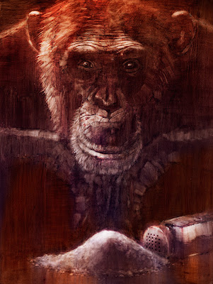
Back in July 2007, TIME Magazine did a cover story on addiction -- the science behind it, hereditary factors, natural tendencies, social influences, and just why people may or may not be prone to addiction. As an exercise, I did an illustration depicting this concept.

At the time, The Soprano's had recently ended it's run, and people were up in arms debating the genius or the outrageous letdown of the final scene. David Chase has voiced his thoughts on what may or may not be behind the lead-up to the cut to black. He said there was no symbolism, but I prefer to think, rightly or wrongly, that there was. In my opinion, "Last Supper" symbolism-meets-2007-Sopranos, in the cafe, meticulously planned and executed...is brilliance!

Anyway, that debate had me thinking about the power of symbolism in art. Something I'm interested in exploring is saying as much as possible with as little as possible. Drawing on people's knowledge and experiences by using symbolism can be an effective tool to do this. The question then becomes: what constitutes a symbol? Does it have to be iconic, like a Freudian cigar, or can it be obscure, like a Rold Gold pretzel stick representing a Freudian cigar?

Here, there is the monkey on the back reference coupled with a lost shaker of salt. I had it on good authority that this reference from "Margaritaville" referred to cocaine. Even if it doesn't, it probably does...to someone.

So, what are you addicted to? Internet social networking, perhaps...blogging, maybe? Who knew "blogging" would become a verb?

In 1996, before "blogging" was a verb, K's Choice, many would argue a one-hit-wonder from the "alternative" genre of 90s rock, recorded an album called Paradise in Me. "Not an Addict" was the first single off this disk. I thought it a symbolic appropriation for this entry's title.

Here's an acoustic version from a solo Sarah Bettens (lead singer).


One of many huge losses to addiction.

Sunday, February 17, 2008

The Black and White Portraits

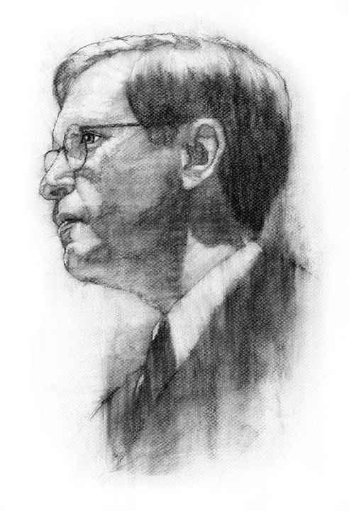
One of the staples of my illustrative diet is black and white charcoal portraiture. In 1997 I was a fresh-faced illustrator advertising on a new site called theispot.com. One of the pieces I placed in my on-line portfolio was a black and white charcoal portrait which I had produced in college. After a year on theispot with only nibbles, it was time to either renew or jump ship. I opted to jump ship. Shortly after my decision was official, I received a phone call from Science Magazine. On the strength of the lone black and white piece, they asked me to participate in a year-long project to illustrate the authors of a weekly essay on science and society. The illustrations would be black and white charcoal portraits. I subsequently reversed my decision and have been with the ispot ever since.

The project for Science Magazine led to a multi-year relationship with this tremendous organization and its tremendous people. Cynthia Faber Smith, who has since moved on, is still perched high on my list of art directors who have set the standard for excellence and generosity. Preston Huey was a complete joy to work with and resides in my professional network at LinkedIn.

Professionally, what grew from this amazing assignment was more portrait work. Steadily, business publications, universities, entertainment companies, and annual report designers would call about the charcoal work. It has bloomed into some of the best assignments and working relationships any illustrator could imagine.

Aside from a beautiful depiction beyond a typical photograph, there are some practical advantages to the illustrated portrait. Not that you'd want to, but some have taken advantage of the easy ability to take 5 years or 15 pounds off the subject. Also, sometimes the only usable photo is a postage stamp-sized, pixelated web thumbnail. There is no time to track the subject down and shoot new photos before the deadline. In this case, an illustrated portrait would be the perfect solution. I think I've used the complete gamut of reference, and have yet to come close to meeting a photo from which I could not work. They also add an elegant touch to your brand -- something extra that distinguishes you from the crowd.

The portrait above was commissioned for the Columbia Business School through Zehno Cross Media Communications, while the one below was for one of my great clients, the University of Chicago Magazine.

Friday, February 8, 2008

John F. Kennedy

Some interesting things are happening in the world of Allan Burch Illustration. Namely, busyness. More-so than any other point in my history. I'll post the jobs, soon, and I'll talk about the other pending jobs, once they are secured.

In the meantime, I'm watching with anticipation to see if Amy Winehouse can pull off some Grammy wins. She is laced, liberally, throughout this blog, in reference as well as the christening post. Needless to say, I think quite highly of her music.

In current blogging news, how about this nugget from 2007. In my prior post, I mentioned how my Bruce Springsteen portrait ushered in a "golden age" of my illustration development. That was in the mid-90s. A lot of steady development took place between then and the summer of 2007, but JFK ushered in a new golden-age for me, in a number of ways. Firstly, it was my initial foray into a stylistic experiment with a traditional underpainting + digital "overpainting." Secondly, it was the first of my TIME Magazine self-assigned illustrations. When I have a free day, I will assign myself a TIME cover story. Thirdly, it was the first in a long stretch of voluminous output that continues today. I made the decision to continuously and relentlessly generate new work every week with the end goal to master my "game." Whenever I (or others) learn anything, it mostly comes from sheer repetition -- identifying the patterns, understanding the whys and wheres of these patterns -- inside and out -- and finally, being able to manipulate the patterns and let your voice find you. It sounds much easier than it is, but my credo is keep moving forward. Win or lose, I get closer to my goal, and a new piece of the puzzle emerges. For any budding illustrators out there reading, give that a try. It's a solid recipe.

So, the story of the TIME issue was of JFK, and what we can learn from his time in office. This is a fairly straightforward portrait, but upon completion, something nice emerged -- a sort of golden glowing deity feeling stemming from the colors, the sculptural form and shape of his face, and his youthfulness, coupled with the Kennedy aura. As I tend to do, the palette is 90 percent warm with a touch of cool. In this case the cool can be found in his shirt collar and the subtle green shocks in his hair.

My experimentation with a traditional underpainting combined with a digital overpainting stemmed from my curiosity. Could I get where I wanted to go quicker and easier by introducing Photoshop? So, being somewhat nimble with Photoshop, I thought to give it a try. Many illustrators do this in some form or other -- often times digitally coloring black and white linework. But, I would hazard not too many do it this way.

It's all pixels, right?

underpainting

Saturday, January 26, 2008

Bruce Springsteen

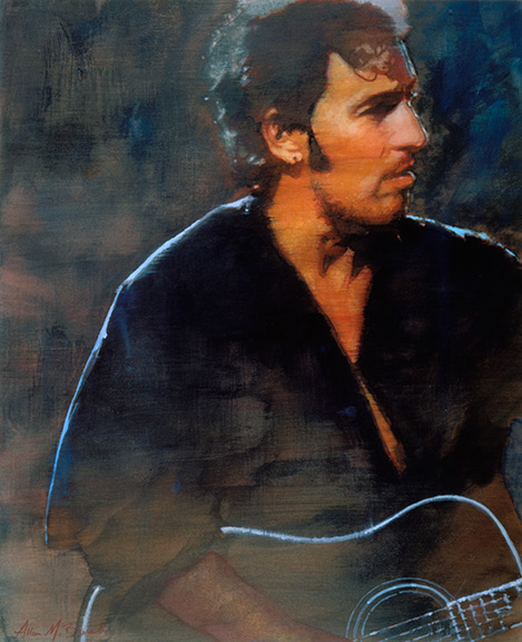
Bruce Springsteen -- one of my favorite pieces. It gets a lot of hits on both my website and the various other portfolio sites in which I participate. It made the Communication Arts Illustration annual and both the Los Angeles and New York Society of Illustrators annuals. People have inquired about purchasing it (which I'm willing to do, by the way).

I did this illustration shortly after college, which initiated one of the "golden ages" of my development as an illustrator. I had moved back home, after my freelance work ran dry, working at the local Hy-Vee grocery store stocking shelves by night and working feverishly during the day building my portfolio. I found some reference one day that inspired me to create another Bruce Springsteen illustration. You see, in college, as an assignment, I did a Springsteen illustration. So why do another? All I do know, is it seemed like the right thing to do. But, it didn't come easily. I made one pass at it and failed. It had become labored-looking, and had no integrity or direction. It didn't look like I knew what I was trying to accomplish. So, I scrapped it and tried again. Some of my favorite pieces are the result of second attempts. This time it came together like the planets lining up. When a painting paints itself, as Bruce did, one tends to bookmark the occasion in their mind. When it was complete, I felt like it could be something special -- it said much with deceptive simplicity. When it fortunately snagged all kinds of space in the annuals, I decided I might be onto something. In many ways, it has proven a benchmark for my measurement of later pieces. It is also one of the few I have done that tends toward a cool color palette.

One thing that helps this piece hold up over time is the fact that Sprinsteen seems to hold on to this look. He looks about the same now as he did in 1995, which is good for me, as I can continue to ride this image. If an artist likes a musician's work, it shows in the illustration. Bruce is certainly one of the great storytellers in music. Today, he hangs on my wall, with the other illustrations that needed framing for one reason or another, keeping an eye on all things to his left.

Check out this version of "Fire." You can feel the energy aching to burst through. Bruce wrote this for Elvis in '77, but Elvis died shortly thereafter.


And, here is a duet with Melissa Etheridge. "Thunder Road" unplugged. Pretty cool.


And, speaking of Melissa Etheridge unplugged, here is a killer version of "Maggie May."

Sunday, January 13, 2008

Voyeurism

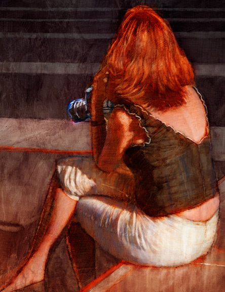
Yet another of my San Francisco images. While I was people watching, a couple caught my eye. Particularly this woman. They looked to be not from the U.S., probably in their 40s. They were both dressed smartly and summery. She had a camera and they were both scanning the Union Square, looking at the people. Once and a while, she'd take a shot. They would talk to each other in lower tones periodically, perhaps conferring about the person she was about to photograph. It was a fairly high-end camera, and she looked to have had experience with photography. I wondered what she was looking for.

Her shock of red hair captured my attention, which drew me into her story, and looking at the clues to try and deduce her story. I thought an image of the attractive, seductive woman holding the camera, perhaps herself the voyeur, might be a unique take on the concept. Particularly when composed in such a way to ask who exactly is the voyeur -- the viewer or the woman. Maybe both.

The lines of the plaza become design elements to reflect the angles in the figure. One of my favorite parts is the foot terminating precisely in the lower left corner. The red throughout becomes a strong presence, stemming from the hair and accentuating a mood.

Maybe she has a photograph of me on her blog.

Sunday, January 6, 2008

Let's Dance

I saw Rob Thomas do a version of the David Bowie tune, "Let's Dance," on PBS recently. It was shown as part of his concert at the Red Rocks Amphitheater. It was a pretty credible rendition, in my opinion. I thought it a fitting title for this illustration that was used on my 2007 Christmas card. My intent was to have this image up for the holidays, but work and travel precluded this. So, Obama remained for 2 additional weeks, which turned out very topical with the recent wave he's created.

But back to the image this week, which was prepared months in advance for the express purpose of my card. I thought it captured the celebration and color of the season, and also alludes to the partnership I engage with my clients.

Working with a great art director is a very rewarding symbiotic partnership. When you find yourself in a good professional relationship, it's something that should be celebrated, in my opinion. In this business, markets, situations, budgets, and positions can and do change. When the creative planets align just so, if for one job or many, I think it's important to take a moment and recognize it.

A blast from the past.


detail

Sunday, December 16, 2007

Barack Obama

The Oprah-factor. Will it help? It certainly can't hurt. He and Hillary are essentially neck-and-neck in Iowa. What's fascinating to me is his charisma and presence. That seems to go a long way with many people. He also seems to be an intensively smart man. Many people came to first know about him after his keynote address at the 2004 Democratic National Convention. I missed the speech, but I remember the buzz afterward. People noted how brilliant and inspiring his speech was perceived, and how he would be the future of the Democratic party.

It's always interesting to watch the polls and how people analyze them as if they are of critical importance 100% of the time. Any bodybuilder (or anyone trying to get into shape for their class reunion) knows it's all about peaking at the right time. Obama's peak appears to be happening at about the right time.

I did this piece a few months back to be included as part of a portrait-themed promotional brochure I was planning. After doing it, I decided it disproportionately out-shined some of the others I was to include. This sparked a fervent stretch of voluminous output on my part, that continues to this day. This has advanced my work, invaluably, and sparked some of my favorite illustrations to-date (check out the Amy Winehouse image from September -- no pun intended but I'm completely addicted to her music right now).

The brochure is still in the works. Drop me a line, and I'll send you one when it's complete.

detail